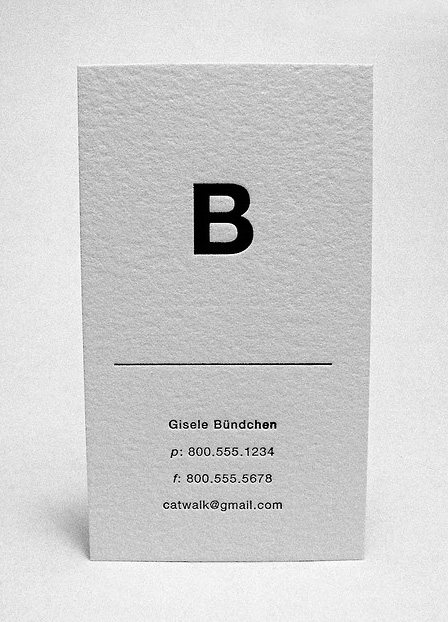
I know it's Helvetica, I was just wondering if anyone knew the weight(s) of the bottom text. I'm also not sure how to properly embed an image, if someone could help me with that that'd be awesome!
| Attachment | Size |
|---|---|
| 41.jpg | 124.63 KB |
I know it's Helvetica, I was just wondering if anyone knew the weight(s) of the bottom text. I'm also not sure how to properly embed an image, if someone could help me with that that'd be awesome!
| Attachment | Size |
|---|---|
| 41.jpg | 124.63 KB |

Whatever it is it's not light enough. And if you do a card for Kate Moss make sure you use the Goddam Cadaverous Waif weight.
hhp
I think it's a good weight. Any lighter and it might compromise legibility. Anyways thanks for the input.
I was kidding - you know, underweight models.
But I still don't get why the "B" is asymmetrical - that's kinda yucky.
(See last one here: http://gmunch.home.pipeline.com/typo-L/cart/arch1.htm)
hhp

It’s almost impossible to know given the letterpress treatment. However, it looks like something lighter than regular (45 or 35, if it’s Neue).
If you use the Edit link to move the thread up to the main Type ID Board, maybe someone else could chime in with suggestions.
Thanks!
Captured from web.archive.org on 19 Aug 2013. view this capture