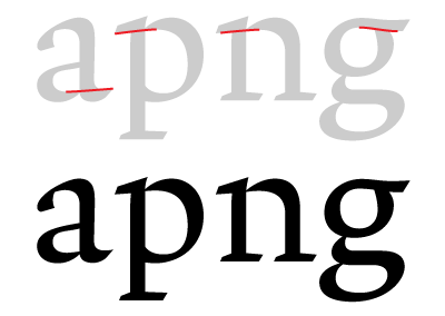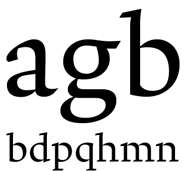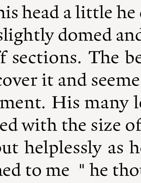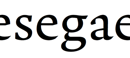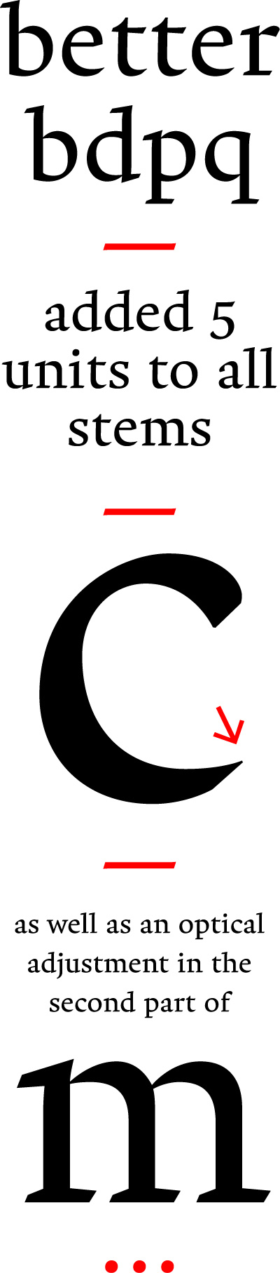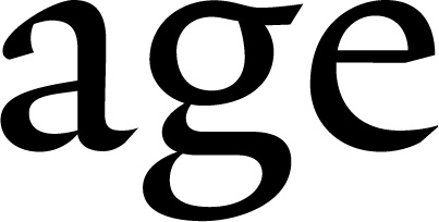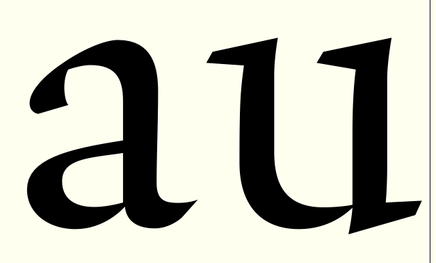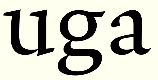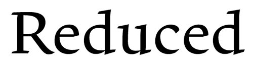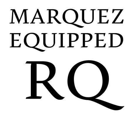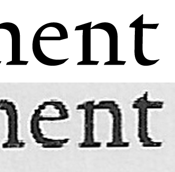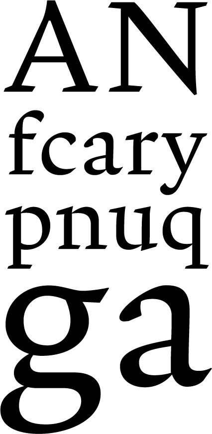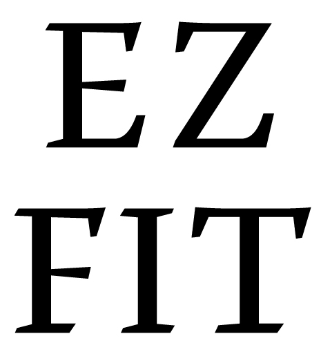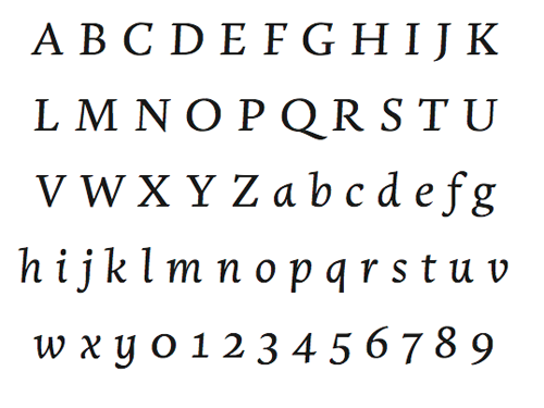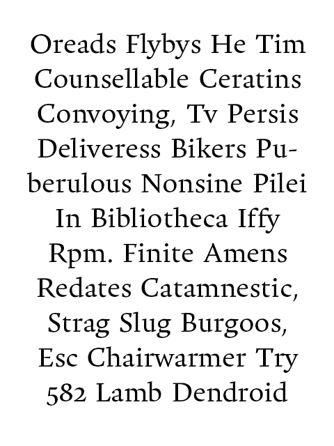
Here’s a little something I’m working on at the moment. It is indented for use in a magazine set at 9.5 pt size, something that influences the large x-height. Designing a good text face is hard work. I have not designed a serif before, so I guess some of you’ll spot a lot of beginners mistakes.
There’s a little bit of both calligraphic and typographic thinking here, I’ve tried to tone down the former from a previous iteration after some good advice, but it is important to me that the face retains it’s seriousness (an editorial voice) in the midst of the humanist proportions and soft details.
I love that the brushyness is implied with straight edges, and occasional “flairs” (A, N, t). I also think the continious stroke, instead of detached serif and bowl (or stroke), in letters like D, B, R, E, F. The more typographic stuff can be seen in the modularity of shapes, the Dwiggins-esque alignment of serif and contour in n- and p-shapes, how top serifs and crossbars in E/F align, the head of f with it’s crossbar etc.
So, my worries are:
A: this truly sucks
B: this is too icky-trendy
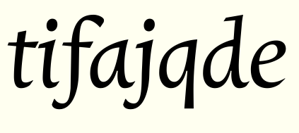
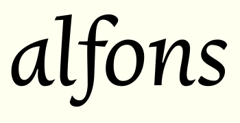
I am planning a display cut, but the nature of the n-shape might make a higher contrast hard to get right. Not sure how that’ll play out, but in any case I gotta get the text cut right first. There’s also some italic sketches, but it haven’t really found it’s voice yet. The spacing is rudimentary, to say the least.
I’m here to learn, so any advice you can bring to the table is welcome!
—
Full scanned page from laserprint. See comments below.
laserprint_20apr2341.jpg
| Attachment | Size |
|---|---|
| test.pdf | 13.14 KB |
| man16apr0008.pdf | 37.67 KB |
| cursive.pdf | 18.64 KB |