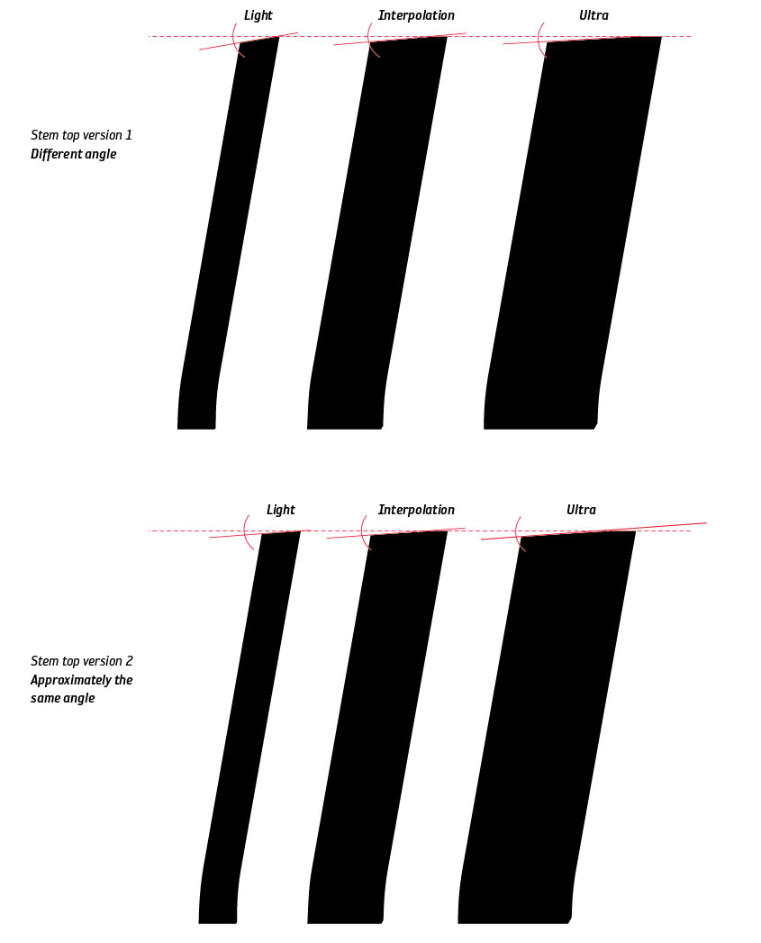
I wonder which angle — same or not the same angle — (see attached image) should I use for the stem in my next Fregate typeface. That angle will be used on the top of the stem on my extrema letters to interpolate the font. In the image you will see the italic lower case “l”.
| Attachment | Size |
|---|---|
| Fregate_stemAngle.jpg | 50.05 KB |