Hello everyone!
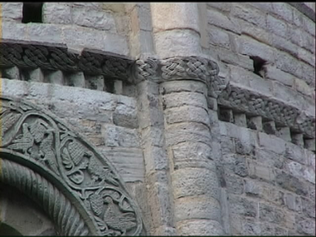
We are a group of students doing a visual identity project about Como, Italy. We need font suggestions for the logo of the city we created: it should be sans serif and possibly coherent with the different identities of Como (romanesque decoration, rationalist movement of Terragni, liberty-inspired elegance). Attached some images of reference.
We were thinking of Neutraface because of its geometry matching that of our logo, but it turned out to be a predictable choice and the result was too "fascist".
Thank you very much for your help.
| Attachment | Size |
|---|---|
| casa del fascio2.jpg | 1.31 MB |
| sant'abbondio22.jpg | 65.44 KB |