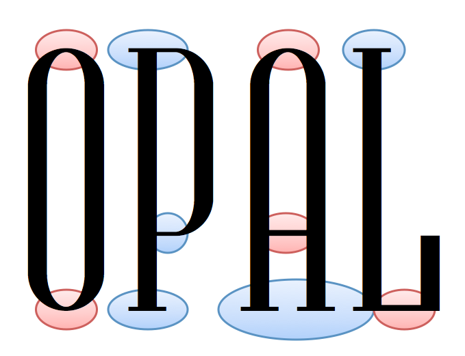
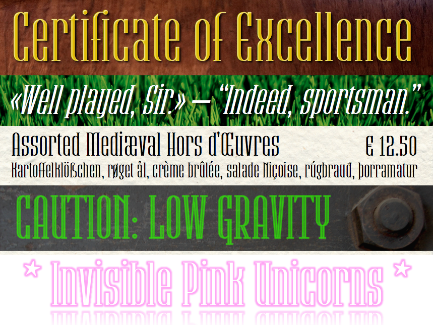
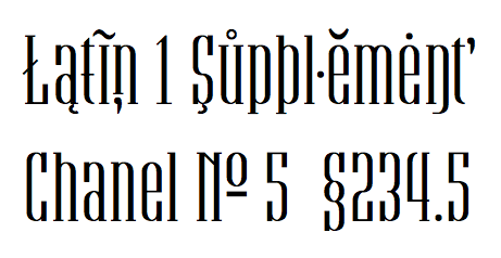
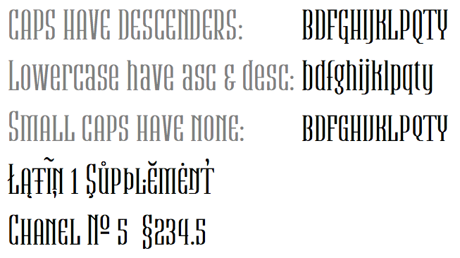
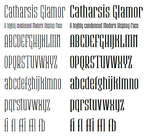
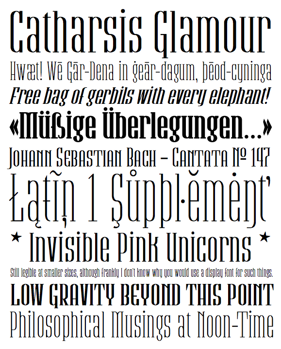
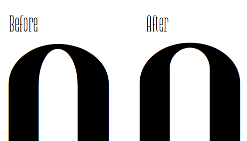
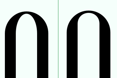
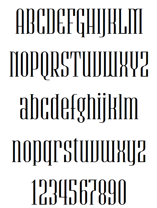
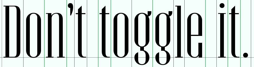
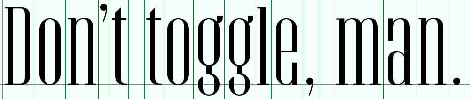
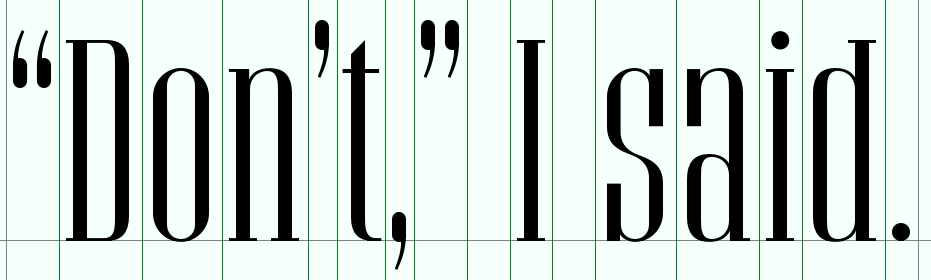
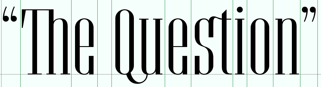
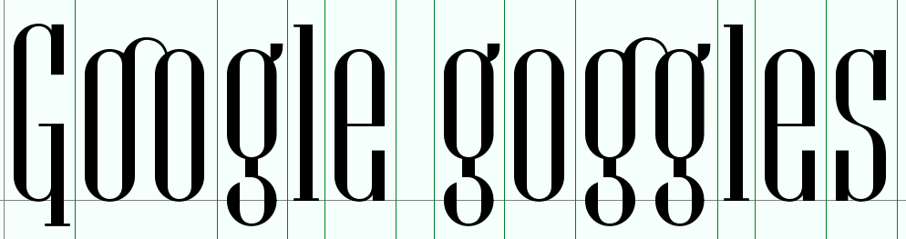
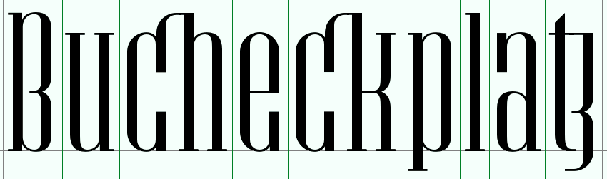
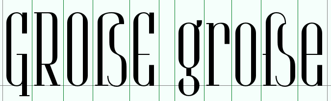
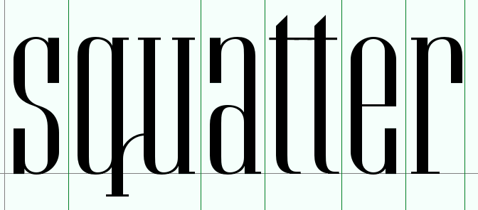
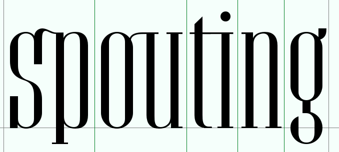
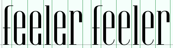
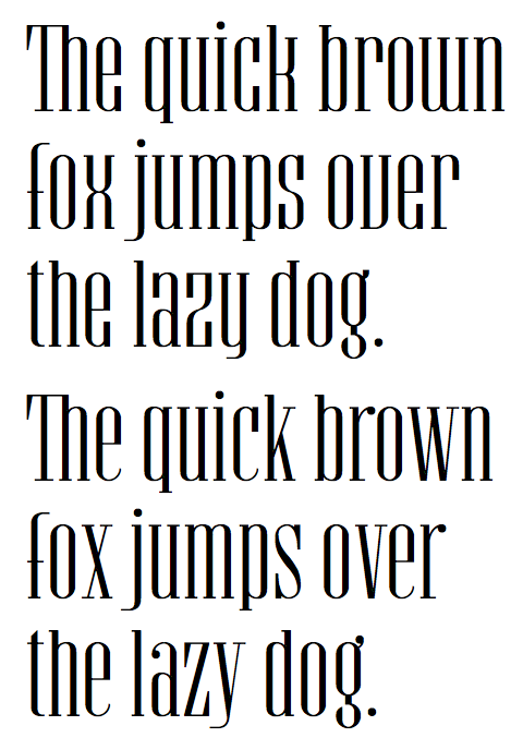
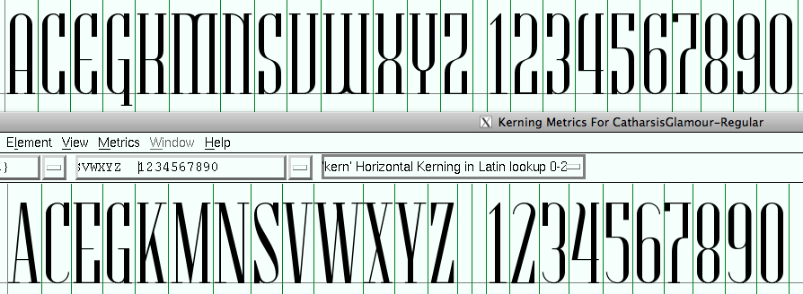
Having become somewhat disillusioned with my book font project, I dug up an old attempt at fontmaking, "Catharsis Requiem", and started remaking it with the new knowledge on typography I had gathered in the meantime. While the original was supposed to look serious and ceremonial, I moved from a humanist to a modern stroke to make a flashier and more glamourous font... Catharsis Glamour.
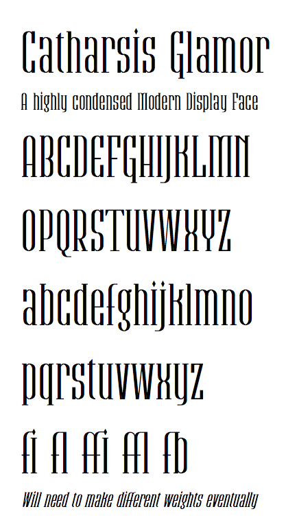
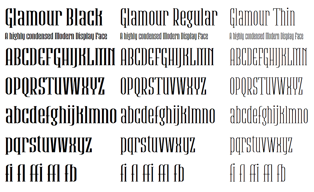
I intend to make a companion font, Catharsis Glory, with less contrast and possibly adnate serifs, for smaller text sizes and "tougher" environment. Also, it should be fairly easy to make different weights for these fonts, given their modular nature. I will probably skip on the italic because the machine-created slanted version looks already quite usable to me.
Of course, I won't start with any of that until I've polished the base font a bit more. What are your opinions and suggestions?
And in case you were wondering, this is the old precursor font, Catharsis Requiem:
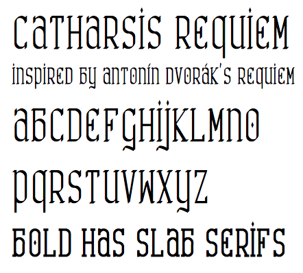
Oof! My eyes! It hurts! ;o)