Typophile

Appropriate typeface for 15th century Gothic-Renaissance castle?

This copy was truncated by the archive that captured it, so the thread may be incomplete.

I'm talking about Hunyad / Hunedoara Castle in Hundedoara, Romania. Information about the castle: in English; in German (more detailed).
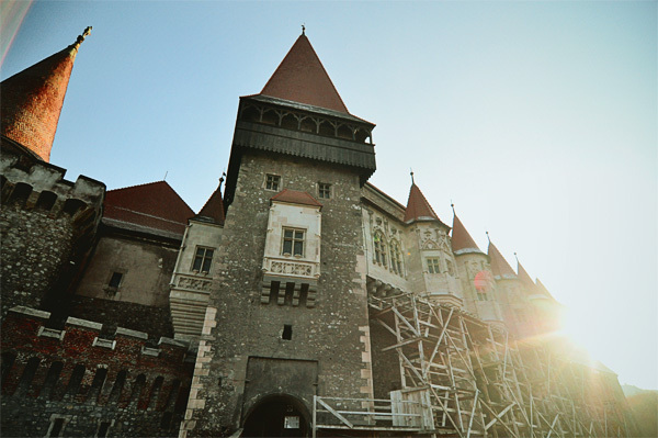

Please visit this page for other photos of the place.

We're looking for appropriate typefaces to be used for display purposes in a branding project. "Appropriate" could mean inspired from that era / matches certain motifs from the buildings / etc.

Here are two typefaces we're considering: JAF Herb and Harbour. Do you think these are appropriate for the period? Do you see any weaknesses in the way they are constructed? (I simply don't have the expertise to tell, so any help here would be very much appreciated.)

Feel free to add your own type suggestions. Thanks in advance.

PS: This isn't my project. I'm helping my brother with a bit of research for his final school project.

Herb (http://www.typophile.com/node/75367) is a wonderful typeface, but I'm not sure how well it could work as a display one.
What about a typeface that looks historical but actually isn't?
http://www.myfonts.com/fonts/andreas-stotzner/rosenbaum/

Litteratra accompanied by Grotext for long texts.

For the display component something like Litteratra seems great, but when it comes to text there's no need to be too literal (which doesn't mean a sans would be ideal) so I might suggest a Fleischmann here.

hhp

Or perhaps a Janson, considering Miklós Kis was Transylvanian too? :)

Thanks all for your suggestions. Litteratra is brilliant! I do agree it would look great paired with Grotext. Too bad the latter doesn't have italics (yet?). Rosembaun is quite interesting too.

Hrant, is that DTL Fleischmann? Beautiful, but pricey, no? I can't even find the price on their site.

Birdseeding — I see what you did there :)

Corvinus Skyline

J Weltin (and all), would you recommend something similar to Grotext that has italics as well? What do you all think of Calluna Sans? Thanks.

EDIT: also: Ideal Sans?

Oh, for display, maybe this:
http://www.myfonts.com/fonts/infonta/amalta/

For the text, why go generic-sans?

hhp

It's not my decision, obviously, but I think my brother would say the same thing: with the display type having so much character, the regular copy should probably be less "in your face"?

Amalta is quite nice. Added to the list. A pairing with Calluna (the serif, this time), would be nice, no?

> the regular copy should probably be less "in your face"?

1) It depends how expressive/reserved you want the whole to be.
2) At text sizes this sort of happens automatically.

hhp

Captured from commoncrawl.org on 19 Apr 2015. original URL