Hello there.
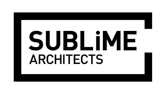
Well I've designed this logo for an Architecture firm in Maldives. Its pretty simple. Its actually a small floor plan with a door cut out to let the type in.
Since the main logo type is DINPro with a modified tittle, I am looking for a secondary typeface to work on body text and others. I took DINPro for it legibility and geometry. Finally wreaking my self over the secondary type face I've finally decided to use Proxima Nova.
Is this combination too similar? or too boring? Any suggestions is welcome.
I've attached the logo and example type combination.