Hi all,
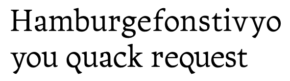
I suppose the goal of producing a font good enough to write a book with is a bit audacious for a blatant amateur's first "serious" typeface. Well, I've given it a first try anyway.
I admit that many (if not most) serif types look alike to my untrained eye. Recently, however, I fell in love with FF Quadraat on the cover of a book. It managed to look beautiful and original despite being perfectly legible and "well-behaved". Of course, I immediately wanted to create something like it of my own.
My design goals were to make each letter as beautiful as I could while still maintaining a consistent style across the letters and a comfortable reading feel at small sizes. After some exuberant doodling followed by some grudging tempering for legibility's sake, I finally ended up with the following. Working title: Callisti, Greek for "most beautiful". I'm also thinking of other nymph-based names, such as Pegaia or Naiad.

Whaddya think? Is it worth pursuing this project? I know it's a lot of work, and I'd rather not start with it if it is doomed to fail.
If a book-capable font turns out to be too hard, I will probably turn this into a display font. I started out Callisti with an extremely low-bowled a that I had to moderate in order to make it legible at small sizes. For the display font, I would probably return it to its former extreme:

Opinions?