Dear Typophiles,
although I've been enthousiastic about design and type for ages, I have no education whatsoever in those fields... nevertheless, my interest often ends up making me the "expert" on such things. Seeing that my workplace (Astronomical Institute "Anton Pannekoek") only had an inofficial logo that someone had hand-drawn in Paint, I set out to design a better one. It ended up garnering a lot of approval by my colleagues, and has recently been pronounced the "official" logo of the institute.
However, personally, I'm not quite happy with the logo as it stands now. I'm having this nagging feeling that there are some glaring typographic crimes in there that could be fixed easily (and probably without most people noticing), and I'd like to do so before the current logo entrenches itself too much. Hiring a pro is not an option — the institute is not going to pay money for something they think they already got for free... ;o) So:
Please help me "fix" this logo!
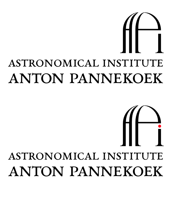
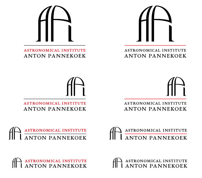
I'm showing two version of it here: A text-heavy one and a graphics-heavy one.

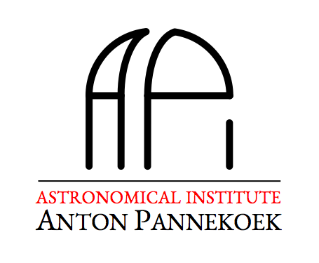
Here's the rationale behind my design:
At first sight, the graphic is supposed to depict the dome of an astronomical telescope facility. On second sight, it is resolvable into the letters "API", which are the acronym commonly used for our institute. The positioning of the dome on top of the text block's "roof" mirrors the location of our actual telescope domes on the roof of the university building.
The colors black, red, white are from Amsterdam's coat of arms.
I picked the font (EB Garamond) to match the one in the official logo of the University of Amsterdam, though I suspect they're using a different (and expensive) form of Garamond.
Here are my grievances with the current design (and I'm sure you can come up with more):
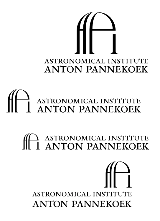
The text is fragile and becomes unreadable on, say, a PowerPoint slide, unless one were to make the logo rather big. That may not always be an option.
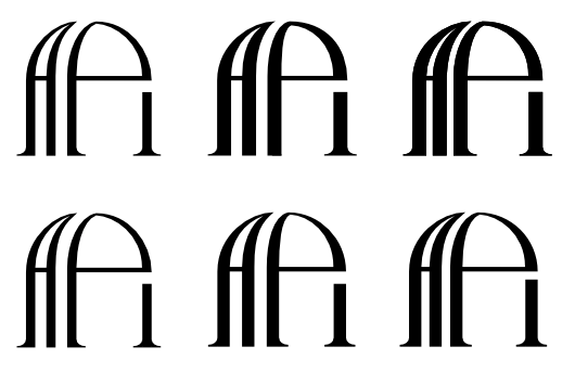
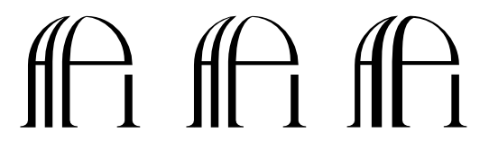
The graphic feels somewhat unbalanced. The dome is not a perfect half-circle; rather, it is made out of two perfect quarter-circles with an offset in between... as a result, I'm not happy with the not-quite-square overall proportions of the graphic. I haven't figured out how to do it better, though.
Taken by itself, the graphic feels ungrounded, like one of those Pac Man ghosts. It needs the straight line below to give it some foundation. However, I haven't found a good way to include such a line while preserving that unified, closed-in-itself "badge" feeling that good logos have.
Any ideas?
Kind regards,
Catharsis