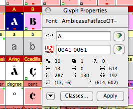
If you create an all-uppercase font, it's possible to assign two Unicode values to each glyph: one for the uppercase and one for the lowercase. In both cases the same glyph can be used. (It seems nothing in the specification prohibits assigning yet even more UC code points to the same glyph.)
Some software doesn't appear to notice this: both Windows and Mac OSX show a 'full' character repertoire in their default preview field. OS X's Font Book only reveals the hidden truth when you select "Full repertoire"; Adobe InDesign, on the other hand, only shows capitals in its Glyphs panel (although typing in lowercase still works).
Are there any significant advantages for re-using glyphs this way? File size is one. It also makes Opentype feature programming a bit easier, or so I imagine, as you don't have to worry about all combinations of F-I, F-i, f-I and f-i ligatures ... (Imagine a six-letter ligature).
Are there known disadvantages? If you copy text out of a PDF, do you get the original uppercase/lowercase you entered, or is it All Uppercase by then?