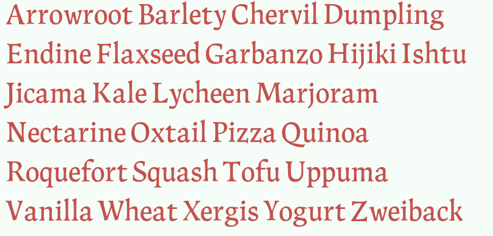
This is something I've been working on and off—mostly off. This is what I will be using as my main example for experiment on the thread about Multiple "cuts" of one typeface. The initial idea for this came from some vague Xavier Dupré inspiration, although that's not very evident here, and sketching. In fact, I'd like to get a somewhat organic and "drawn" feeling.
I vaguely had in my head something of "classic" printing types also, likes ones in books I own printed 1970 and earlier. Like Baskerville, Kis, Dante, Caledonia, Sabon, Fournier, Electra, and Times. Although the digital versions of these just don't look like they do in old books; they are much lighter and crisper. Alpine likely does not very much resemble any of those, as I haven't looked at them much during my process. (Except to read my old books!)

Go ahead and tear apart the design! :)
***
Note:
I've decided, at least for now, the name will be Hemlock. Hemlock is the state tree of Pennsylvania, where I was born.
There is also now finally a PDF.
| Attachment | Size |
|---|---|
| 2012-4-13.pdf | 89.26 KB |