
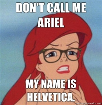
This was recently brought to my attention by a friend named … Ariel.
http://carbonmade.tumblr.com/post/3220161684/dont-call-me-ariel-my-name-...

:o)

New typebattle: typophilic LOLcats! ;-)

I still can't believe Arial is supposed to be analogous to Helvetica. They're almost complete different if you ask me.

I only really noticed the differences when someone enlarged the letters and then overlaid them one on top of the other, then it was astonishingly obvious. Where I work has both fonts but people seem to interchange them without any thought and it winds me up.
Arial is so much colder and more sterile. That's not always a bad thing, depending on what project you're working on.

As I learned from another thread on this forum, Arial was designed to have the same metrics as Helvetica, but the face itself was derived by Monotype from Monotype Grotesque.

I wonder what will happen to Gill’s Ariel when Bush House changes hands.
Tim

Auntie Beeb is moving?
Captured from web.archive.org on 28 Oct 2012. view this capture