Typophile

Font o' the Day

CanwllCorfe

I hope this hasn't been done before. I'm trying to be original. The premise of the thread is simple. Post your font o' the day. Whether it be something new you discovered and like, a classic you admire, or just an excuse to post a pretty specimen. Whatever you wish.

For me it will be Brandon Grotesque Bold, by HVD fonts.
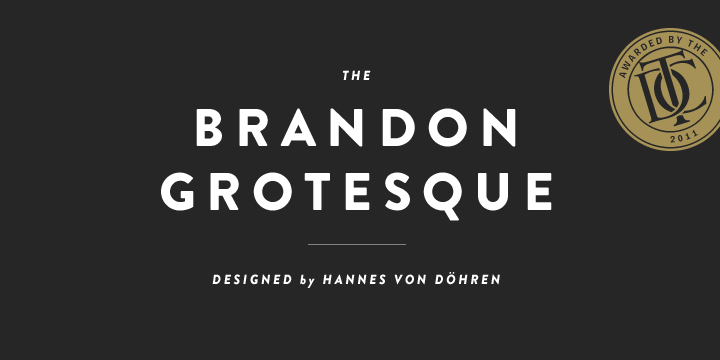
I love that retro look, and especially those wonderfully soft corners.

Today: Baskerville Italic

I discovered it on the first day of my first typography class. I was enamored instantly. I ended up using it on my first project too.

Not to be a wet blanket, but to me ol' John B can rightly
be accused of doing a rush-job when producing his Italic...
For one thing, wassup with that "N" vs "M"?!

Font of the day for me? Hmmm, maybe:
http://www.stereotypes.de/archives/528

BTW, may I suggest a refinement? The font of the day
must be a new discovery (to the person mentioning it).
But take it or leave it - no hard feelings.

hhp

I'm not even close to having a thorough understanding of typography, so I'm completely okay with it! It will help further my knowledge and help in college*. And I'd be okay with that, but I feared putting too much of a constraint on what's posted. I figured if I made it a free for all, more people would respond, and it could then end up being the longest thread in forum history.

*That rhymes.

Okay, here's one I discovered recently. Laura Worthington's Alana. Shown in an excerpt from a letterpress (photopolymer) project I'm doing below.

Lots of fun to play with, but while it has a ton of final alternates (for end of lines), it's a shame there are no initial alternates.

I discovered ‘Alegreya’ today:

Here's one I used today ... Sullivan by Jason Mark Jones.

Parsley Script by Jess Latham

I ended up choosing this for my package project. I like it, it fits, I'd eat it.

Been after finding out what fonts the Financial Times uses in its magazines (FT Weekend and How To Spend It) for ages, happened across this (http://www.fttoolkit.co.uk/2011mediakit/pdfs/FT_Weekend_Guidelines_2011.pdf) and all was revealed. Probably old news to everyone on here but it made my day!

Just had a look at how expensive the fonts are... staggeringly so :( But that's a moan for a different thread I expect.

^I love Miller!

Today it's Vista Slab by Emigre! I'm confused as to how I've never heard of it yet. Lovely!

Recently discovered Biographer tops my list, with runner-up Modkanfire.

http://www.myfonts.com/fonts/sudtipos/biographer/

http://www.myfonts.com/fonts/chantra/modkanfire/

Captured from web.archive.org on 8 Nov 2013. view this capture