
Large 'O' and text. Thank you.
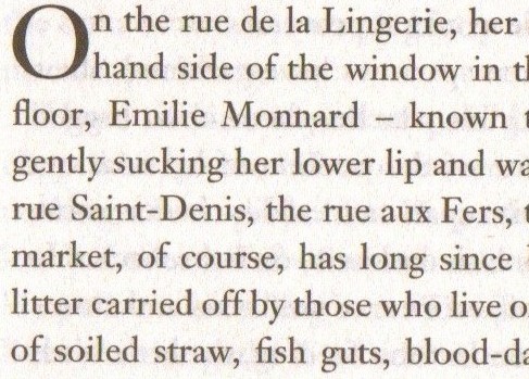
Large 'O' and text. Thank you.

It looks like Janson Text.
http://www.fontshop.com/fonts/downloads/linotype/janson_text_std_complet...
Like the above, this also appears to be Janson, but slightly less contrast between thick and thin elements. Would this be another form of Janson, and if so, which?
_4229.jpg)
Character width appears overall perhaps a bit wider as well, aside from the wider kerning. Which version of Janson might this be?
 - Copy_6561.jpg)
Captured from commoncrawl.org on 26 Apr 2015. original URL