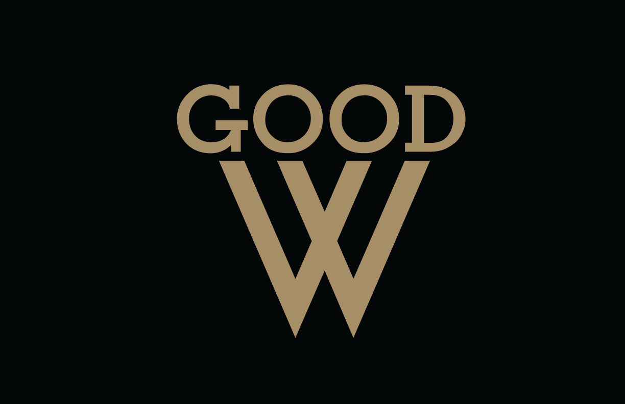
Here's a logo I'm working on for my company. I'm not a graphic designer (and can't afford to higher one), hence I'm keeping it simple. The name of the company is Good Winter. No matter what I do I can't seem to get the full word winter out and keep it uniform. So I might just keep it like this, It's only for the web and anyone going to my sight knows the name of my company. I really have no idea how I feel about this logo. Feedback, advice, critique, all are welcome. Thanks