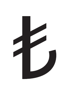
News story.
To cut to the chase:
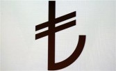
News story.
To cut to the chase:

Oh yeah, that will fit low res and Extra Bold Condensed to a t.
"Turkish Prime Minister Recep Tayyip Erdogan says the anchor shape means that currency is a "safe harbor" while the upward facing lines represent its rising prestige." (reports CBS)

I suppose they got tired of waiting to being accepted into the EU… ;-)

Reminds me of the mess of the Euro-sign introduction years ago. Well, we fontists got it right in the end, at least. Despite of all the official shit.
But now this, I don’t know what to say.

We will get this right in the end, too.
What kind of contrast and terminal would you give that curved stroke in a seriffed typeface?

Would that be a phallucy?
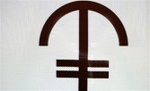
"… the umbrella shape means that the currency is “well protected” while the horizontal lines represent its solid value."

I think it could've been worse.
Although it does look a bit too much like a weapon...
hhp
The symbol was the result of a competition, unfortunately not the best way to get a good design.
This is a typographic symbol, and yet, like the Euro, it was designed by someone who is not a type designer, and the criteria for judging would not, I assume, have had any mention of scalability, slant, weight variance or screen rendering.
You know, one line for the crossbar, rather than two, would have been just fine, and would have magicked away all kinds of monstrous type production problems that the double bar will create.

The crossbar was parallel to the baseline in the winning entry but revised later by the in-house designers of Central Bank of Turkey.
Apart from the need to symbolize growth and rising prestige, another motivation for the revision, in my opinion, might be the fear of a resemblance to the Christian cross (which would be even more significant with a single line crossbar).
It has also been criticized by some to be the rotated copy of the Armenian currency sign (http://en.wikipedia.org/wiki/Armenian_dram_sign).
All seven finalists selected by the jury:


I would have thought that, given the name of the currency unit, they should just have taken a British pound sign, but modified it to have three horizontal bars instead of one (or two), instead of going with something completely novel.
In some subsequent searching, I've found that the form with two crossbars, although sometimes infrequently used for the British pound, was associated with the Italian lira as well, confirming my suggestion that the Turks would need to use three crossbars to have their own unique member of this family.
Nick, for something like this you do want a type designer
consulting, but you don't want a type designer actually
making the final decision; for that you need an alphabet
designer. Those are pretty rare though. :-)
--
I think slanting the bars was an improvement,
since it balances the symbol better.
> It has also been criticized by some to be the
> rotated copy of the Armenian currency sign
If that's a coincidence, that's not so bad. If that's a
ruse to get Europeans to like Turkey more, that's not
good (simply because deceit backfires in the end).
If it's a genuine nod towards the need for honesty
in dealing with the Armenian Genocide (unlikely) then
that's awesome - just as impressive as the April 24th
demonstration held in Istanbul last year.
Even though I'm Armenian, the one thing I like about
the symbol is its gentle allusion of the Arabic past of
Turkish writing.
Looking at the 7 finalists, I would have put my
money on the middle one, since it does the most
to make Turkey look Western. But I still prefer
the one they ended up with.
> taken a British pound sign
!
Turkey is not part of the British Isles.
Lucky for Turkey.
hhp
… for something like this you do want a type designer consulting …
At the very least.
As someone who will be required to adapt the new character to many different kinds of font, a type designer would, one hopes, address the issues of scalability, slant, weight variance and screen rendering — and make sure that the design brief requires each entrant to show specimen glyphs of how their proposed symbol would look in a variety of typefaces, styles, and media. Not just Univers 45 or whatever.
What kind of contrast and terminal would you give that curved stroke in a seriffed typeface?
Answering my own question: the seriffed version could go in a number of different directions.
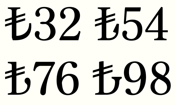
It is NOT a new character. (!) There is the Lira sign existing at codepoint 20A4, typographically a variant of the sterling glyph. End of story. (Note that by annotation it is specified just as LIRA, not as Italian or Turkish Lira per se.)
Everything else is just nonsense.
If you wish now to tune the design of 20A4 according to the new turkish briefing, feel free to do so. But I won’t, because it’s rubbish.
And if ever our turkish friends come to raise the request of a new character before ISO, I will say: 20A4.
the Lira sign [...], typographically a variant of the sterling glyph
Etymologically it would be the other way around ;-)
If you wish now to tune the design of 20A4 according to the new turkish briefing
I wonder which Opentype feature would be best: Localized Forms or Historical Forms?
… which Opentype feature would be best
It won’t matter. For the average user it will not be appealing, such niceties. It won’t help the “new logo” arriving in reality.
As long as they don’t sort out this business in terms of the existing LIRA sign, it seems all fairly rediculous to me. To pretend as if “a new sign for the turkish Lira” would have been something to invent at all, this is the initial mistake. And the story goes downhill from than on.

It is NOT a new character. (!) There is the Lira sign existing at codepoint 20A4 ...
Yes, just like the Rupee, oh wait.

If ever there was case for contextual alternates, this one is: on a scale from 0 to 10 of course, from no prestige at all to the highest mark — and that could be tied to the S&P’s rating of Turkey!
(And why not apply the same principle to all other currency signs?)
Andreas, why wouldn't the Unicode Consortium approve
a new code-point for the currency of a sovereign state?
hhp

Hrant, the argument that this is a glyph variant of the existing Lira sign is not a particularly bad one.
But was anyone in Turkey using that anyway? It appears they just write TL.
In handwriting no one will be able to write this really in any way other than an L with two horizontal strokes, I suspect.
I guess it looks like half a euro. ;-P
@hrant:
> taken a British pound sign
!
Turkey is not part of the British Isles.
Lucky for Turkey.
Neither is Italy. But if Britain gets one bar, Italy two bars, and Turkey three, Turkey would still get its own codepoint.
Also, I'm pretty sure the relation to the Armenian dram sign is a coincidence. But possibly one so embarassing to Turkey that it will choose something else. Noting the finalists shown, it does seem that instead of being inspired by symbols for the lira and the pound, the chief goal in those submissions was to reflect the letters T and L. In the Latin script, which, of course, Turkey now uses.
I suppose using the Arabic script as a source of inspiration is right out for political reasons. And it's Iran, not Turkey, that would have the additional option of going back to cuneiform... ah, there is an "Old Turkic" alphabet, resembling runes, that they might consider.
One problem with three bars is something already
alluded to: the crowding would be very troublesome
in terms of typeforms, especially in darker weights.
> so embarassing
Well, we have increasingly seen some gestures of
empathy... and even if those are probably mostly
a ruse to gain Western acceptance (as with the
switch to the Latin alphabet) the allusion remains.
Mostly though I think it's too subtle to really be
actionable by anybody besides extreme nationalists.
> I suppose using the Arabic script as a source
> of inspiration is right out for political reasons.
Actually the current Turkish regime is Islamist,
and Arabic is the language of Islam. In Iran for
example they learn Arabic simply to be able to
read the Qur'aan, even though they dislike Arabs.
In fact I think that middle one from the finalists
would have been the one chosen by the Secularists.
hhp

This design, at least used with latin script, looks pretty poor to me. I hope it doesn't catch on.
I guess it looks like half a euro. ;-P
That’s what I saw too.
It should be something that a person could easily and quickly write with a pencil but still be clearly different from other glyphs and currency marks.
The non-chosen one [dead center on the image posted] looks to have the most potential.
One of the finalists said it was rumored that the slanting revision was made by the prime minister himself.
I think it is quite possible that he might have contributed to the change; given his educational background the prime minister has to have a good understanding of Arabic lettering and as Hrant stated, the symbol in a way, tries to pay tribute to the Arabic calligraphic tradition.

Andreas, while I dislike and see all sorts of design problems with this new Turkish currency symbol, it is clearly not a variant of U+20A4. The fact that both the Italian and Turkish currency units are called lira is beside the point: they are not the same currency, and the symbol represents the currency, not the name of the currency. Different countries may use the same currency symbol to represent different currencies -- e.g. $ which is dollar in some countries and peso in others --, and other countries may use the same names but different symbols (I can't think of one off hand).
other countries may use the same names but different symbols (I can't think of one off hand).
The Philippine peso uses ₱, while most Latin American countries use $.

>and other countries may use the same names but different symbols (I can't think of one off hand).
Pakistani Rupee vs Indian Rupee?
> it is clearly not a variant of U+20A4 …
• It is a kind of L with a double crossbar,
• it stands for “Lira”,
• it is meant to be a currency sign.
What’s that other than 20A4?
The artificially “designed” symbol of the azerbaidshan currency Manat has been just recently rejected for encoding by ISO, because it was not shown in usage. For some good reason the international character set is not intended to present propagandistic logos or whatsoevers launched by governments to illustrate their pride.
If the “new design” comes in use in Turkey, I presume, then it will end up on the market blackboard looking more or less like ₤.

Eszett Eszett Eszett ...
@Andreas:
For some good reason the international character set is not intended to present propagandistic logos or whatsoevers launched by governments to illustrate their pride.
While I can support the sentiment, since pride and vanity are exaggerated in the types of autocratic government I dislike, it's not particularly unusual for any given country to have a distinctive symbol for its currency unit. Many do; others, in the past, have declined to do so because of economic factors.
Now that type doesn't have to be molded from metal, now that it is "soft", so that a new character which would obsolete a manual typewriter places no one's laser printer in jeopardy - poorer countries, which had to make do with hand-me-down type from other nations want their own symbols finally for their currencies.
This to me isn't the destructive evil pride of some preening militarist - rather, it is the desperate pride of those who struggle to maintain dignity while in poverty. That's something I am inclined to support rather than deprecate.

To be honest with you when I first saw it on the Facebook stream shared by my friends from Turkey – I thought that it was a joke. I am ashamed and so embarrassed by the design which seems to me a failure. I presume it'll show its true face in handwriting. We'll wait and see...

Someone told me the name lira was a tribute to Mussolini but, as John said, that’s beside the point.
I gave a workshop last year at a state university to push the students to think of that missing character as well as of other issues in the Turkish alphabet.
The slanted crossbar is a left “classic” to me since I noticed it in the paper.
Just like Gunnar, I do think that “design contests are usually a bad idea and a designer working back and forth with the commissioning agency might have dealt with a lot of questions including different serif variations before the grand announcement.”
The image that Serdar posted is from this .pdf – I didn’t expect to find the “altın oran” there, it is silly.
> I presume it'll show its true face in handwriting
Yes I think so. It will find it’s master in the hands of ordinary people who have no reason for pretending to be designers.
> desperate pride of those who struggle to maintain dignity while in poverty
I have great respect for Turkish pride. And nowadays the Turkish nation is not that terribly poor and desperate as you might want to suggest. As a matter of fact, Turkey is a rather successful nation with a growing population. So far so good.
But all this is rather not at stake here. The presented “design” is based on a mental mistake (like it was with the official Euro sign) and therefore it will undergo substantial transformation or it will vanish.
The mistake is that the proposed glyph is meant “to look like a piece of design”, rather than to look like a natural currency character.
Pride or prejustice, that is the question.
Anyway, you can always go and furnish 20A4 with any glyph you like.
To my knowlegde there are only two countries with Lira left today, Turkey and Syria. But for Syria as an Arabic writing country the slot 20A4 is of no interest. So in fact, the point is finally left for Turkish conquest ;-)
Is there any political message in this official announcement, with regards to Turkey’s membership of the EU, and possible adoption of the Euro, which would make the Lira obsolete?
John, I think you're painting an overly negative picture.
I wouldn't talk about desperation in the context of Europe
currently... Somebody said Euro?
Ayse, maybe your expectations are too high? This is after all
a politico-bureaucratic thing. Or maybe you wanted something
more European, less religious? The shape of such a currency
symbol might improve outside views of Turkey in the short
term, but all that would do is delay an honest resolution of real
differences, which have to be overcome internally first. To
me alluding to the long and glorious Arabic past of Turkish
writing can only help. You don't have to be religious (I'm not)
to believe that.
Also, I would not rely on handwriting, for two reasons:
- You're going to get regional variations, plus even in a
given region it's going to take a while for it to stabilize.
You don't want to wait a couple of decades just to settle on a
final country-wide symbol, especially since it could be worse.
- Whatever casual handwriting produces is only elegantly
typographic by dumb luck; the typeform derived from such
a model would probably be either ugly or highly divergent.
Alessandro, what's "altın oran"?
BTW, I'm feeling a panel discussion about this at ISType 2012
coming on. :-) I'm still trying to figure out a way to make it BTW.
If I can swing a Moscow connection for my Armenia trip the cost
of a detour to Istanbul seems to be pretty modest. But the timing
still has to click just right.
Andreas, national pride can be quite important... but mostly
for endangered peoples. In the hands of dominant people it's
sadly mostly used to get the populace to behave contrary to
its own good, as happened during WWI.
> therefore it will undergo substantial
> transformation or it will vanish.
What's "substantial"? That's not what I feel happened
to the Euro. What we see in type is clearly a rendering
of the original idea. It really doesn't matter that the
original idea was intended* to be implemented strictly.
And that actually has its place too, like as decoration
on buildings. In fact it's better to start with something
formal and let people deviate; the other way is hopeless.
* Which I'm not sure was the case. There's a
difference between what politicians say versus
what they think should happen. And if they had
said "this is just a suggestion of how it should
look" then we might have seen some substantial
changes (and you don't want too much deviation).
> you can always go and furnish 20A4 with any glyph you like
Overloading that slot would only confuse. That's almost
as bad as re-using the sputnik (the generic currency slot).
> Syria as an Arabic writing country the slot 20A4 is of no interest
That's an over-simplification - you could be writing about
the Syrian currency in a Latinate language. And if I'm not
mistaken the Syrian currency notes have an English side.
> Is there any political message in this official announcement
Explicitly: unlikely. Implicitly: definitely. :-)
Although it's possible that the Armenian Dram's recent
incorporation into Unicode was a trigger, something like
this would never get off the ground unless there was a
political message. And the only message that seems to
make sense here is "we don't really need Europe"; and
in that context the new mark pretty much had to have
a non-Latin skew.
hhp
what's "altın oran"?
Hrant, it means "golden ratio" in Turkish, the symbol is said to be designed using the golden ratio.
A fishmonger's usage of the new sign, no slanting crossbar but nicely italicized!

Bulgarian and Greek tourists are confused and thought it's the euro sign, so "TL" is also added to avoid confusion. (Full story here.)
Actually, I like the "TL" design too.
>So in fact, the point is finally left for Turkish conquest ;-)
Fonts are used to reproduce or render legacy documents, so redrawing a character could be problematic. This is one of the reasons we have Japanese JIS forms for the older designs.
And who's to say an out of favor currency may not be revived at some point in the future by a regime looking to evoke a more glorious past. Although a bunch of European currencies had a stake thrust through their hearts with the introduction of the euro, who's to say Count Drachma (for example) won't come back from the grave? :-)
Although it's possible that the Armenian Dram's recent incorporation into Unicode was a trigger
Although the Armenian example has proximity and a particular political significance, I think in general we can thank the Indian government's rupee symbol initiative for this recent fad for inventing and encoding symbols for currencies that have got on perfectly well without them for decades. Both the method (open competition) and the justification for the new Turkish symbol is the same as that employed in India; so too are the problems with the design.

Apparently someone took the pragmatic approach to encoding (read: »I don’t care«). In the font offered here:
http://www.ntvmsnbc.com/id/25326728/
the new lira symbol is encoded as dieresis (U+00A8). But hey, the font comes with a new keyboard layout!
Paratype’s fonts come with almost any free slot in the currency Unicode block filled with the not yet officially encoded rouble sign.
LOL
When told to "Putin Roubles" the expected answer is "how many" not "why?"

WTF?!? Nick lawls out loud???!? Age!
Hey, it’s more fun than Rolfing.

nhng
Thanks for posting Michael.
Now we can prepare for the worst …
Looks like the code point is considered stable if this blog post can be believed... http://blogs.msdn.com/b/michkap/archive/2012/05/09/10302596.aspx
Good news.
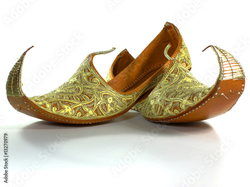
BTW, this just hit me:
http://t2.ftcdn.net/jpg/00/13/27/09/400_F_13270979_ValS8Lgtbm7j22B6RwT8F...
:-)
hhp
Hrant, did you steal my bedroom slippers?
;-)
Unicode announcement - http://unicode-inc.blogspot.com/2012/05/unicode-62-to-support-turkish-li...
My first:
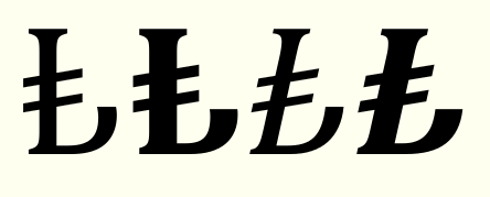
Slanted cross bars are part of the spec -- apparently symbolising the rising prestige of the Turkish currency --, but I'm hoping that over time it will become acceptable for them to be horizontal. Hinting two shallow diagonals to remain parallel is a pain.
I'm hoping that over time it will become acceptable for them to be horizontal.
Why not increase the chances of that by making yours that way? People follow the pioneers. On the other hand I can see how a non-native might more easily be accused of inauthenticity when trying to innovate.
hhp
At this point, I'm more concerned about the client coming back and asking me to redraw it if I were to make the bars horizontal. When there isn't much established practice, quality assurance testers are liable to rely on official descriptions and reference images.

Nice to see how the sign could start to evolve. Here's my take:
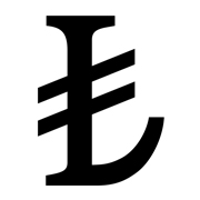
John, maybe take that small risk for the sake of what you feel the symbol should look like? It's now or never.
BTW, I'm starting to wonder whether the tilting was intended as a distancing from the Euro.
Ben: Seems like a further allusion to Arabic - nice.
hhp
It's not a 'small risk', Hrant. Designing and hinting sixteen Turkish Lira glyphs (four per font in lining, oldstyle, tabular and proportional variants) took four man-hours. I'm not willing to risk having to re-do that work just to make a point. I have much, much better things to do with my time.
This is becoming the mess I have expected.
By now I don’t even know if the new “char” thingie gets approval by the ISO working group. Unicode – becoming a stage for promoting poor propaganda design pieces? How low can we get.
John, well done, but to me that is still but a glyph variant of 20A4. It is anything but your fault, it’s just the inherent conundrum.
(I repeat myself I’m afraid.)
I shall just double the 20A4 glyph into the new slot and be done with it. Will anybody come up to complain?
My only hopes now lay with the average Anatolian market folks. Wether they make something reasonable out of it on their blackboards by time, or my vision of the matter will remain dark.
_ _ _ _ _
And now we’d rather spend our wits on re-briefing the design of 20AF. Will be needed quite soon, I fear.
Mess? I'm personally seeing the normal birthing pains of a new character; as it matures it will have to decide (via our proxy) what glyphs it can be. And I feel lucky to be in the right place at the right time to witness the thick of it. Sadly I missed the Armenian Dram's formative period (although I think I'm OK with the adult it's become).
Will anybody come up to complain?
Well, if John's concern about the inclination of the bars is valid (and I agree that it very well might be) then I would say many Turks will find your proposition offensive (even though you didn't intend it as such). Nationalism permeates everything (even if many Westerners think they're impervious). That said, there's always room for an individual to make a statement, even via a minor glyph in the font he makes; I make a statement with my «հ» every time... although Sylfaen just obstructed it for most people. :-)
Also: Fonts being more formal and prestigious, I don't think how people handwrite the Turkish Lira (which is easy enough to write that I don't expect any structure-changing facilitation) will have much of an effect. The people in a position to strongly affect the evolution are the ones choosing the fonts we make (partly based on how our 20BA* looks).
* See below.
hhp
I've just come across a news item announcing that the next release of Unicode has been hastened, due to the urgent need to support the new Turkish lira sign:
http://unicode-inc.blogspot.ca/2012/05/unicode-62-to-support-turkish-lira-sign.html
Maybe I clicked on the link to it earlier in this thread, in which case this didn't need to be posted,
(EDIT: It was: Si Daniels' post above.)
or perhaps it came up in a Google search I conducted for other reasons, in which case this might be useful news.
So its code point will be U+20B4, and we can all stop waiting.
EDIT: So now the comments can start about how such a thing can be called "urgent". But despite what opinion one might have about Turkey's adoption of a distinctive symbol for their currency, the fact is that once it has been adopted, Turkish computer users, at least, will want to be able to generate it from their keyboards as easily as U.S. computer users produce the dollar sign "$", and without a standardized Unicode code point, chaos and inconvenience will result from attempts to satisfy that desire.
Turkey should have been able to just reserve a codepoint before even picking the appearance of the new glyph, in my opinion, so that the moment the winner was announced, standardized implementations could be rolled out without waiting an extra second.
So its code point will be U+20B4.
NO IT WON'T.
Sorry to shout, but stating incorrect code values for newly encoded characters is not helpful. The approved codepoint is U+20BA.
Repeat: U+20BA
Andreas: but to me that is still but a glyph variant of 20A4
Well, no, it isn't. A glyph variant of U+20A4 is a sign whose underlying encoding is U+20A4. But the Turkish Lira symbol is approved for encoding as U+20BA, and that is the only correct, standard encoding for this sign. Your opinion has nothing to do with this, any more than mine does: it is a matter of text encoding standard.
Maybe somebody wrote down an "A" but it looked like a "4"?
The evils of handwriting, I tell you! ;-)
hhp
Maybe somebody wrote down an "A" but it looked like a "4"?
The evils of handwriting
Or of 1337 speak… ;-)

Well, what can I say. When I discovered the sign, I was unaware of the change, and I saw it first on an advertisement for a computer. I was a bit disturbed for a little while, and I got quite accustomed to it. It's actually in line with other signs of the world (yen, euro, etc), and it's very easy to reproduce by hand (a VERY important issue).
David
Still looks too much like a scythe to me.
What's wrong with a scythe? I own a scythe.
hhp
Hrant, you own a scythe because you are a cut above the rest ;-)
OK, everybody, it's time to get your design caps on.
1) The character will be encoded. No point in arguing about it. Turkey submitted a proposal to encode it, as did I. Mine is here.
2) So far for the ballot, the glyph for the character will be the "official" one as seen at the top of the page here. Now as you know, in the code charts the more generic shapes (in this case based more or less on Times) are generally used. Now despite the fact that I had proposed to use one of Craig Eliason's forms in my proposal, the UTC felt that it was too early to know how this would be designed and implemented in OS fonts or other fonts. So I said I would come to this forum and ask the wider community for designs so that se might see what sort of consensus there would be. I see John and Bendy have come up with some. It looks a bit like people are turning a P and lopping off part of its bowl. In a serif font, the real questions are, what to do about the top serif (I followed Craig's), what to do about the horizontals, and what sort of finial should go on the anchor's fluke.
Start designing!
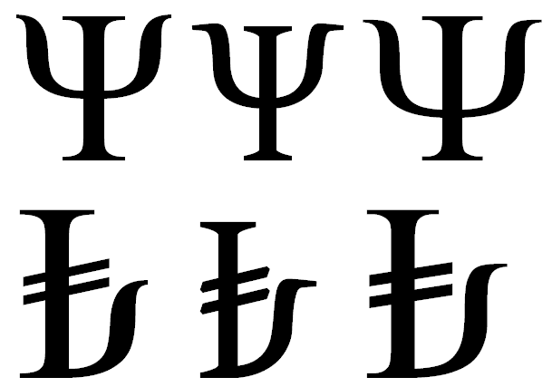
I think the design of uppercase Psi already presents much of the same issues.
(and there could be worse historical references)
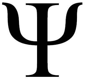

Regarding the top serif, it seems to me the primary relation of the sign is to the L for “Lira”, so the top serif treatment might as well follow that.
I don’t think the starting point for the lower curve should be so much a turned P. Since the official spec derives from the quarter circle, I think you need to look at the “circular” elements in a face, primarily the O — which naturally leads to the D, which is already a half rounded form with a straight left stem. So, I think the lower curve could probably derive from general pattern of the D.
(Obviously, there is usually a close relation between the P and D. So maybe I’m making a trivial distinction, since neither is usable outright.)
Now, what happens with the terminal of the truncation — the anchor fluke — that’s where the interesting design happens. And I expect this element will be the most variable, echoing the more salient aspects of any particular design’s “style.” Will it admit of a ball terminal, for instance? There’s an intriguing question.
I expect the treatment of horizontals will be driven by the proportion of the other elements and the targeted size and display environment.

@Riccard0
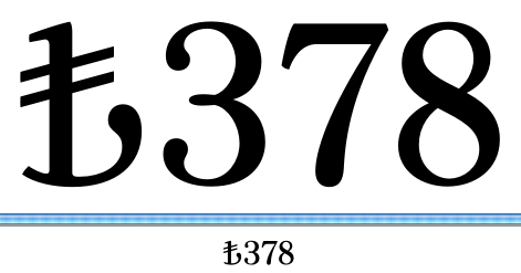
Yes, thank you, that's exactly what I had in mind.
I think it could be the best solution for the terminal of the upward curve in a serif style.
Especially if one manages to balance the relationship between the slanted crossbars and the "exit stroke" of the curve.
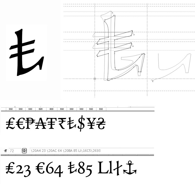
How about this "rocker bottom" alternative?
Fancy! ;-)
The following didn't turn out as coherent as I could manage, but I hope it will still serve to temper our -commendable- enthusiasm and provide food for thought.
Michael, nice to see you spearheading this. But I'm actually surprised that Unicode is proposing to pay attention to what we do "on the ground". Is this usual? Is it that they need to figure out what the actual Times-flavored rendering will be in their codepage renderings? That makes sense (but not much beyond that does).
And I have to take issue with the first half of Kent's post. Yes, formal harmony in a set of glyphs is important, but I personally always strive for a character to be itself and basing the TL too closely to existing structures risks shortchanging it (pardon the pun). Also, most currency marks are derived from alphabetic structures, but all currency marks end up abutted to numerals... So maybe we need to think in terms of [diverging from?] the numerals, which for example traditionally have thick horizontals.
Also, as much as I admire Craig's inventive -and polished- work, I think we need to talk about this in the abstract before we resort to renderings. This is one of the biggest responsibilities that Typophilers can have - let's go slow and tread carefully.
hhp
I agree with Kent regarding the top serifs: this should refer to the L in the same typeface, in the same way that the treatment of the yen symbol refers to the Y.
I don’t think the starting point for the lower curve should be so much a turned P. Since the official spec derives from the quarter circle, I think you need to look at the “circular” elements in a face, primarily the O — which naturally leads to the D, which is already a half rounded form with a straight left stem. So, I think the lower curve could probably derive from general pattern of the D
I think a turned P -- sic, actually inverted -- would be very wrong. What I did for the Cambria signs was to take the lower right portion of the P bowl and modify it to flow into the serif construction of the bottom of the 'L' stem, i.e. actually making it less round. I think making it more of an arc of a circle is a mistake unless the design of the typeface already includes such forms in some way. Kent suggests referencing the D instead of the P, but in my types the D and the P usually reference each other, and the P is proportionally a better match for the Turkish lira sign.
What I think is important is that the arrangement of stroke modulation in the sign should reflect that of the rest of the typeface, in order to maintain a sense of stability -- surely desirable for a currency --, and that it makes sense to make use of the same construction as used elsewhere in the design in similar situations of transition from horizontal to vertical bowl segments. Because of the bars extending to the right, I also think it is important to keep the terminal of the upturn quite simple and not too high, with a good amount of clearance between it and the bars without the latter being placed too high on the stem. What I did in Cambria is to optically centre the crossing of the two bars on the vertical stem, and to roughly align the top of the upturn with where the lower bar emerges on the left side of the stem. This seems to me to be the sort of handy rule that suggests a general model.
There will, of course, be plenty of room for more flamboyant designs, as there is for any glyph, especially in display types, but what is needed at this point is a kind of 'basic construction model' that can be applied to as wide a range of styles of type as possible and produce harmonious results that fit well with the other glyphs, especially the numerals. This is the approach that various people took to the euro symbol when it was instroduced:notably Linotype, who had the largest library of fonts in the target market that needed updating, and who produced a euro symbol design guide that we found produced suitable results for all but an idiosyncratic handful of the 500 fonts that we were hired to extend. Indeed, so good was Linotype's basic construction model for the euro symbol that Adam was able to semi-automate the production of new euro symbol glyphs from elements of existing glyphs, which I had only to fine tune. To me it simply makes sense that the best way to ensure that a new sign harmonises with an existing design is to reference the construction of like-elements in that design. It also accords with my belief that once one has established a core set of glyphs with characteristic shapes and constructions, the rest of a typeface should mostly design itself, and my job is careful refinement of proportions and spacing, not endlessly wondering what shape something should be.
who produced a euro symbol design guide
Is that publicly available anywhere?
Did you reject a serif terminal at the end of the hook because of overall busyness? Does that stroke truncated at the thick part find any analogues in other glyphs?
(My first thought of an existing model for that terminal would be capital /G/, but maybe a typical ampersand could offer some guidance.)
Ben reversed the contrast to go thick to thin (which I had floated earlier, too): the consequent pointier terminal might seem less of an oddball. The thick horizontal, as noted, might fit fine with figures like 2/5/7. I found the thick/thick join at the bottom hard to deal with though Ben's is pretty persuasive. With higher contrast typefaces will that still be workable?
I think we need to talk about this in the abstract before we resort to renderings.
I dunno, when the conversation is about "what should this look like" I find renderings a good way to converse.
Visible language has multiple layers, with different mentalities required for the proper design of each. And when a character has an "official" rendering it gets even more complex. I worry that if somebody produces a very attractive rendering that works well in one style, people will blindly gravitate to that and try to extend it to every other style, and we'll pay the price in the long term.
What I personally find important right now is the sort of thing John did in his most recent post: try to talk about what the symbol -and its parts- need to be doing. This is parallel to the advantage of performing rough sketches of an idea before actually making things that look final.
Specifically, the biggest question seems to be: assuming "stroke" contrast, should the bottom be thick or thin? Although it would be OK to go against such a decision in a given case, it's a sort of decision that does have a place, and on a level higher than making glyphs.
hhp
Yes, Craig, I avoided a serif terminal on the upturn to avoid busyness. It isn't reflected elsewhere in the basic Latin set, but it is in some of the mathematical sorts for the same reason.
I can't say whether the 'reversed constrast' is successful without seeing it in context of the rest of the design, but unless that construction carries across elsewhere in the type, what is the point of such a departure?'
I think your hairline-to-lachrymal upturn can work in an appropriately styled font, as could hairline-to-ball terminal.
_____
Re. the Linotype euro design guidelines, see pages 36 & 37 of my Same Difference lecture slides. Pages 38 & 39, which shows Andreas' suggestions for uppercase eszett construnction are also germane to this discussion.
[Due to a font embedding problem, some of the specimens of student work on the subsequent pages are messed up.]
Michael, nice to see you spearheading this. But I'm actually surprised that Unicode is proposing to pay attention to what we do "on the ground". Is this usual? Is it that they need to figure out what the actual Times-flavored rendering will be in their codepage renderings? That makes sense (but not much beyond that does).
Hrant, what happened was that when the UTC accepted it to put it on the ballot, somebody said we should use the Turkish Bank glyph. I pointed out the hullaballoo which ensued when the ECB said that the euro's glyph should be inviolate. One of the UTC people (reasonably enough) said that it was too early to know how typographers would shake this character out, so they shouldn't pre-empt that discussion by mandating a harmonized glyph (like the one based on Craig's that I used in my proposal). I said, fair enough, I'll go prod the typographers and see what it is that they intend to do.
I would rather see renderings alongside abstraction.
I think we have seen consensus that the top of the vertical bar should have the same serifs as the capital L though.
It seems we’ll have to sink or swim together …
Craig, this looks promising.
Is it to be derived from the L or from the anchor?
I hink this question is rather important. An L is not an anchor and vice versa. I don’t like to vision a bastard of both … :-)
Perhaps the official “anchor” interpretation helps to make the newbie sufficiently different looking from the Lira sign?
Here’s my first take.
.
I think a turned P -- sic, actually inverted
Yes, I misspoke — inverted, not turned — thanks.
But I see what you’re saying about the bottom portion of the P instead. Which makes the distinction between D/P more minor.
That said, as I’ve played now with this glyph, I’m moderating my view about this arc. As much as I admire John’s specific solution, in my own explorations along these lines, I keep feeling too close a kinship between the result and the D and less affinity for an underlying L.
This bothers me in the same way that it bothers me that so many Euro designs seem to look more like a C than an uncial E.
John’s approach seems to ameliorate this by flattening the arc and curling the end slightly — yielding something that reminds me more of a gondola prow, perhaps, than an anchor.
But I wonder if there isn’t some way to retain more of the intention of the quarter circle anchor (as misguided as the specific geometry itself might be) while still referencing an underlying L. To that end, I’m thinking that some kind of simple terminal treatment echoing the leg of the L, where possible and appropriate, might help stave off a truncated D feeling.
Just musing out loud.
I suppose just for the sake of the elephant in the room:
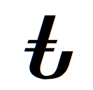
Michael, don't go there! :-)
I'm not opposed to a full double serif up top. But: why? For one thing, the need to relieve crowding that John mentioned should possibly be extended to the top = no serifs. Also, numerals don't have head-serifs.
The "metaglyph" we've been given clearly deviates dramatically from an /L (something I personally value). We shouldn't ignore that intent; it's like the Turkish government and people are our clients.
I can't say whether the 'reversed constrast' is successful without seeing it in context of the rest of the design, but unless that construction carries across elsewhere in the type, what is the point of such a departure?
- To make it less a letter in general, and less an /L in particular.
- The numerals have reversed contrast (which however could actually just as well lead to the opposite decision, although the TL seems difficult to confuse with any of the numerals - except maybe a flipped /7).
Is it to be derived from the L or from the anchor?
It is to be derived from what it needs to do. And to me the best /@ is one that doesn't look like an a-with-something. So part of it is what it shouldn't do.
hhp
I think we have seen consensus that the top of the vertical bar should have the same serifs as the capital L though.
For argument's sake here's some dissent on that point:
1) The glyph retains sufficient "L-ness" regardless of the serif treatment there. What that bilateral serif may do most is not lend "L-ness" but lend "capital-ness" to the glyph, but there is no pressing reason to associate the lira symbol with the majuscules, is there?
2) A unilateral (to the left) serif treatment at the top makes visual room for the rising crossbars, which the original proposal specifies as longer on the right and higher than many of the serif-topped proposals have them.
3) Settling on the top first may be constraining options as we work out the problems of the other parts of the glyph. The truncated thick stroke at the end of the curve in the John Hudson design perhaps needs some terminal, such as you might find on a /G/, but the busyness of the glyph kept him from using serifs there. Could a different solution on top make serifs possible? If there's no serif on the right side of the stem at the top, the crossbars can be higher and a G-like serif can have more room. At the same time, a unilateral serif means just less ink overall, and less visual clutter with the crossbars right of the stem. And if it is an angled serif on the left, being closer to parallel with the crossbars should also make the glyph less busy. (Though I suppose that angle might vary with the angle [if any] of the ascender serifs in the typeface?)
there is no pressing reason to associate the lira symbol with the majuscules, is there?
No, except that most major currency symbols have this sort of "capital-ness" (leaving the "lowercase-ness" to sub-units, like ¢). And it seems clear that one of the goals of Turkish government was to establish the Lira as a "world class" currency.
I think the whole 'anchor' notion is a red herring. In the press release introducing the symbol, it has all the marks of a post facto interpretation of a design that is clearly based around an uppercase L, a lowercase t -- more on that below --, and the conventions of other major currency symbols. And this is what it is important to remember: it is a currency symbol among currency symbols, not a pictogram of an anchor. The whole point of the exercise is for the Turks to have a symbol for their currency that takes its place among the other internationally recognised currency symbols, so we'd be doing them a disservice if we adopted an approach that makes the sign visually out of synch with other currency symbols and risks exoticisation. As far as I'm concerned, the anchor notion is something to be completely ignored, along with any other external shape correspondences; hence I am neither seeking to make the upturn look like a gondola prow nor fussed if it turns out to suggest that, any more than I care if my uppercase A reminds someone of a Swiss ski chalet. I'm designing a sign within a writing system according to the construction of the other signs in that system and the particular typeface design. As Gill might say at this juncture: a currency symbol is a thing, not a picture of a thing.
Hrant:
I'm not opposed to a full double serif up top. But: why? For one thing, the need to relieve crowding that John mentioned should possibly be extended to the top = no serifs. Also, numerals don't have head-serifs.
I didn't find any problem with crowding or busyness at the top of the symbol, but then I also didn't place the bars as high as in the official logo sign. Why not? Because that's not the convention of most currency symbols, and I didn't want to make the Turkish lira sign unnecessarily distinct in this regard (although I consider the higher bars a valid alternative that should be considered relative to the shape and size of the upturn terminal, as in Craig's lachrymal example).
I favoured a double serif at the top because, with few exceptions, currency symbols are based on uppercase letters, and the other Cambria currency symbols follow this pattern. Once again, I think it makes sense to follow what one has already done in the other currency symbols in a typeface, in e.g. the yen symbol. Now, that said, it should be obvious that if one has deliberately crafted currency symbols that utilise terminals referencing lowercase forms, maybe for use with oldstyle numerals, then it would make sense to apply the same approach to the Turkish lira sign. In other words, the shape of serifs to be used is not part of a basic construction model, but a design-specific determinant of the general approach to currency symbol design.
_____
Most of the discussion so far has focused on the relationship of this symbol to the uppercase L, with some reference to the anchor notion. It may be helpful to consider that the sign also resembles a lowercase t, and this is presumably intentional. This is why I think Craig's 'elephant in the room' is potentially a legitimate variant, although I think it would benefit from longer and slanted bars.
Another option for the lower join would be a little closed loop to the left. Starting point here was thinking about £, but you'll also sometimes see this structure in other letters, e.g. some italic /z/s.
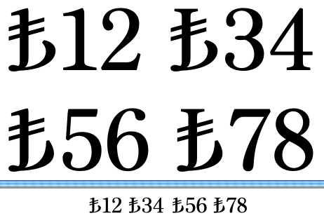
What in the origin gives it flavor akin to Turkish? The Latin L may say Lira but what tickles the national origin? Is the anchor part of this? If so. would it look so much like the typical European anchor?
Craig's upturn feels more Turkish to me as a westerner but I have no idea how it feels to aTurk?
Craig, I think that construction is a valid option if that's the sort of thing that happens in the typeface design. Note that the closed loop reversal in £ is usually a factor arising from the slant of the descending stroke -- the more vertical the stem, the more likely a simple stop-reversal or corner -- and is specifically a cursive construction, i.e. in ductus terms a result of the pen not ceasing to move. So I can see this form of construction being particularly appropriate in italic fonts that follow cursive ductus models. And, of course, there is no reason why the roman and italic forms of the symbol should have the same construction, just as one might vary the treatment of terminals and stroke transitions between roman and italic £ $ etc.
John, the "elephant in the room" was mine, not Craig's, and it was a turned Armenian dram sign.
the sign also resembles a lowercase t
That's a good point (that I for one had missed). But I really would be wary of getting closer to the Dram... Especially if I were the one making it. :-)
Craig, do you think it's good to evoke the £?
Chris, I'm repeating myself, but I think the Arabic-script undercurrent in Turkish culture is too easily ignored (especially by Westerners) and it's something that should instead take pride of place. And the fact that this symbol is to be used with a set of symbols that have their [recent] origins in Arabic only amplifies this.
This is such a wonderful challenge.
hhp
What undercurrent?
Arabic script was formerly used, a good long while now. Is it still visible in signage? Do Latin fonts made by Turks have an Arabic feel to them?
I'm just not sure where this undercurrent is.
You mean like on mosques? :-> Compare how long Turkish used Arabic versus how long it's been using Latin... And you can't read the Qur'aan without it (since it's Arabic by definition - translations are not kosher, pardon the pun).
Do Latin fonts made by Turks have an Arabic feel to them?
To me, the ones that are worth talking about, yes. But in very subtle ways, like the wonderful diamond-shaped tittles in the work of Emin Barın (that Onur Yazıcıgil showed at last year's TypeCon).
* http://www.barincilt.com.tr/eng/eminbarin.html
I'll find out first-hand in less than a month* but I'd be shocked to see Arabic having become irrelevant. BTW, a good chunk of my talk will be about how Turkish type could help preserve their culture if/when they join Europe.
* http://typophile.com/node/91821
hhp
>translations are not kosher, pardon the pun
http://www.jewlicious.com/2007/08/first-authorized-hebrew-translation-of...
Very cool. But it depends who you ask. And I think this might be a difference between Sunni and Shee'a, noting that in Iran (a Shee'a nation) people learn Arabic for the sole reason of reading the Qur'aan. Turkey is Sunni, so I'm guessing Turkish has [long had] an "official" translation as well, I mean in Latin script. But what's the largest text on the typical cover? :-)
http://www.hilalplaza.com/ProductImages/DS/reg/LT01-NobleQuranTurkish.jpg
hhp
John,
> I think the whole 'anchor' notion is a red herring
And I think the whole business is one, too.
> the anchor notion is something to be completely ignored
It would be best if we could ignore the matter *at all*. Well, now we’re in.
We can try to ignore the one or the other aspect, it won’t help much. The official drawing presented by the Prime Minister has nothing – nothing – of neither L nor t nor ‘anchor’. It simply hasn’t. As you say: post facto interpretation. I reject to take it for serious that the proposed design has something of an capital L. It has as much resemblance of a capital L than it bears resemblance of a Turk praying (viewed sideways) with a upturned c***.
I fear it will remain looking like a bastard between the € and the £.
Keeping the curve tail-like (rather than arm-like) can also be had without resorting to the loop on the left with a join like this:
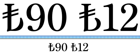

That's starting to look like a b or a ♭ now. :) It does seem to be the way it wants to be written, mind.
To me that wiggly bit at the join looks unstable and like a leaf that will break off.
I can’t help: of all the so-far proposed L-derivates I can see L-ishness from the top to the bottom only. Everything which comes then (on the bottom right) looks more or less crampy and ill. (this is not our fault. It’s the mess of the initial briefing. There is no true L-ishness in it and hence it cannot be achieved while sticking to it.)
On the Unicode discussion list I just have proposed a postponing of the encoding process. I think the matter needs time to mature.
That isn't going to happen, Andreas.
Everson Mono
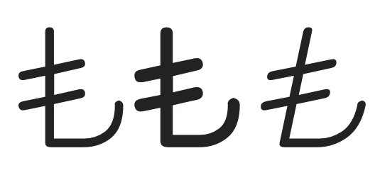
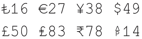
Can we see the Everson Mono forms in context with some numerals, Michael?
Also, it would be nice to see various example of the new Turkish lira in the context of the other monetary symbols that are in current use--particularly the Sterling, since it is the one most likely confused with the new entry.

much of this thread strikes me as judging a house by the tatty, tasteless furniture left over from the seventies by the old granny who died there - It will all be gone long before you move in.
Write the glyph out by hand a dozen times with a blunt marker on a piece of cardboard to set you minds at rest.
It is all just geometry. There are a million ways to convey the topology of the glyph without direct reference to that fish hook in the first post.
R
FWIW — My explorations in Whitman have wound up somewhere between John’s Cambria and Craig’s latest:

Here's Everson Mono in context. I never realized how lousy my ¥ was before.
So I did some thinking, and some rough sketching, and came up with:
- Three ways to do the top.
- Four "essential" terminal styles.
- Seven ways to handle the critical bottom-left.
- Two ways to modulate the bottom.
- And two ways to connect the bottom to the terminal.
To narrow down the permutations, here are ideas I'm getting comfortable with:
- The glyph should be a cross between caps and numerals.
- The best place to make it look like a capital is the top.
- The best place to make it belong with the numerals is the terminal.
- The bottom-left must have a singularity, probably a serif (but not a [closed] loop).
- The bottom "stroke" should be thin (assuming contrast), not least because I'm a fan of "rationalist" stroke contrast in the numerals anyway.
- Attaching an up-curving form immediately at the bottom of the stem is no good.
- The structure should be able to accommodate narrowness.
I'm starting to see two overall strategies to combine everything:
- Very conservative, where I'm ending up with something like what John first showed, and Kent just showed. Although it's solid, it also feels like a lost opportunity.
- Something akin to Craig's "rocker bottom" version, but less flamboyant (and with capital serifs up top). I think curving the bottom might be the key ingredient to making this click.
If this all sounds too detached from the making of glyphs, sorry, this is how I roll. But now I am ready to make glyphs.
hhp
Here are some "rocker-bottom" alternatives in which the stem, instead of dumbly running into the curve, swings over like a J.


Hrant,
How you roll is how you roll; however, you may be overthinking the subject. To me, it appears that the character is based on an uppercase D, so whatever works for the D will work for the currency symbol.
On the other hand, Occam’s razor isn’t the best tool to use all the time…
Craig, your last version really looks like a scythe.
I wonder if someone would try to make it with a crescent. You can’t go more Turkish than that. ;-)
Craig, I love the bottom ones! Probably because I have a weakness for sharp implements... The extra Arabic flavor and the crescent allusion really kick it up a notch; I think the official structure should have been like this actually. I do have to worry about people at large (especially secularists) accepting it, but it has so much going for it (not least a strong deviation from the Euro).
Nick: guilty as charged.
hhp
Love it, Craig. Here's the command economy version:
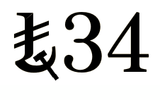
Folks, please grant yourself a break from this Frankensteinism for a short while. This is decadence at its worst.
Reality will slam all those pieces back in our faces.
> Write the glyph out by hand a dozen times …
Yeah. Hic Rhodos. Hic salta.
On http://www.netfront.fr/ at the top left hand side, there is a red logo similar to the symbol proposed for the Lira.
Isn't it just a "t with stroke" (ŧ)?
What does it mean to stroke a tee to someone who does not play golf?
To stir a cup of Darjeeling :-)
Or pat a short-sleeved shirt?
Michael, there's an interesting passage in a newly posted online article you might want to read:
http://designtraveler.wordpress.com/2012/06/04/turkey-part-i-the-young-t...
It's the paragraph following the photo captioned "Turkish Delight / Antique tobacco packaging from an earlier Turkey".
Andreas: I hope you don't think your stance is discouraging people from resolving this fascinating design problem.* For one thing I don't know how half an anchor is less "decadent" than one-third of a crescent... It might seem strange to see an Armenian defending Turks, but I hope you eventually realize that you're being unnecessarily offensive.
* I myself will be working on it after my imminent trip to Istanbul.
hhp
> you're being unnecessarily offensive.
By what, if I may ask?
How about inverting the numeral digit seven upside-down and intersecting two parallel lines through its stem?

It would look as if you'd inverted the numeral digit seven upside-down (inverted upside-down brings it back to right-side up, but we'll ignore that double inversion) and intersected two parallel lines through its stem.
Just wanted to share a photo I took in Istanbul on the 19th:
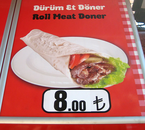
hhp
Moderators: klopiuj is a spammer.
ya right
Captured from web.archive.org on 16 Apr 2015. view this capture