Typophile

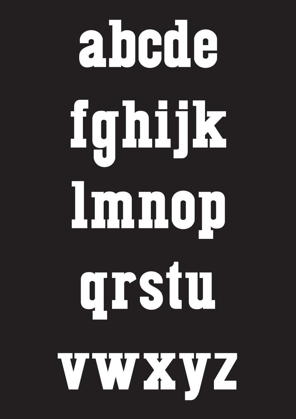
Kostel - Slab Serif

Kostelansky


Click for larger preview

Started working on this to take a break from another typeface that I'm currently working on. Trying to experiment more with curves since they are quite intimating for me. Like always any feedback is appreciated.

AttachmentSize
Kostel-SlabSerif-Beta-Lower.png32.48 KB

Bottom slabs are too close.

Thanks, riccard0.

Updated Preview:
Brought out the a a bit, and fixed the lower slab weights.

Nice work!
But, maybe the "z" needs a slab serif too. It seems lighter than the others.

brunomello, thanks- That's what I wanted to do- I just didn't know where to position the slab since the slab since that is what makes the top of the "z" & The rest of the slabs are all horizontal, so I really didn't know where to put the slab.

Captured from web.archive.org on 26 Apr 2015. view this capture