hey all,
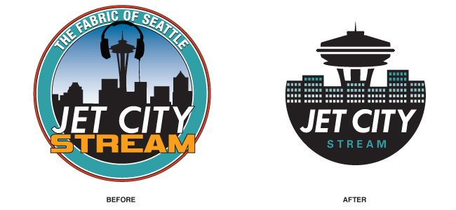
helping out a friend who works at the place mentioned in the pic. i believe they did a crowd source type deal. the owner likes it, but the friends dislikes very much. primarily because he's a promotions guy and feels it doesn't represent the company visually very well.
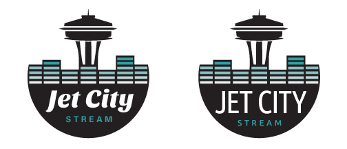
i don't like for many reasons technical issues, but i do like the idea. just needs some simplifying and tuning. one issue, they already launched so a complete overhaul was not an option. kept the font and space needle idea. incorporated an equalizer concept for city landscape. thoughts on the revision.