
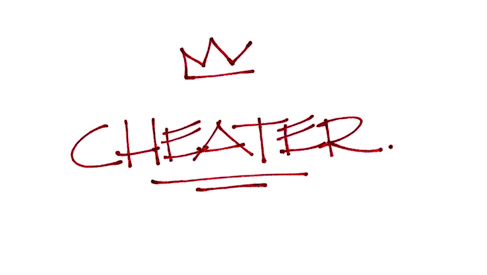
Bottle front label for a micro winery (my own) that produces wines from concentrates.
I wanted to keep the label's vibe crude street level and have it play off several innuendos.
Comments and crits always appreciated.
Thanks in advance.
n.
Bottle front label for a micro winery (my own) that produces wines from concentrates.
I wanted to keep the label's vibe crude street level and have it play off several innuendos.
Comments and crits always appreciated.
Thanks in advance.
n.

Not sure the type of 'street level' you are aiming for when it comes to wine, but it's an interesting mark. Definitely crude, but not offensive nor clumsy.
Only nitpick would be the places where 3 lines meat such as the first E and A. Maybe make that one stroke going from the E into the A.

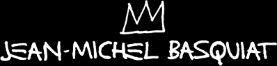
To me, the three-pointed crown over the word recalls the artwork of the late Jean-Michel Basquiat too strongly.

There was a Fool's day news bit of some winery starting to produce "condensed port". A small flask would be a gooey essence and one would mix it with vodka to reconstitute the original. I think that was an awesome idea :-)

Astronaut liquor?
hhp

I like it, but I wouldn't call it "crude street level". It looks very neat and tidy and legible. Maybe a bolder stroke and varying some of the baselines would help. But I don't know exactly what level of casualness you're going for.
If that's a period at the end, I'd suggest deleting it.

Incorporate an arrow at the end of the last R if you want a graffiti reference, and try a reverse with a burgundy background and white type. I agree with James on the thicker stroke. Perhaps vary the density of the stroke to emulate spray-paint as opposed to marker, or, change the stroke to emulate the giant grease markers taggers use when they go bombing.
For a great watch, check out the graffiti documentary “Bomb It.”
I like that. The 'ea' join is a little awkward, but it keeps with the untidy theme.
Thanks for all your comments, I'll rework it a bit.
Here's the bottle's back label graphic...
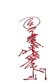
...and to it I'll add a quick description of the bottle's contents.
n.
@hrant - It was "Московский завод дессертных вин приступил к выпуску сгущенного портвейна." The translation sadly lacks the ring and true awesomeness of the original :)
If the text is set in a language that reads from left to right, I would change the direction s/he is walking.
Agree with Christopher on the walking direction.
For argument sake, wouldn't the walking direction depend on whether it's a trip to the liquor store or back from it?
Then the guy on the bottle would need to be carrying a bottle on which there would be a picture of a guy caring a bottle with a picture of a guy carrying a bottle on which… ;)
He's already carrying a bottle, Christopher, can't you see it? ;)
Awesome comments ... thanks!
That squiggle/stick figure is my name/tag. The feet (and parts of the lower legs),form the shape of an N (for the first letter of my first name etc. up from there) and the head is in the 'shape' of a C (for the first letter of my surname etc. down from there), still a work in progress. I should focus some serious time on it but I don't know, it ain't perfect and neither am I.
I always - well not always always - try to incorporate that signature/tag/squiggle/stick figure thing into my more important stuff. Few other examples I've posted here ... and here on Typophile.
It all started when DONDI, Haring and SAMO did theirs ... I just had to get one up of my very own.
:)
Bottle this guy. Being on the bottle label that would make it a thinker for those who care :)
I thought he was carrying a gun…
Now that you mention it, it does sort of look like a gun. I like the figure but it's so abstract that it's like a rorschach test. When I first looked at it the head it reminded me of the Westinghouse logo.

What it reminded me, is Gyro's little helper:

If it's a gun, then he's clearly walking to the liquor store. So his direction is fine.
Captured from web.archive.org on 19 Apr 2015. view this capture