


Definitely interesting, but it could be improved, especially at the bottom.
This is just a first draft Riccardo, I'm improving it all the time ;-)
For some strange reason the bottom has been flattened; I can assure you it's not so in the draft.
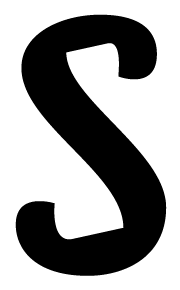
Also a draft for /s/.

Hi
I like this one very much.

This is going to take a VEEEEERRRRRRYYYYYY long time if you are going to show a potential font letter by letter.
And you'd do better in the 'Critique' forum.

If Matthew Carter were here, he'd
ask to see the "n" and "o" first...
hhp

No, I do not like.
Driving a design with detail-styling tricks is a superficial way to conceptualize a new typeface, and can only produce a superficial result.
I hope you appreciate my critique, please don’t set your dog on me.
Captured from web.archive.org on 20 Aug 2013. view this capture