I am not a professional typeface designer. Still, in our modern world, one simply cannot avoid typefaces, and I have some observations about what I commonly see about the numerals in typefaces.
Briefly, it seems to me that numerals are generally designed as though they were just ten more characters to take care of, like thorn and eth to non-Icelanders, rather than numerals.
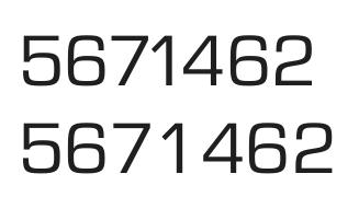
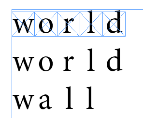
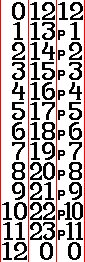
The main reason I feel this way is the width and spacing of numerals. To me, it should be immediately apparent which is the units, tens, hundreds, etc., digit of a number. This is why I strongly prefer monospaced numerals in almost all contexts. I am guessing that commas for large numbers are useful mainly because proportional digits make it hard to see at once exactly how many digits a number has, and which place each digit occupies.
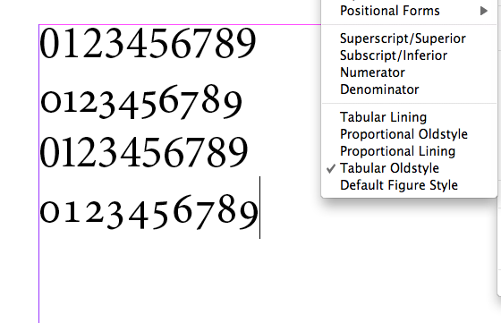
Another reason has to do with lowercase numerals and the "flow of text". First of all, one's eye probably should slow down when reading numerals: after all, they are more information-dense than words. So what reason is there to be concerned that the numerals are too distracting? Sure, I can see why some people do not like European numerals in Devanagari text, but that is not what I mean. Devanagari numerals do not try to camouflage themselves as letters: the lack of the upper bar makes them stand out. But European numerals in Latin text do not have some automatic "I'm not a word" feature, unless you give them one.
Third, numerals are often not designed to look distinct. For example, the "6" and "9" in many typefaces can look too much like an "8". An example of apparent awareness of, and solution to, this problem can be found in Futura. Perhaps the hardest digit to design is "3", because it looks too much like three other digits: "5", "8", and "9".
I will end with a link to something beautiful. (Would it be nearly as beautiful with proportional digits?)
http://www.youtube.com/watch?v=CsCx8wUF3bg&feature=related