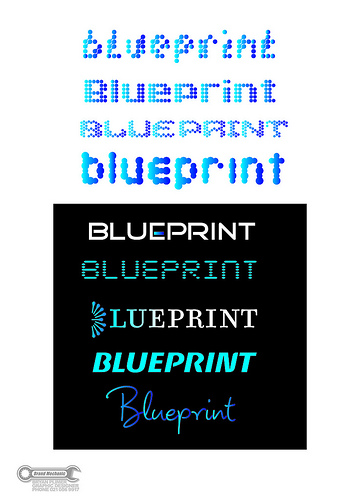
some joins are a bit rough...
just getting my head around the shift to illustrator from freehand MX but i'll get there - in at the deep end
i consider myself a branding / logo expert - this is what i do best...
my customer imports high end large format printers and supplies for signwriting and billboards.
i have thrown together 2 A4 pages to show the job progression...
first page is overview of my initial presentation to the client... included for the younger designers here to see the "concepts"... there were equal number of concepts not presented to the client. as you can see i was hung up in the "bubble jet" dot concept for a while... then i moved on to "slicker" concepts...
[img]http://farm8.staticflickr.com/7148/6838521963_1bb318b3b3.jpg[/img]
customer saw the white one reversed out of black and said it was good but needed further refinement...
feedback included
-maybe it needed more blue
-stencil font was ok to boss but 2ic hated it!
-make more of a feature out of the EP cross bar thingy
so here i am looking for external feedback...
some of the more experienced designers will pick up on what i have done with letter spacing, width etc...
[img]http://farm8.staticflickr.com/7154/6838520973_5e8b9fd66c.jpg[/img][/url]
enjoy - go hard...
thanks, B