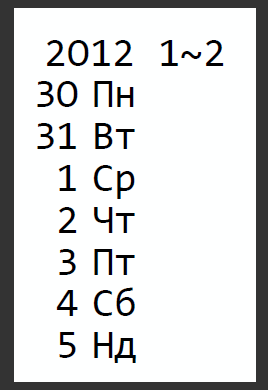
I need a typeface for a calendar for my very elderly grandmother. She has very poor vision, so here is what I am thinking:
* Lowercase letters are irrelevant. This is, after all, not an art project.
* Leading is a colossal waste of space.
* Numerals are extremely important.
** The number 11 has two digits; do not try to cram it into one digit's worth of space.
** The numeral 6 should not look like an "8"-wannabe. Sorry, Helvetica.
** Strokes should be thick so Granny can see them.
* I will not pay more than a few dollars (say, $10) for this font. After all, there is always FontStruct and magic markers.