Typophile

Introducing Alter Littera - New Letters of Old - OpenType Font Revivals of Medieval Scripts and Classic Typefaces.

José Alberto Ma...

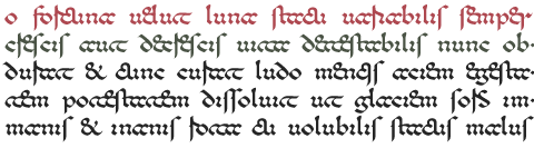
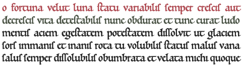
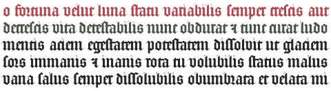
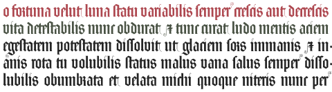
I would like to introduce typophiles to Alter Littera - New Letters of Old, a "personal" digital-type foundry located in Madrid, Spain. Alter Littera produces and markets opentype fonts reviving some of the most beautiful bookhands from medieval Western manuscripts, as well as some of the finest European and North-American typefaces designed from the mid-fifteenth through the early-twentieth centuries.
So far, only five fonts have been completed (although many more are currently under development), namely:
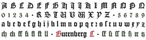
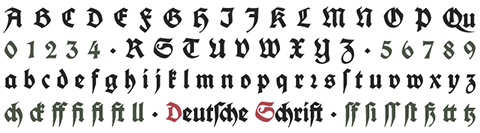
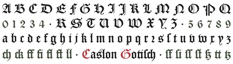
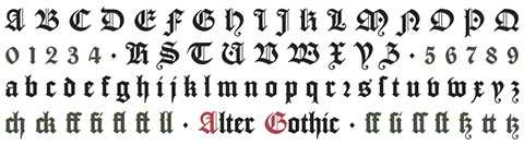

Please visit our website for further details (including full character maps and OpenType features, type sepecimens, font samples, and image galleries). Every comment/suggestion will be very much appreciated.
Thanks in advance for your interest.

Interesting!

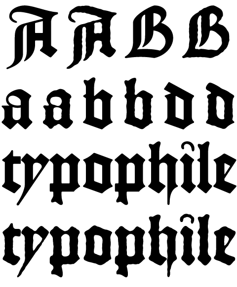
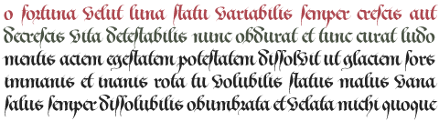
Nice work. Although some letters are hard to read in each row I like it. I especially like the basic calligraphic design in the third row.

Thank you very much for your kind comments: They are really encouraging for a newcomer.


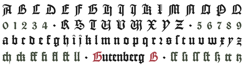
(Typeset using the Oldtype "Gutenberg B" Font)

They all look reasonable readable to me, even though I can't spot the difference between Gutenberg B and C.

Gutenberg C is a slightly roughened version of Gutenberg B, simulating irregularities and ink spreads associated with old metal types, papers and parchments. The difference between the two fonts will be clearly noticed only at large poit sizes. For example, at 36 pt:


Further images and comparisons can be found in our website under the Oldtype menu entry.
Thanks for your interest.
Superb! It would be nice to also have a variant for text size though. One with thicker thin strokes and a more distressed look so they optically look equally distressed as Gutenberg C.

As for the Alter Littera logo you posted, that /r/ should only come in front of a rounded letter. In all other cases a regular /r/ should be used.

I will definitely try your suggested variant with the Gutenberg A font, which is still under development. As to the /r/ after /e/, I just liked the way it looked when designing the logo. Anyway, "round r is sometimes found after other letters such as e, g, i, which likewise do not end in a bow, in manuscripts from Southern Germany and Austria dating from the end of the Middle Ages" (from A. Derolez (2003) "The Paleography of Gothic Manuscript Books", page 91).
Thank you very much for your comments.

Hm... Think I oughta dig out GoodCityModern for comparison.

As you can imagine, I've got my own personal oppinion about the comparison among current (to the best of my knowledge) recreations/versions of Gutenberg's B-42 type (as well as among those of many other historical scripts and typefaces). I expect to hear about yours soon.
Once again, thank you very much for your interest.
GoodCityModern ain't mine, not even by parsecs. That buck stops at one Andrew S. Meit.

> Anyway, "round r is sometimes found after other letters such as e, g, i, which likewise
> do not end in a bow, in manuscripts from Southern Germany and Austria dating from the
> end of the Middle Ages"
I had no idea this /r/ could also be used that way. It does look cool. However I think I might've used the regular /r/ in 'Littera' to fill the gap on the top left of /a/.

>I think I might've used the regular /r/ in 'Littera'
>to fill the gap on the top left of /a/.

I like this one too. Which one do you prefer?

By the way, Martin, did you finish your "short little book called Essential Typefaces"? Any info available about that project?

The new version of the wordmark works better.

> I expect to hear about yours soon.

It was a coin toss if this bit referred to opinion or typefaces. I got tails.

Excuse me for my English. It referred to opinion. I would appreciate yours very much.

The second version of the woodmark works better.

> I like this one too. Which one do you prefer?
Yes, this is quite perfect! I like how it creates consistent white space structures.

> By the way, Martin, did you finish your "short little book called Essential Typefaces"? > Any info available about that project?
Did you read that in an older post? I designed a PDF at one point but later went back to Microsoft Word to gather more information and then make a consistent layout for the information to publish as a PDF and potentially a book. In the end though I felt like there was no real purpose to it other than the wonderful process of having educating myself in the different type classifications and general type principles. I still have the documents if you like them, but it's incomplete and in regard of my grown experience and knowledge quite outdated as well. Perhaps one day I will use the information to write a proper book about something more specific and substantial. For example, I'm a big fan of Gerrit Noordzij's "The Stroke". Something like that gives a much better insight in typefaces and type design than a compilation of subjectively "good" typefaces.

Thanks for your comments on the woodmark. I will switch to the second version throughout our website and its documents.

>Did you read that in an older post?

Yes, I did. And I expected the project had grown into a finished book. I would appreciate any document you could provide me with (especially with respect to black-letters). And I will get a copy of "The Stroke" right away.

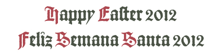
I tend to like them, but then I do have a soft spot for blackletter anyway. Personally, I find the Koch most interesting as it seems to be the type you'd expect to find on a quay, entertaining children with tall tales of tall ships. The Caslon? Somewhere in the depths of Oxbridge (Oxford/Cambridge), scouring the libraries for a few tidbits for the next issue of that academic journal, while Baron Alter Gothic is lounging about the halls and pretending to be studying the paintings and not the maids.

A hop, a skip and a jump left me thinking of this: http://www.typografi.org/index.html

> I would appreciate any document you could provide me with
Message me your E-mail address and I will send you the documents of my old research. If you're interested in blackletters it's quite a treasure to get the book 'Fraktur mon amour'. It doesn't really give any information but it's a nice showcase of many blackletters and it comes with a CD with all the fonts included in the book (or a lot of blackletter fonts, anyway).

>Message me your E-mail address and I will send you the documents of my old research.

You can find it here. And thanks for reminding me of "Fraktur Mon Amour". It is one of the first books I got when I started this trip.

> I will get a copy of "The Stroke" right away.

Get a bag of salt on the same trip.

hhp

Thanks to all of you for your comments (Any tip on the meaning of hrant's one?) I will be posting additional samples in a few days.

It comes from the English expression "Take it with a grain of salt".
In this case, try a rate of one grain per second.

hhp

Hrant, why would you say that?

I don't want to hijack this thread.
Allow me to find a suitable existing post to link to.

hhp

Oldies but goodies: http://typophile.com/node/20100

hhp

From Hrant's housedoor: That book is not canon, and you should not believe it or rely upon it without thorough testing/reviewing.

Anyway ... A few forthcoming releases:

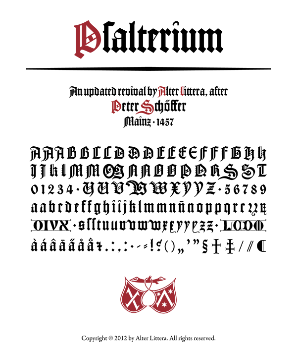
Psalterium (Psalter-type) - Peter Schoeffer - Mainz, 1457 - Includes the full set of special characters, alternates and ligatures from The Mainz Psalter (Psalterium Moguntinum).

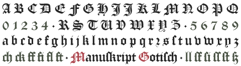
Manuskript Gotisch - Bauersche Gießerei - Frankfurt am Main, 1899.

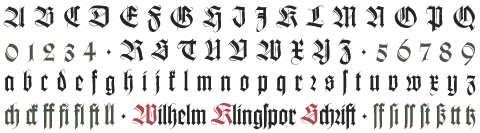
Wilhelm Klingspor Schrift - Rudolf Koch - Offenbach am Main, 1925 - Includes both normal (wide) and narrow capitals, plus the full set of alternates, ligatures and finial characters from Koch's original designs.


.. And a few additional ones, now from The Bookhand Collection:
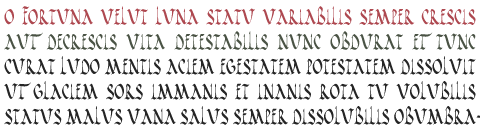
1 ROMAN RUSTIC (from Vergilus Romanus, Ecloga II, 5th century)
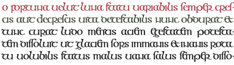
2 INSULAR MAJUSCULE (from The Book of Kells, 8-9th centuries)
3 BENEVENTAN (from the scriptorium at Monte Cassino, 10-11th centuries)
4 EARLY GOTHIC (from several 12th century Bibles)
5 GOTHIC TEXTURA QUADRATA (from The Zwolle Bible, 15th century)
6 GOTHIC TEXTURA PRESCISUS (from The Luttrell Psalter, 14th century)
7 BASTARDA (from Heures d'Anne de Bretagne, 16th century)


I hope you like them. Regards.


Best wishes to every typophile.

.

Any tip on J Weltin's comment? I can only see a single dot. Just a mistake?

It's just a way to have listed any updates to the thread on one's own list of posts.

Thanks. And excuse me for my ignorance. I'm afraid I will remain a "newcomer" for a long time ...

Newcomer with nice old stuff. I wish i had a commission to set some bible or prayer book with your types!

So do I. Anyway, as time permits, I use to set pages from famous incunabula with several of our types, in part for type testing, in part for mere amusement. I really enjoy looking at the results. A few samples from Gutenberg's Bible can be found here.
Thanks a lot for your comments.

What i quite like in your character set of Gutenberg B is that you designed an @-sign but refused to do any of the currency symbols. Chapeau!

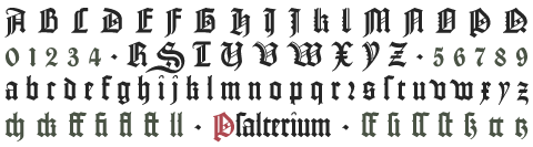
Thanks. Versions 1.1 of both Gutenberg B and C are now available (just minor revisions of several "archaic" glyphs). Still no currency symbols, though ... And the Oldtype "Psalterium" Font, after Peter Schöffer's Psalterium Moguntinum (Mainz, 1457), is nearly finished. Here's a brief preview:

I think my mind must be shattered still. Coulda sworn there's an interrobang in there.

The Oldtype "Psalterium" Font is now finished (no interrobang, though ...). It's been a long and hard road (longer and harder than that of the Gutenberg fonts, indeed). A worthy one, I hope. Comments in the corresponding Typophile forum topic are truely appreciated.

Regards.

Some news from AL's website, including the debut of the Digital Press.
Regards.

Just a few words: New tables and galleries available on AL's website for browsing through our font collections. Further info and links on our news section.
Regards.


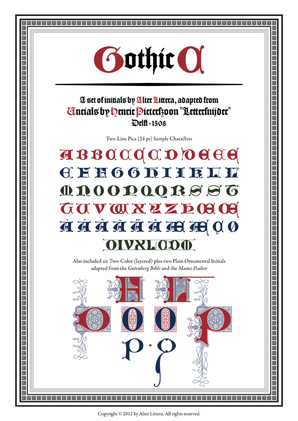
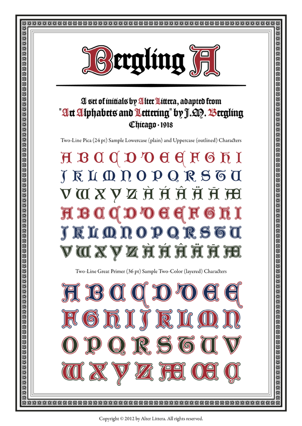
The Initials "Bergling A" Font is now finished. Our goal is to be releasing several fonts from the Initials and Bookhand collections in the next few months. The Oldtype collection will remain untouched for a while.

Best wishes.


... And the Initials "Gothic C" Font is now finished too. I think it's time to close this topic, so future news about AL will be posted on separate topics. Thanks to all who read and commented. Now it's time for a break ...

Kindest regards.

Just one final note to let you know that some of our fonts are now available at MyFonts. We expect to be expanding the collection soon. Once again, thanks to all who read and commented.

Best wishes.

For the sake of closing the "50-post-topic" circle, I am pleased to let you know that Alter Littera's first three fonts available at MyFonts have reached today the top-ten in the blackletter bestselling list.

Again and again, thanks to all who read and commented.

Have a nice summer.

Best of luck, again: nice collection!

Just a few words to let you know that all of Alter Littera's fonts on MyFonts and on alterlittera.com are on sale (50% off) until october 16.

Regards.

Captured from web.archive.org on 26 Apr 2015. view this capture