Typophile

Type for logo re-design

gravity0

Hello! Long-time lurker, first-time poster.

My company is looking to re-brand itself, and I'm playing around with a few ideas for our new logo. The attached design is currently popular (especially the slightly modified Industria version), but I'm concerned Industria - while bold and interesting - is too cold and unfriendly for a company looking to attract new clients.

Your thoughts on the font selection below, and the general design? We're a publishing/design house, mostly working with print.

Thanks in advance!

http://bit.ly/wIMMk1

If possible, I would make the logo and the type interact more.

Thanks riccard0. Interesting suggestion.

The idea with the icon was to represent the three sides of Custom Media (detailed below the logo). I'm planning on incorporating it on its own (blown up at the back of business cards, as well as base the shape itself on a two-fold, three-panel brochure, etc.)

Finding a font which works well with the very square, sharp icon, but remaining at least somewhat friendly and approachable is proving a challenge. The boss is looking for something bold and confident, so I can see the appeal of Industria, but I'm still not 100% convinced.

Thanks again!

Maybe something "cut and then curved"?
http://typophile.com/node/41687

I'll look into those, thanks!

The icon seems inconsequential above the text. It is small, plain, and constructed out of very basic geometric shapes arranged in a typical way. I think it will be challenging for you to stand out without something more memorable in the icon (assuming the name is not up for change - it is quite generic too). I would dive into the brief more. What is unique about you? Is it just about a folded piece of paper? What do you want the identity to communicate? What does a custom media piece mean? Custom type?

These are all pretty generic. I agree with Luma...the icon really adds nothing. I'd focus on type.

Cheers for the comments!

The name is the biggest challenge I've had with the logo up to now. Yes, it is very dull and generic. It somehow manages to say everything and yet nothing at all.

I've suggested logos with no icon, just focussing on solid typography, but they were dismissed as too plain. I've tried to reason with the guys higher up, but they seem pretty set on having an icon which we can use as described above.

The brief I got for this logo is summed up as: three services but focus on print as main strength, bold and confident.

To be honest, I'm more worried about Industria than the icon.

I agree with the others that the icon needs improvement. If management wants to stick with it, I'd experiment with variations that are bolder and more contemporary.

For example, perhaps making it larger than the type and putting the type on top of it (or reversed out of it so the letters are holes in the shape) so its a background for the type and it's all one integrated unit. (Might need to adjust the angles.) And perhaps overlapping the panels and/or using translucent effects.

The double m's in the name — perhaps something interesting could be done with them. Not sure what; my first thought is some kind of overlap effect.

look at this www.mirvac.com

Excellent suggestions, James, thank you very much! I'll give the icon and its relationship with the type some more thought.

levshin: I hate you.

> look at this www.mirvac.com

That general shape has also been used in logos for many libraries and book-related companies.

Hmm...

http://bit.ly/wkH9ZB

Maybe not. :)

I sort of like this idea as a concept, but it needs a lot of tweaking.

http://bit.ly/wlmvXb

Cliff, can you please embed the images instead of hiding them behind bit.ly links? There's an "Insert image" link right below the Comment entry field.

And really, how can you guys rely on Libya so much?

Cliff, I think you need something... custom! ;-)
What about something like this?


Based on FF Quadraat Display Bold Italic.

hhp

apankrat: Sure thing!

hrant: That is uncannily similar to an idea I had (based on Fedra Sans), but didn't show the team due to the boss disliking the fact that people often call the company "Customedia" (we're based in Japan).

To be honest, I feel like I'm having to shoehorn an icon into the logo, and I don't like it.

> I feel like I'm having to shoehorn an icon into the logo

Can you try to argue for a purely typographic solution? I'm thinking that a strong wordmark, like you might be developing here, can stand alone (and perhaps even should, so the logo doesn't get overloaded with too many different ideas). And where an icon is needed, such a typographic solution could in turn spawn short-form icons – for instance you might consider using that triple "m" for favicons and the like.

I'm with you. I might refine this latest idea and make a sample business card/brochure sample to show the boss.

The only thing he could say about the design is that people might be inclined to read the logo as Customedia. Do you think he'd have a fair point?

Put a fourth arch on it?

Or see if it clicks in all-caps (although that would be
technically more tricky, except in something like
Industria*) using a font with a splayed UC "M".

* But please don't use that.

But even if you use two separate words, it might still be
good to use something like Quadraat Display: somewhat
expressive, bold, slightly inclined, very large x-height.

hhp

Thanks guys. I've tweaked it a bit and tried using a flipped 'i' as an icon at the back of a business card.

I kinda like it, actually.

Does anyone think it's difficult to read? It's definitely "Custom Media", right?

hrant: Preferring Fedra to Quadraat at the moment, but thanks for the suggestion! :)

To me it reads a bit like a stutter. Maybe it is the alllowercase treatment. The mm connection is a cute visual connection, but it doesn't really say much for the brand. I would think something more custom would be desirable.

It does say "yummy". :-)

BTW, if this were a Hispanic operation I
would suggest putting a tilde on the "m"!

hhp

The /t/ looks odd, almost falling to the left. Also I would consider to not merge the /m/s, at least not in the obvious way. It is somewhat trivial, both conceptually and visually and as such it defeats the very purpose of a wordmark, which is to make the symbol memorable. It's gotta have a quirk or an AHA moment to it. For example -

Oh, another idea is to slant /custom/ to the left, making it in fact custom.

Hm – I don't find an upside-down (and badly readable) "media" to be more fitting or more "aha" or more quirky (or more "custom", for that matter) than the connected "m"s, dunno. Even though I agree that the latter may not be the most original and groundbreaking invention on Earth, I must say I find that 24.Jan.2012 12.34am version above (with the business card) rather appealing.

slant /custom/ to the left
Making it lean/pull backwards? Maybe not the best message either...

Interesting suggestion by apankrat there (thanks!), but it does make the name more difficult to read.

I agree that the 't' looks odd, and I think it's mainly due to the awkward 's'. I've tweaked it a bit and attached the new version below (together with our current logo at the top, just so you can point and laugh at it ;).

Also, just in case it wasn't obvious, the colour-scheme has already been decided.

My only concern with this new version is the light blue on white. I can see 'media' getting lost on bad screens and crappy prints.

And the arch could become a motif throughout.

BTW, you might do something to the second
and fourth legs - maybe just a simple shear.

hhp

Yes, I had thought of that. Will try it out!

Really appreciate everyone's input on this. Thanks a lot!

Nice progress!

I've tweaked the type and the kerning a little more. Does it look okay to everyone here? Angles seem fine?

hrant: tried the shear, wasn't really working. The woodmark ended up with too many things going on (double-m, shear, two-colour /i/). Thanks anyway, though!

Just loosen "cu", "me" and "ia" a hair, and "di" slightly.
Where slightly = a hair × 2. :-)

Also, it looks like the "mm" is sitting a hair low.

hhp

Thanks hrant! :)

I've tried adding an extra arch to avoid possible "Custon Media? Custom Nedia?" confusion. Does it make it too long?

Am I being a bit paranoid?

Ruining a design is no cure for paranoia! :-)
I'm pretty sure you want as many or fewer arches, not more.

But do fix the "mm" sitting too low.

hhp

I'm the one who originally suggested that something might be done with the double m's, but to me the combination is looking a bit confusing. It's like a centipede with a whole bunch of legs. :) I see you've used shading to help differentiate the two m's, but I think it would help if they were even more different. Maybe if one word was italic and the other wasn't, or if the weights of the two words were different.

hrant: You're probably right. That's the problem with thinking about something too much!

Regarding the mm, it seems to be properly aligned to the baseline.

JamesM: I've tried all the combinations you suggested, but they made it even more difficult to read.

I have similar concerns, though. Being based in Japan (where few people are fluent in English), the merged /m/s - while a cute idea - could make the name difficult to read. I can imagine people going "Custon Media?", which is not what my boss will want.

> Regarding the mm, it seems to be properly aligned to the baseline.

If the baseline looks constant in your outlines, it could be a
rendering issue in your image, if the "mm" is "converted to
outlines" while the rest is actual type; but it's a rendering
issue that could manifest elsewhere too...

hhp

(nevermind)

How is this?

By the way, this design is just something I plan on presenting to the bosses. It might be accepted, rejected at first sight or tweaked after they see it. These are people who approved the original Industria version, remember. I've got a challenge on my hands.

> I've tried all the combinations you suggested,
> but they made it even more difficult to read

Perhaps a positive/negative approach might work. The example below is crude but demonstrates the general idea.

I really do appreciate all the help, but I feel I need to just go on to the final stage and show the design to everyone for their feedback. At the end of the day, they're the ones who are going to decide whether we go with it as-is, or change certain aspects before approval.

I've attached what I think should be the final revision of this concept. I'll present it together with a proposal I'm putting together now:

CONCEPT

Everything in woodmark - no separate icons to distract attention from name, or confuse the image

Italicised - implying movement and forward-thinking

Sharp and rounded elements - implying astuteness and precision, as well as friendliness and flexibility

Customized font - /c/, /s/, /t/, /m/, and /i/ have been modified, meaning no risk of doppelgänger logos

Flexible - the more neutral typeface (compared to Industria) gives more flexibility. Custom Media can be bold and cool, friendly and approachable, or a bit of both.

Two focus areas - merged double-M and two-colour /i/

Merged double-M
- Implies: collaboration, merging of ideas (between us and the client, as well as in-house)

Two-colour /i/
- Creates a good color balance
- In usage: when flipped 180 degrees, the /i/ becomes an exclamation mark, implying thoughts, ideas, and creativity (as per our recent print ad)

The idea is to play with the angle of the italicised type, together with the exclamation mark, to create a striking, forward-thinking, creative brand, without coming across as cold or rigid.

I'd lean towards the 4-hump ligature. On a quick glance, it seems to fairly clearly say custom media. custon and nedia aren't words, so aren't what people would see.

The 5-hump ligature actually requires me to stop and think for a minute...and with teh gradient, I tend to start seeing a bunch of n's instead. And, really, with two full m's, there's no need to mash them together as a ligature anymore.

woodmark -> wordmark

And if I may, just another thought on a leg quintet :) -

aluminum: Yep, that was my thinking too. I just had to try it out with two full /m/s to see how it looked. :)

apankrat: Cheers for spotting the typo! The suggestion makes it look more like Custom Nedia to me, though (I've tried similar solutions).

don't like the mm thing

print | communications etc is not very scalable

Here's another idea I had recently (re-enforcing the Japan/print link with origami-style lettering):

Like the mark. Don't think the proportion and lock up with the text works at all.


Besides, what does Japan have to do with it? I am kind confused about what concept and message you are trying to achieve.

As much as I appreciate the relevance of the origami to your case, I'd stay away from the idea. It has been used to death, everything got folded - from letters to animals, appropriately and not. It was really cool when there were few logos using it, but now the origami idea in logotypes is pretty much a design cliche.

Luma: You might have missed the post where I mentioned we're based in Japan. I was thinking it'd be nice to combine that with our core strength (print).

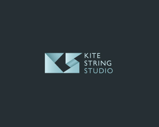
Yeah, I realise it's not an original idea. I thought I'd seen a similar design before and Googled 'origami logos'. That Kite String Studio design from Logopond came up loads of times. Like 99% of the designs on there, though, it appears to be for a fictional company. Green Chutes doesn't exist either.

It's an interesting question to ask, though: if you come up with a design for a real company that everyone is happy with, and then realise someone from the other side of the world has created something similar for a fictitious company and posted it on a design blog, does that mean you have to scrap the idea entirely?

Apankrat: Appreciate the comment. There does appear to be several "30 Inspirational Origami Logo Designs" blog posts out there, featuring mostly Logopond creations. I'm not sure it warrants dismissing the idea, though.

Also, I like my design more than the others, because I haven't resorted to gradients and built-in drop shadow effects. ;P

Incidentally, I'm not scrapping the double-m ligature idea. I've simply had time to play around with a few other concepts, and the origami one was quite pleasing so I posted it. I might end up proposing these two ideas so the bosses have a choice (and I've got a feeling they're going to prefer the bolder, origami design).

I've changed the 'A' and separated the wordmark from the icon a bit more in this latest version:

I don't like this last one...
I liked two of older ones:

1. The one with exclamation, although I'd try vertically aligning top of "x" height with exclamation's dot (you aligned top of "X" height).
2. apankrat's ide of mirrored type. Really nice.

Captured from web.archive.org on 28 Feb 2012. view this capture