
Typophile
Mantika Sans released
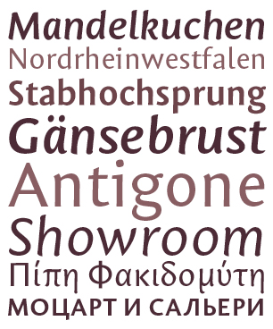
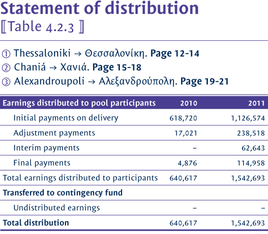

\·> The way the italic looks a bit round compared to the roman is really interesting. Good work, I like it!
Thanks! Due to the little inclination the italic needed to be fundamentally different than the roman.

Glad to hear the deviating Italic wasn't just a result of
the (hopefully not) emerging trend* of making the various
styles obviously different, like Yanone and Hasebe have
been professing.
* http://typophile.com/node/88931
But what caused you to make the Italic slant so gentle?
(I'm being curious, not critical, since I actually like it.)
hhp
Ha, Hrant!
It may well be, that this was partly your fault :-) Sometime around here you were talking about only slightly slanting italics. That could have been one of the reasons to try this approach. But the main reason was that i intended to make the overall widths of the four weights the same. With only a gentle slant this was the best way to do it. But then other ›cursive‹ elements were needed to make the italic work as a companion and to be a convincing type for emphasis in running text.
I love being guilty of such things.
> i intended to make the overall widths of the four weights the same.
Ah, interesting angle (pardon the pun). I love uniwidth fonts myself.
hhp
So i am glad that there is already someone liking it! I was playing with the thought of making an Armenian alphabet for Mantika Sans, too. But so far i haven’t found the time for doing so.
Well, you could always just join my Evil Plan For World Domination.
I'll email you.
hhp
Sounds dangerous ;-)

Impressive work, I really like it!
Dankeschön, Roland!
Captured from web.archive.org on 14 Apr 2015. view this capture