
Hi everyone, just posted my first typeface in the san-serif forum, this is another typeface i've been working on and its a super-bold display face.
Any advice or feedback on the direction that i'm heading in would be great.
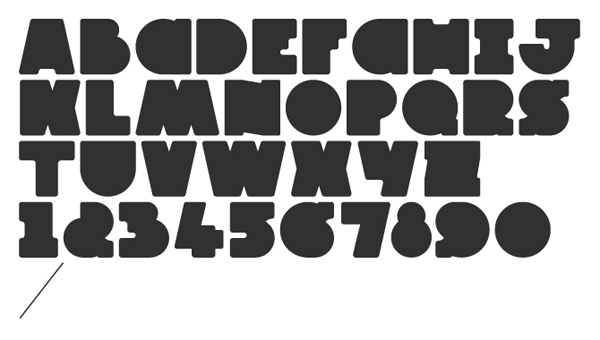
Hi everyone, just posted my first typeface in the san-serif forum, this is another typeface i've been working on and its a super-bold display face.
Any advice or feedback on the direction that i'm heading in would be great.

/T/'s color is much more lighter than the rest of the alphabet. /J/ doesn't work: it's "open", unlike the rest of the alphabet and therefore creates an edge effect, isolating it even more from the design style. /2/ looks like a kind of ampersand and /6/, /9/ are unrecognizable. I'd like to see /C/ and /G/ in a word to check if they really work as they are. I like the overall feel of the font, yet I think you should check the inconsistencies of the "cuts" of the letters. For instance, compare /R/'s bottom and right cut; and /M/, /V/, /W/, /X/, /Y/ as opposed to /N/, /Z/. Good start ;)
Cheers for the feedback LexLuengas!
I was worried about the 6 & 9 - especially the 9, and agree that is doesn't work.
Great feedback on the consistencies of the cuts - this is something I didn't pick up on, but now that you've mentioned it, its the first thing I look at..
C & G are below.

I'll definitely take your feedback on board for round 2!

I see the C as a lowercase a. Also, I think your O is too small.
Hey Justin, I see what you mean about the /C/, I'll add this to the list of things to re-consider in round 2.
With the /O/ I kind of want to keep it symmetrical, is there any way of increasing the size without distorting the shape? Resize the widths of the rest of the characters maybe?
O: Just enlarge the circle from its center. It should overshoot the baseline and cap line some; this compensates for an optical effect where it doesn't quite seem to meet them. The same principle should be applied to the 8, the bottom of the U, and anywhere else you can find it.
Cheers cerulean, this makes sense, i'll fix up the /J/ /O/ /Q/ /U/ /6/ /8/ /9/ and possibly the top of the /C/ and the bottom of the /G/

Could you take a snip out of the C and G along the size/shape of the Z? That might be enough. I, too, see lower case 'a'--even when in context of the alphabet specimen.
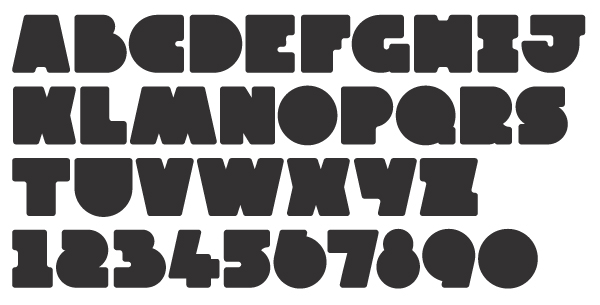
Hi everyone - Round 2.
Some things I've update:
- Re-drew the /C/ & /G/ - unsure of the /G/
- Fixed the optical alignment of the /O/ /Q/ etc.
- Re-drew the /6/ & /9/
- Re-drew the /N/ & /Z/ to make the cuts more consistent
- Re-drew the /2/ & the /S/
- Thickened the /T/ & /L/
- Tried to close the /J/
- Slightly updated the /A/ /H/ & /I/
I'm now not too sure about the /4/ & /5/, the seem out of place, also the /Q/ & /R/ may need to be looked at.
Thanks again for all the help!
The cut in /R/ should look more like the cut in /K/ or /H/. Perhaps something like this, for not loosing the basic shape of /R/:

What do you think of either of these? The original is on the left. I think the problem is the curve in the cuts. I quite like the one on the right.

I think you've got the makings of two faces here, and you should save your work and then decide which one you want to do first. For the solid-blocks concept you seem to be going for, you can easily start filling in more notches to match that last new R. But I look at what you've got now for L,M,N,T,V,W,X and see what could be a very respectable heavy sans in the more traditional vein, so if you take the cue from those and start punching out counters I think you'll learn a lot more and finish with something more valuable.
Cheers cerulean, I can see what you mean.
I've tried to create an /R/ with a counter. I'll obviously have to see how this looks across the board, but as a start I think I prefer the second from the left. What do you think?

Round 3 - added counters & tried to make the cuts more consistent across the board.
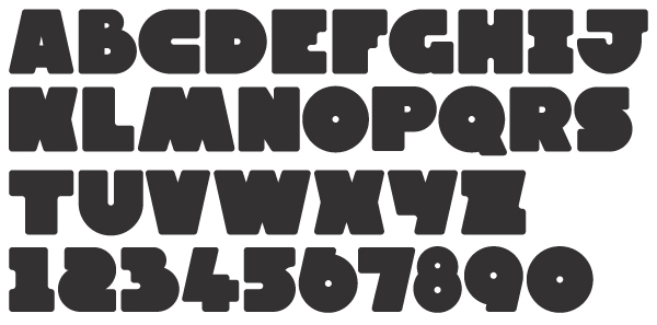

2 should have a square corner bottom left
8 looks tiny
I liked the rawness of the earlier block look. I think trying to visually equalize stroke weights will help a lot. Great work!
Thanks Luma, Is this what you meant with the 2?

Revise the stroke weight in /B/.
Bingo!
You're on your way! Maybe I'm seeing things, but the R of 6:44 looks balanced while the R of 8:01 doesn't.
D can stand to be wider, if that helps you distribute the weight.
B will almost certainly need a different outer shape in this version if you want the counters to work.
A: lower the counter.
It is not absolutely necessary for the bowl of P and R to be identical; enlarging the P bowl vertically may help.
J is still out there in what-are-you-doing land. Remove the right serif, or remove the whole serif-crossbar, or start over with a narrow J form.
When it's all starting to come together, you'll want to look at the glyphs that are perfect for the block version (which, again, keep them for that) and decide whether they really fit this version. Z, for instance, should either be made as narrow as L or cut deeper. E and F are a toss-up: They may still fit, in a daring and distinct kind of way. You might bring down a full crossbar for F and leave E as it is. With the support of the current E and F you might even go for removing the top counter of B, which would something quite new.
Cheers for the feedback cerulean, this is great! I'm working on round 4, and will update when I'm happy with everything.
Out of interest, for a display typeface like this - what would be the usual character count? I originally was only going to have uppercase - but with the counters, I think this could work across lowercase as well.
You definitely need !?.,&

Quotation marks and some other punctuation would be useful.
And, if you would like to go a bit out of the English-writing world, definitely some diacritics.
Captured from web.archive.org on 16 Apr 2015. view this capture