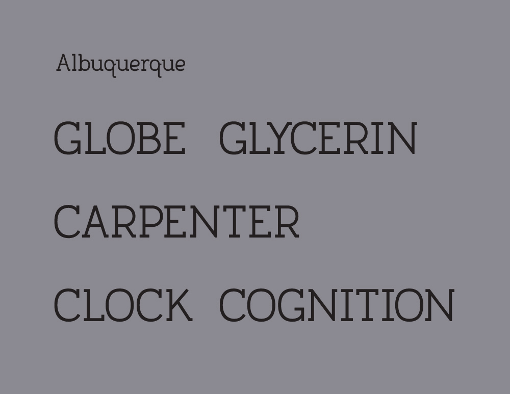
I posted Albuquerque here a long time ago, but it's changed a great deal since then. A lot of the missing serifs have been put back, and some of the weak looking corners that were rounded off have been re-squared. /C/ and /G/, which were problem characters from the beginning were redone from scratch and I think look much better, though not perfect. I also went through Karen Cheng's Designing Type, fixing some of the oddities and optically correcting some things.
I've started hammering out the metrics in FontLab, but I don't have the full version, so I can't really use what I've done until I buy that...
Anyway, here's what it looks like now:
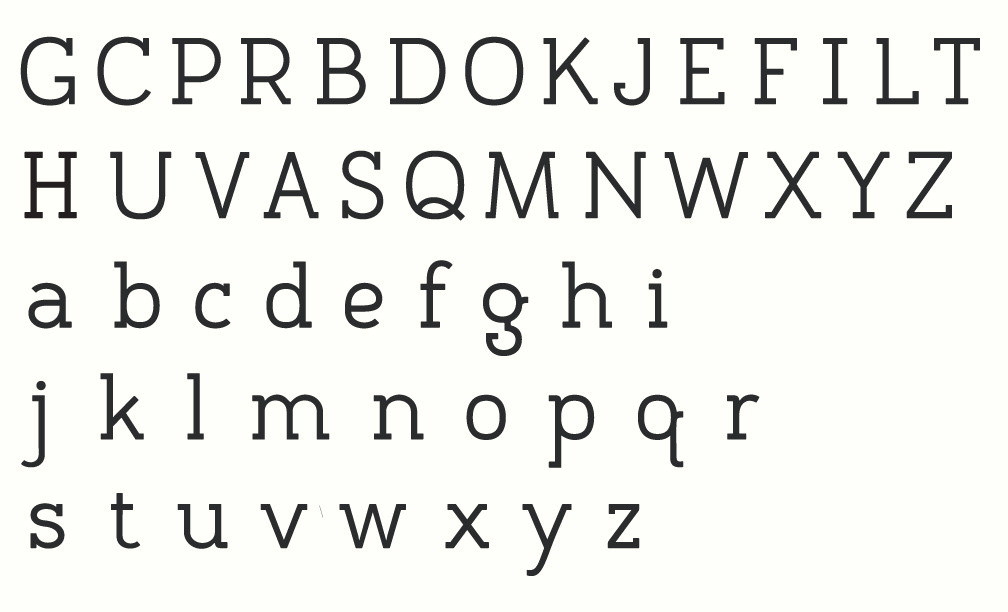
pdf is attached.
| Attachment | Size |
|---|---|
| Alb_r11.pdf | 68.8 KB |