
Hi friends
Please help em ID those fonts used in the Old World Door logo
http://www.vectorartnow.com/image/fonts/OWD-logo-white.jpg

http://www.vectorartnow.com/image/fonts/old-world1.jpg

Thanks in advance
Hernando
Hi friends
Please help em ID those fonts used in the Old World Door logo
http://www.vectorartnow.com/image/fonts/OWD-logo-white.jpg
http://www.vectorartnow.com/image/fonts/old-world1.jpg
Thanks in advance
Hernando

Delphin maybe?
Buy it anywhere other than Myfonts! RIP OFF
Michael
Thank you very much for your help

Michael,
do you mind me asking where the animosity towards MyFonts comes from?
Seb
Pulled all I could from them... have had issues with them for years with copies, "inspired versions" etc. This is not a game to some of us! I love capitalism but I despise lazy and situationally ethical businesses.
No problems with revivals but to sell "bad" and incompetent redrawings of stuff that is less than a decade old is just offensive.
Re: "No problems with revivals but to sell "bad" and incompetent redrawings of stuff that is less than a decade old is just offensive."
Without specific examples, Michael, I'm at a loss...but it disturbs me, because I'm a Moderator on What The Font at MyFonts.com.
They strike me as a decent bunch... you bring any of these ripoffs to their attention? With so many new fonts out, I can see a few sneaking under the radar. There are certainly worse offenders out there.
Other than redesigned caps what new/different contribution lies here. 10 years apart!
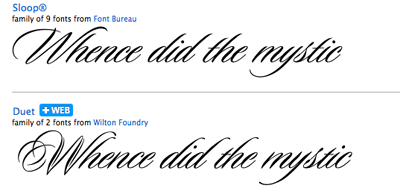
This is one of many. And I pleaded with John to address this and was rebuffed.
Now some of you may get it but this is a prime eg. This font took several years to figure out the parallel dilemma. When I saw Flavour 5 or 6 years later I was not amused. Compare the "l's" because that is where the essence is... and then he missed the parallel in the other characters and "did the caps like an amateur. When I confronted him he said, "Oh yes, I was inspired by Pooper Black."
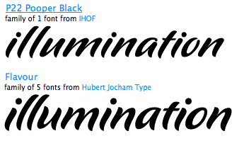
Way too much of this going on!
Want some more examples Jan? It could take days to amass a comprehensive list.

Actually to me neither one of those is problematic. The first
does indeed seem a bit close at first blush, but it's really just
another example of a now-ubiquitous style; and the fact that
it came a decade later only makes it more OK. The second is
really not even close, even though is was apparently a case
of inspiration (a normal and good thing). My own concern is
outline theft - the remixing of an actual font file.
hhp
Differently trained eyes, different thresholds.
And different persecution syndrome levels.
hhp
?
My comment was not meant as anything other than we have different sensibilities.
pressed send twice, sorry.
I'm sorry, I thought you implied my sensitivity ("threshold") is lower.
hhp
Your tolerance is a bit higher (edit) than mine, but you have demonstrated a good eye.
Thank you for the compliment.
hhp
Fiber glass and french doors,patio doors and vinyl windows.All these exciting possibilities of beautifying your place with best quality and great deal of prices is our promise to you.Instant quotes are available within a click on our website.Vinyl replacement windows | Patio Door
It is a leading manufacturer and distributor of high quality new construction and replacement windows.
basement window well covers
Active discussion board with font identification and type design critique forums. Sporadic features include interviews with typographers.Taxi From Heathrow Airport To Birmingham

It’s quite lovely of the spammers to keep this thread alive, don’t ya think?
Hi Hernand, I personally don't exactly know the fonts you are referring to, but I suggest try to install some fonts app on you mobile for you to determine what font you are looking for. Those apps listed several font style, so that a huge lists of it.
Regards,
Richard G. Foster of Caldwells Store
"see us at Bay Area SF for more info"
Captured from web.archive.org on 2 Jul 2014. view this capture