
Hey there,
I'd love to get some feedback, particularly on the legibility of this logo type. Can you tell what the company's name is? We were going for a unique logotype using familiar letter forms. The base typeface is a helvetica.
Hey there,
I'd love to get some feedback, particularly on the legibility of this logo type. Can you tell what the company's name is? We were going for a unique logotype using familiar letter forms. The base typeface is a helvetica.
Sorry, the file uploader failed. Here's a link:

stepframe
Thanks riccard0. Any other thoughts? Ideas for refinement? spacing?
Could we see it as small as the smallest application will be? It will always be white on black?

Here it is in the most likely smallest screen-size. We'd probably want to pay a bit more attention to pixel alignment if it were this small, but you can get the idea...

Way too much going on for my taste. For two, the am ligature feels forced, a completely artificial construct. Either the pf ligature or the custom /t/ would've been enough IMO.
Shading is nice, but it is quickly becoming a cliche... at least judging how every second type-based logo on Dribbble appears to be using it now.

Nice, but too busy - loose the am ligature and shading. Looking forward to seeing how this develops.
About shading, what about going all the way?
http://new.myfonts.com/search/afrobeat

sterframe
can you see the p is the same letterform as the r?
you also have an unresolved a-m join
the more i look - the more the t bothers me... other letters have assenders - so should this
re the name - nothing to do with house construction??
Thanks everyone for the feedback... here are a few options based on the response. Let me know what you think, or if you have any ideas for further refinement.


there's too much going on. I think the last is best, as it's simplest, but the p/f is still a bit too easy to interpret as different letters, IMHO (r, s, d, etc.)
It's definitely going to be a challenge as there is no real natural way to make a ligature out of a p and f.
It may be too simple or cliche of an idea, but what if you actually stepped the type? set 'frame' on a baseline a tad higher than 'step'?

I agree that this is still too many things going on. Try to simplify and get at the heart of the concept. What is the industry? What keywords describe the image that should be communicated? There are some really simple ways to go with this. Here is one if it helps:
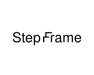

current version reads to me as "r" "f". you don't need a second ligature on the 'a' and 'm', just because you can doesn't meant you should. sorry.
great idea luma. =)
I liked number 3 from a previous iteration. I think it's important to have the the main line extend, otherwise it just looks like an r. I don't think it has too much going on, I like it! :)

The logo looks great to me except for the 't'. The kerning is also okay with me. I suggest that you touch only that part. Good typeface.

I'm with apankrat.
Second. Why not go for a more geometric font? There are a few helvetica / din crossovers. Or maybe even go further. I would like riccard0's afrobeat with a little bit of tinkering.
You've got to find a way to make the curves look more natural.

Of the last three you showed I like #3 the most.
Here's the thing. You've done a great job so far, so if you'd stick with v1 it would be almost ok to just use that. But it's true it needs some work done. So even though people have provided their negative input, I'm sure they have positive one as well. Don't get dishearted by it.
But. To continue on the #3. If all the letters are connected, why are you disconnecting /p/ and /f/ then? I know it could have legibility problems, but you could try doing something in that regard.
@LumaVine: although an interesting concept, it doesn't work too good because all things being equal all letters are round-shaped and this step F is completely square-ish. That's why it doesn't goo too well with the rest of lettering. I know it's just an idea and I'm saying it's a good one, but it needs a lot of work if it might go further...
I agree with litera here, #3 is the best in my opinion. I would join the upper stroke of the P to join the F and leave the other gap and see if the legibility is ok.
Also I'll tweak the ligature you've created for the a & the m. Maybe it's too wide, not sure what it is but it doesn't work for me.
It would help a bit of context so we know what this logo is for.
Keep the good job, looks great!
Irene
Captured from web.archive.org on 5 Aug 2014. view this capture