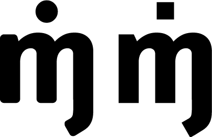
In efforts to practice more designs, I have been working on logotypes for nonexistent clients. This example is for a fellow artist who goes by the pseudonym "Ming."
I started with the typeface Info, and then went from there. The one on the left has minor tweaks to the typeface itself, and the one on the right has added angles instead of curves.
Any thoughts on which looks better? Feedback on the overall design, in general?