
I say that those serifs look good.

What is your opinion?
I say that those serifs look good.
What is your opinion?

Hm… to me that looks either like a rendering problem or a po-mo experiment.

They reminds me of MICR/OCR.
Maybe it will look more appealing with smaller serifs.

It's not pretty yet, but personally I'd like to see this idea pursued.
hhp
Me too, but I am kinda stuck...
I like the idea, but it needs some refinement to avoid the "rendering error" reaction. May need to work a little on the balance. For example, the 'u' and 'p' look good but the 'L' is lacking weight at the top to balance out the double serif at the bottom. Also more definition of some of the serif transitions. The 'c' right now looks like it just gets thicker and the 't' and 'r' blend a bit giving a muddled look.
Great idea though and you should run with it. If you stuck, print it out and stick it in your bag for a few weeks. Let your brain run in the background until an idea strikes.
Oh, hah, now it hit me that it reminds me of this classic:
http://new.myfonts.com/fonts/agfa/computer/
hhp

Designing a face with rendering errors is equivalent to designing a distressed face. Mind you, most look like crap because they don't consider how the effect works in context (in a word, or in a sentence), but a selected few still hold up. If you want to walk down that road, you could look into the effects of digital distortion and maybe also printer errors.
But what if "it's a feature, not a bug"?
hhp
A small step, but big improvement:

And take this as a prototype (no pun intended). I know there are a lot of details that are messy but I want to clarify the concept, before fixing them.
As you can see, I am running away from the "error" look. I want my face to be usable, not just interesting.
In it’s current state, it sports a backslanted look. But not on all characters. You should either optically correct it or embrace it.
I can see how would I embrace the backslanted look (by editing, "t", "c", "g" etc.), but what do you mean by "optically correct it"? To go back to the previous stage?

Interesting, can't quite decide whether you're approaching some sort of cursiveness or detroit serifs. Might be worth playing up one or the other.
what do you mean by "optically correct it"?
Make them slightly forward-slanting, so they vill appear upright.
I made some changes:(look at "t" and "e")

Also added a one degree slant.
Or make them visibly slanted... but maybe keep the serifs vertical!
Sort of like a slanted flare serif, but with the serifs abruptly offset outward.
hhp
Not sure if I can picture it. We will talk again in 2012.

This is starting to look very promising! The 1 degree is also an improvement.
I think the serifs on the 's' are too big though. I see you essentially rotated the serif of a stem, which might be the best solution to avoid giving the 's' the appearance of a more or less normal serif letter, but I don't like the inconsistency in regard to other letters; I think it will look more consistent if the serif has the same length and angle. The same counts for the 'a'. I think the 'r' is the only exception I'm comfortable with in your typeface as its arch resembles the downstroke of the 'm'.
Also, I see you're applying the serifs to most of the letters which would normally feature serifs, though I personally think the serifs are so prominent that it contrasts too much with the serif-less letters. 'e' usually has no serif but I think you did good by adding one. I think I would also add such a serif to the 'g' and definitely to the 'c' (what's your reason for excluding the serif on a letter which usually feature serifs?).
The 'o' is a tough one. It's just too smooth and clean compared to the other letters (as is are 'c' and 'g' but as I mentioned those are easily fixed). I think I would actually make the stroke go inwards a bit at the top instead of a closed circle. A bit more calligraphic. On the other hand, that will make it deviate too much from 'd' and perhaps even other letters with a rounded top. Maybe add a little serif kind of thing which kind of resembles the ear in a spectacle 'g'? Just to have a bit of a weight build-up there.
Hi Martin. I still havent really revised the details of letters s, e, a o etc, because I wanted first to establish the basic form of the serifs. Your feedback gives me a good starting point to do so.
+1 for what you said about the "o".
I will post some pictures of my progress tomorrow or the day after.
Nice. Looking forward to it.
How do these look for you?
The first version, of my typeface, but optically correxted to avoid the unwanted error effect

Hrant's idea (the way I understood it):

This effect makes letters look like some kind of stuctures:

More like a humanist type:

More like kursive:

That actually wasn't what I was picturing...
But I wouldn't want to render it for you.
I meant slant the stems but make the outside edge of the serifs
totally vertical. And I think this face needs hard straight lines.
hhp
I would still like to see what hrant explained because it seems a very worthy exploration for this typeface.
However I think the second design (your misinterpretation of hrant's comment) is quite an improvement on the former design, though those curves might not be necessary if you follow hrant's idea.
I also like the last version with the curves. In that regard I disagree with hrant that this typeface needs hard straight lines but I think right now you really need to establish which direction you want to take this typeface in. Also, this might be a rubbish idea but perhaps it's nice to vary a bit in serif style between Regular and Italic (if you plan to make an italic); for example rely on those hard straight lines in Regular as hrant suggests, and introduce those curves from the last picture you posted in the Italic.
OK, I guess I'll show my idea:
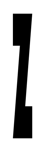
hhp
Yeah that's how I understood your suggestion. It looks good for this basic shape. I wonder how it will look in text.
In my opinion these would be superserifs if they would also be longer. Maybe you could call them vertical serifs or glitch serifs (in reference to the rendering problem effect but that might be too negative).
There sure is a lot to be improved, but I am not sure it is worth it to pursue this idea.

It is a fun experiment, but I am not sure if it can become anything more.
I like the basic shapes but your slant is too severe. The stem of the /i/ almost looks like a /z/. I think you also have too many diagonal angles. Straight slabs like in Hrant's picture will work better. In your picture there's too much contrast between the serifs and the main strokes. I think it's quite worthy of a concept to pursue when done "right".
Now you know what to call it: Disco!
http://www.halloweenplayground.com/images/cc/disco-man-costume.jpg
hhp
> Now you know what to call it: Disco!
Hah that's quite ingenious!
What about this?

Haha, I just realized how my question would look just after Martin's remark... Not intended.
I quite like this. I think it could achieve quite a nice texture while maintaining to look friendly.
I don't know how it will work if you concentrate the weight distribution in the serif areas only. Maybe you need to thicken the right of /p/ and the top right of /n/. I'm just not sure though. I've never done an experimental typeface like this so I wouldn't know what works best in text.
Captured from web.archive.org on 23 Jul 2014. view this capture
