Hello to all members of the forum,
I don't know where or how to start to introduce myself, but I have been following some of the forum topics with great interest. I am amazed everytime a forum member comments on a typeface for critique as I will see something that I would not have noticed before, and this proves that there is so much for me to learn here.
I am keen on typography, and my recent purchase of Robofont (without any prior knowledge of font softwares, neither experience in typeface design, so this is a first) allowed me to draw some shapes to be played around with as a font. I have no idea on how to use the software to its greatest effect, but I would like to start somewhere in learning how to design proper typefaces.
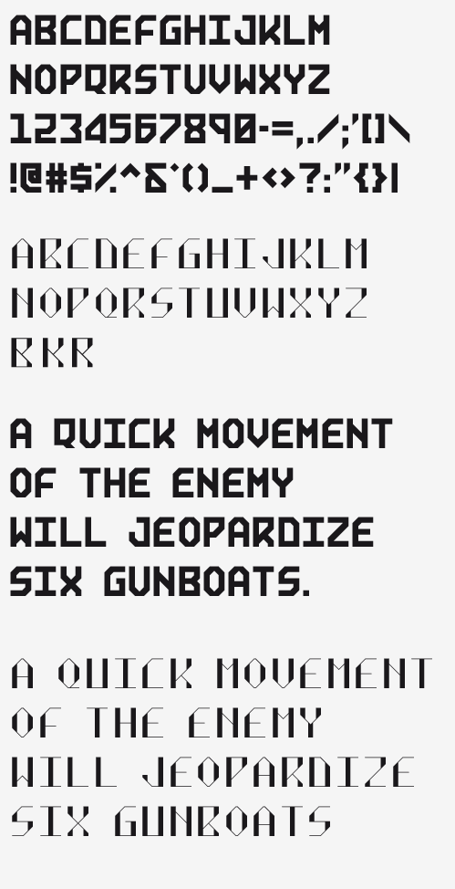
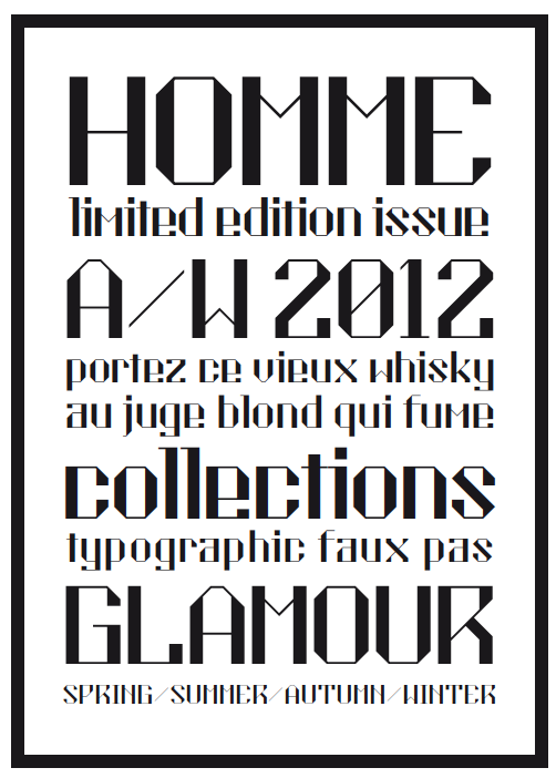
I thought the best way to learn was to dive straight in and put it up for critique, and to see if there is any way to eventually develop this to be used somewhere as a display face? Also would be good to know if there is already an existing font like this that I am not aware of.
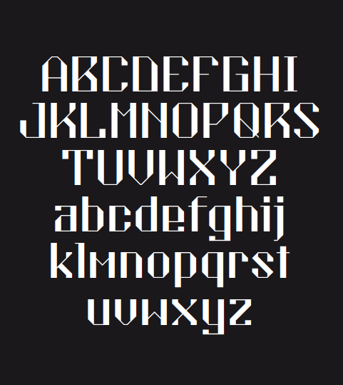
Two weeks ago, I started drawing these shapes in Illustrator based on a simple grid, and imposed some restrictions with regards to the angles for the different parts of the characters. The thicker ones were an initial attempt, and I recently re-drew a new set with a higher contrast between the vertical strokes and the horizontal and diagonal ones, and some changes were done to the structure for some characters.
As you can see, the character widths are kept the same, and I think this has caused problems with the new set's kerning (don't know how to set that in Robofont either) so this is still monospaced for now? I hope to eventually learn how to kern character pairs to remove the awkward spaces between some alphabets.
I would really appreciate your feedback and comments and how I can improve it to be decent enough for use! Thanks in advance :)