Hello again Typophiles.
Although I'm still developing the Lode brand within the forum, I've got a small branding job on so am looking for pro' opinion.
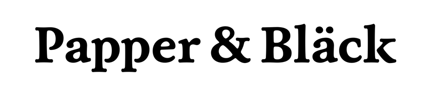
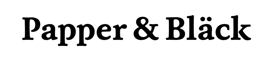
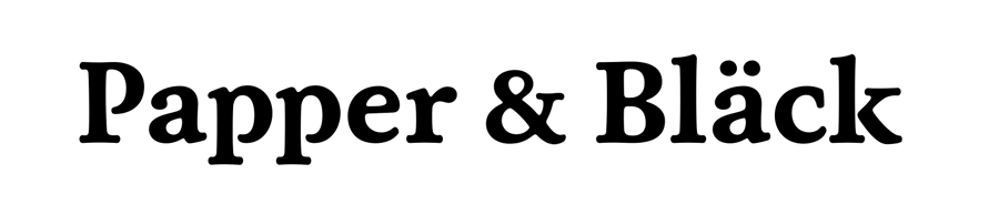
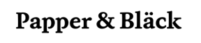
The company is due to start the manufacture of bespoke paper goods such as greetings cards and the like. The client wanted to give an air of an old style, well established company to the identity so we developed the typography and whittled it down to what you see below (Livory Bold). I felt the character of the typeface was strong enough to become a logotype in its own right with no supporting mark (obviously unless the client changes his mind).
After a little typographic history lesson thrown in from me, the general roundness of the characters, open counters on the 'p' and likeness to traditional hand-cut type really appealled to him. It's a simple case of getting the kerning correct.
Any positive / negative thoughts would be appreciated.