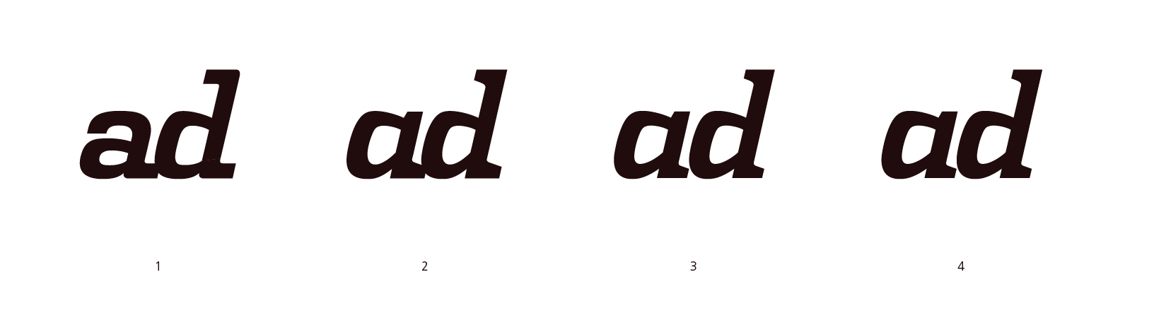
I've been working on some ideas for a slab serif display face, just starting with two characters, and thought it might be interesting to show the progression. Number 1 is a VERY rough initial sketch – numbers 2, 3 and 4 show the characters starting to resemble something like real letters. Any suggestions for further improvement are appreciated. Do you think there's any value in pursuing a full character set in this style?
| Attachment | Size |
|---|---|
| adtest.jpg | 118.44 KB |