Typophile

Parity

Nick Shinn

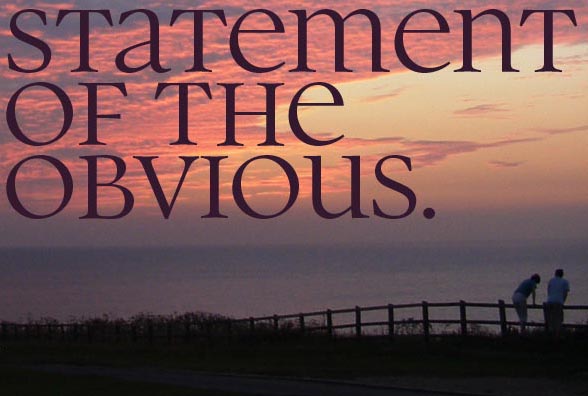
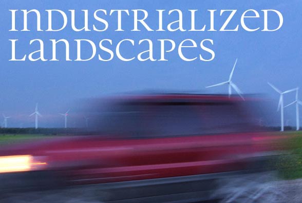
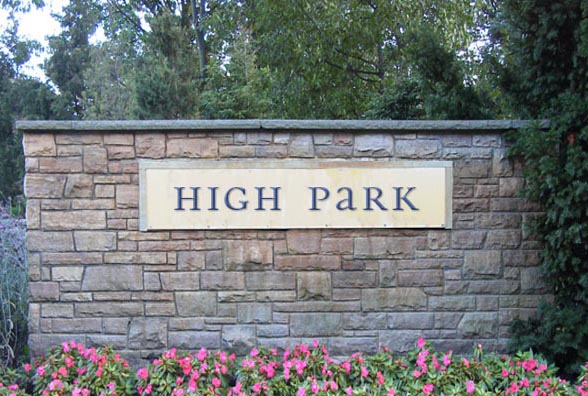
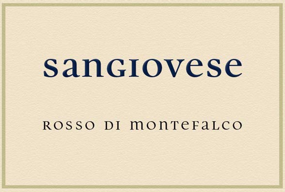
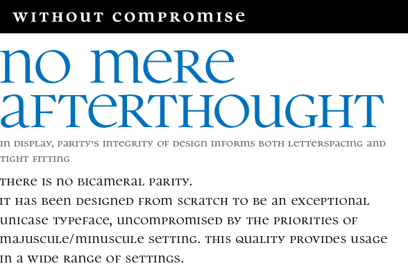
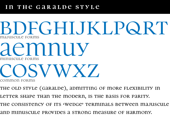
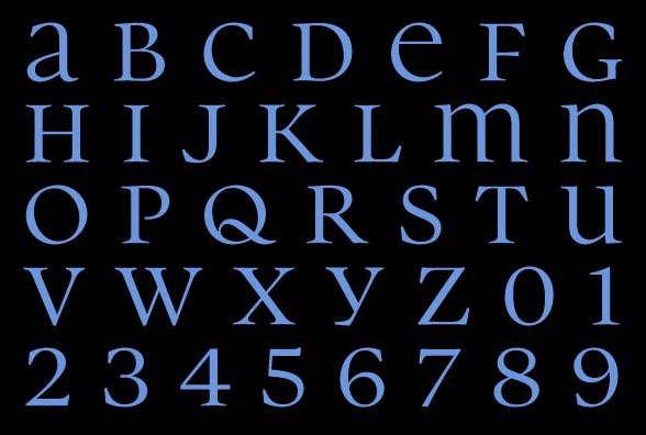
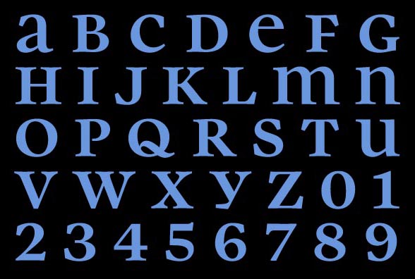
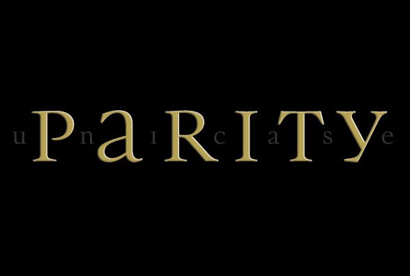
An oldstyle unicase face designed by Nick Shinn, in Regular and Bold weights.
Suitable for titles, headlines, and extended text if you’re feeling adventurous.
Available at MyFonts and other Shinntype distributors.
Download PDF Specimen.
Available at MyFonts and other Shinntype distributors.
Download PDF Specimen.

Again, a Shinn typeface with an extremely beautiful and legible Capital Sharp S. :-)

Poor r, it has no ascender nor descender, but it’s too light and unbalanced to sit well in unicase... ;-)

Shades of Paraoptica! Great job, Nick!

Brilliant!

Riccardo, you've got me thinking—I've seen some r’s with ascenders (Cheltenham, for instance) that might be interesting in a unicase style. Lining glyphs are not a mandatory constraint of unicase, of course.

Right Danny, I started out to do an OpenType upgrade to Panoptica, but got distracted…

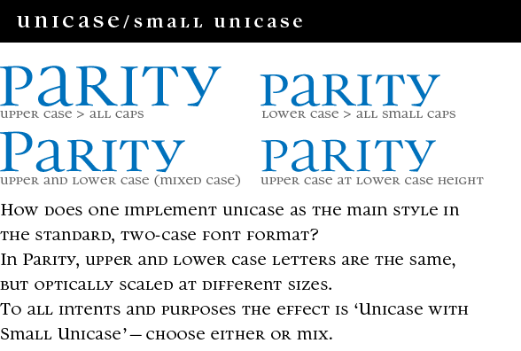
Thanks Ralf! What are your thoughts on Capital Sharp S in unicase? I treated sharp s as upper case in standard orthography, i.e. “ß” is rendered as double-s in both lower case and all-cap settings. This may not be ideal in mixed case (“Unicase with Small Unicase”) setting, but I don’t really like that setting for this face, the two-size/two-case configuration is more of a convenience that provides a degree of size-specific variety for lining setting, which I assume will be the way that most users will set the face.

However, if you do set the cap-eszett glyph in either upper or lower case, then it will correctly transpose in both “All Caps” (case) and “All Small Caps” (smcp) features.

Perhaps I could have done a stylistic set with the lower case “ß” rendering in the cap-sharp-s form.

Really digging this Nick. Well done sir!

Captured from web.archive.org on 17 Aug 2013. view this capture