
Since this is my first post, I believe some introduction is in order: I'm Alexandre Ataide, from Brasília, Brazil, 29, single, Libra and unemployed. I love type. Well, maybe I love calligraphy more, but hell, who's to judge ones heart?
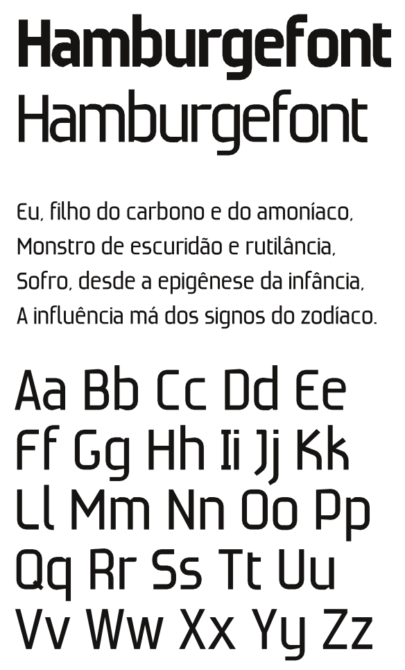
Now to business - I did that about 7 years ago, when I was graduating in graphic design. Was supposed to be used for signage. It's obviously very rough, but I would very much appreciate your opinion about the typeface. Please citique, criticise, flame, bash and/or troll to your hearts desire.
P.S.: I have done but one commercial typeface, so to say, but I cannot show it to you :-[. At the time I was working at Banco do Brasil (it's a bank, in Brazil) and was commissioned a typeface for printing checks. It was security stuff, so I don't have access to the files. I don't think it would be a wise idea to post a picture of a check online, too. Anyway, the fonts are still in use, so, if you have an account on Banco do Brasil and you use checks you have seen my the typeface.

