Typophile

Piquant

50pointtype

Ok, this is a brushy, cutesy, small-x-heighty, condensed display face but I want to keep it somewhat structured, lest it fall into a one-trick-pony category. Ligatures and alternates could be fun on this. My biggest concern has been getting the thicks and thins in the right places. (I've been looking at Franklin Gothic Condensed for guidance) I need some eyes on this...

Piquant 01

I like it! I feel however that the downstrokes on K and R are too alien. It works in the lowercase k. Also, the angle of the K’s downstroke is far too steep.
I would also consider the stroke endings of the thin horizontals; they look too square to me. The same goes for the thin upstrokes of M, N or U.
Just my two cents.

I like it! A perfect combo with 'Madcon's music, swinging from my speakers right now. The lowercase really have a great deal of potential.

The Uppercase need a lot work. Not sure where to start. Compare them to the lowercase carefully and perhaps start from scratch. They need more of the swing that the lowercase has plenty of.

On the lowercase: Remove all straight stroke endings and replace them by the soft stroke endings on n for example. This would affect ijvwxz. They don't fit in currently.

o is bit too narrow.

tittles on ij should be more brushy, or just round, instead of the computarized vertical squezed ones you made.

j would probably benefit from a little curve on the bottom.

The continuation of the swash on g and y (past the stem) looks a bit forced. I'd simply get rid of it.

ces are leaning backward ever so slightly

Calligraphy-wise, it makes more sense to make the stroke ending of the ascender on d the same as in b. same goes for p and q.

xz don't fit in. Not sure how to fix this.

Good luck!

Cheers,
Jasper

Thanks for the critiques. Your tips got me thinking about the "swing" of it all and so I got out my brush pen and drew some letters again but with a bit more flourish. Not so rigid this time. Here's what I've got so far. Hopefully I'll get some more time to do more over the holidays. (Incorporating your notes of course)

Beautiful. Keep it going!

Ok, here's the latest. I have some caps drawn but I'm just focusing on the lowercase for now. Also, I'm having fun with some alternate glyphs and ligs. And the spacing/kerning hasn't been addressed yet, so hold your fire there.

Piquant 04


Very, very nice, but what’s “brography”? ;-)

Think about preserving visual balance in the counters of different letters -- some get too small here.

Ha. Yeah, well, maybe a b-i-o ligature is forcing it a bit.

So I'm guessing /a/k/ and some of the swash loops are the offending small-counters? (or that alternate /o/) I see what you mean.

Yes, and /b/d/g/p/q/.

I agree with eliason. The counters of /bdgpq, etc/ should be balanced with the counters of /mnhuo, etc/.

The last two swashes, on the /b/ and on the /o/, look a bit forced and hurried.

I for one would like to see alternates for /acf, and perhaps s/ with ball terminals like the /ac/ in your previous post.

/s/ is leaning backward verly slightly.

/crsvw/ create too much whitespace. Make them narrower, or, in the c for example, add a ball terminal.

/vwz/ need conceptual work. They just dont have the right attitude.

The 'swash' on the non-swash /k/ is too round on the top. It should be a bit pointy like b.

Overall great job. I like it.

Quick update on some of your recommendations. I didn't intend to have ball terminals on this but I can see how they're useful in filling up unwanted counters. Not sure if the /a/ needs it or not.

That's definitely more even, and better for it.
Are you happy with the bowl shape of /b/p/? There's something about it that is unhappy to my eye. Maybe the top is just too pointy, or too far right? Or maybe it's just me.

That k is darn gorgious! c is also better now.

/a/ looks better without terminal I think.

Bein' a pain, I know, but the right side of /e/ also needs work. The part where the 'crossbar' enters the bowl needs to be thinner. The very top node needs be moved to the right a little and the node on the very right (top) needs to move up. Just like /k/, /e/ needs to have the 'italic' feeling more. Perhaps you could even try to use the bowl of /k/ as a mask for the bowl of /e/. I'm not sure wether you should go all the way with the /e/ though, but at least more towards the italicness of the bowl of k.

In the italic of my font, the /a/ (similar to your alternate /a/, which has the same bowl as d), appeared to be wider than /d/. It's an optical illusion I really don't understand, but you should make sure to check it in your font.

One more thing ;-) I think it makes more sense to make the bottom of /r/ like the left bottom of /n/, instead of the right bottom of /n/.

Cheers!

It is a bit pointy. I'm for rounding it off slightly.

Good catch on the /e/ and /r/.


Structurally I think that new /r/ makes more sense, but perhaps now the whole thing should be rotated counterclockwise a smidge.

Thoughts on which of these v's work best?

Third. But it's still not there. Lacks character amd is too dark.

/e/ is falling backward.

Eh?

Maybe that bar on the /e/ needs to be more horizontal or even curve upward.

There could be a little more weight on the top of that right stroke, but I think that looks pretty nice!

I suspect changing the bar on /e/ will make it too tightly curled.

Nice! I'm only wondering if you should perhaps lower the right stroke ending of /v/ and /w/ to the same level as the left.

The /e/ remains a difficult case...

/e/ contestants:

3. Move the bottom two nodes a little to the left though. It's leaning backward.

I liked the /e/ when it's bar wasn't that horizontal; it flowed better. The solution is near to what Jasper suggested. I would only move the upper from the two bottom nodes to the left and/or five points upwards. Consider both propositions, mine and Jasper's.

Very tasty!

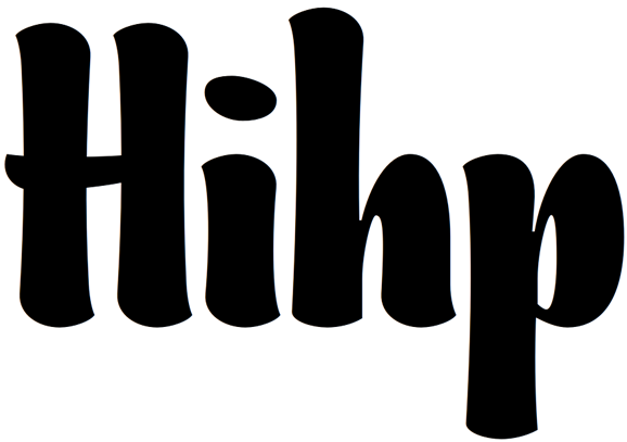
I think the abrupt stem connection at the top of the
bottom-left bulges (meant to convey the turning of
a brush I assume) is distracting. It's too subtle to
mean much to regular users, and they won't get the
tool allusion at all, so I think it's better to make that
connection smooth. Remember, you're not making
this for other type designers.

Also, I'd try to tighten it all up slightly. This is
clearly for display, and the bold forms would
be happier even closer.

BTW, I think you need to find another name... This is
very sugary, not at all spicy. :-) Something a bit old-
fashioned, maybe French... What about Blancmange?

hhp

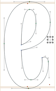
That's the kind of quality advice you'll only get on Typophile. :) Hopefully this /e/ is done or nearly there. (nodes shown here)

Wow. Blancmange. (I had to look that one up) Thanks for offering up the name. I'll take it under consideration. And yes, I think the stem connections work smoother.

Yes, it doesn't fall back anymore. However, following script/broad-nip logic, the control point I selected in this picture should go up quite a lot. On the other hand, it seems that letters like e and o have a perfectly straight stress, whereas letters like n d v have an obvious diagonal stress. For some reason it doesn't really cause any conflicts between them, though. Bringing up the control point I selected should bring some diagonality to an otherwise vertically stressed letter, which is what my gut tells me it needs, but you might be right in keeping it vertically stressed throughout the e (the way it is now).

Just to be clear, vertically stressed is when the broad-nip pen is held horizontal. Diagonal stress is when the broad-nip pen is held diagonally.

For the most part, I've been drawing everything with a brush pen held horizontally.

> following script/broad-nip logic, the control point
> I selected in this picture should go up quite a lot.

This logic is quite arbitrary, with no relevance to the
functionality of the/a font. It will lead you astray as
often as it will seem to give good direction. Plus it's
a brush. But same difference.

> For some reason it doesn't really cause any conflicts between them

Bingo.

hhp

No, it looked better before (at 7:01).

Nice work.

I agree with craig.

Maybe it's a bit too thick on the right. Something's still off...

Why did you move the node? And you barely moved the control point Jasper indicated... This makes it look awkward, as the line to which both right nodes lay collinear is now too angled (relative to the horizontal). If you angle that (imaginary) line, then be consistent and also give an angle to the upper line which corresponds to the both upper nodes (and is, in this moment, perfectly vertical). Or, vice versa, get rid of the angularity of the "right line".

Hopefully this is more like what you described. The right node is back to where it was, with the bottom handle moved up.

Here's another go at the uppercase. I want them to work together, so that's why I'm not going full-on swashy script here. I can leave the stylistic alternates for that. (See if you can spot the letters that I'm not 100% on.)


Piquant 16
Piquant 17

Looking good! I'm really impressed with this progress. Making an all cap setting work is an excellent decision.

/C/ and /G/ top serif droops down too low perhaps. /G/ isn't there yet.
The plain thin left stroke on /M/ and /N/ is too straight and plain. /M/ gets too dense/dark in its top half maybe.
The right stroke on /V/ and /W/ may be too stiff.
Could you do something more with one or both of the terminals of /Z/?
/A/ and /J/ are fun, though they do take the face in a bit of a different direction IMO.
The nubby loop at the corner of /B/D/E/L/: that's such a tight loop, I wonder if it works as a loop. Perhaps simply crossing strokes rather than forcing the loop would be more persuasive. Or maybe a bend and change of direction like at the top of /R/ for example would be.

The /e/ improved, but I still see some imbalances in there, e.g. the bottom left needs a bit more weight. To fix this, move the left most node down to where the loop joins the body without changing the position of its control points.

/s/ looks stiff compared with the rest of your lowercase. As an individual letter it's nicely drawn, though. Or perhaps it is a matter of personal taste; I need to hear other's opinion.

/G/ doesn't look bad alongside capitals, but next to the lowercase it's distracting. I also agree with Craig about the loop corners of /B/D/E/L/. /A/ is too loud :)

Aren't the tittles too high?

Nice alternates!

This might sound odd, but I think your caps would look better, both in allcaps and normal settings, when they'd be wider, much wider. Caps have a different structure by nature so they probably won't stand out as much as you'd think when they're wider than the lowercase.

Right now, they look ok, but no where near the swing of the lowercase. Swing. remember that!

Cheers! jasper

Update below. /e/ looks better, and I made the top half of /s/ more narrow to give a less symmetrical feel. Various edits to the rest:

Piquant 20


You might consider putting the gap in the /Q/ at the bottom rather than at the top (so that the stroke starts at the bottom left, goes up and around and continues into the tail).

I had done that but wasn't sure how it looked. Here it is:

That makes more sense to me.

It also makes it less of an "O".

BTW, if you decide to go with "Blancmange" you'll need to kick
the "B" up a notch! (Sorry for the gastronomic double-entendre...
and that linguistic one too. :-)

hhp

Numbers:

Piquant 24

It's nice to see a "rationalist", non-conventional weight distribution.

The one is a bit heavy, and needs modulation towards the top.
The three is very nice, but the top is a bit light.
I'd lower the bar of the four to make it look bigger.
It might be nice for the zero to be slightly egg-shaped.

hhp

To fit with the typeface, the figures could have more swing. Methods to consider:
- round-topped /3/
- gaps in /6/9/ (maybe /8/) like in your /O/o/.
- make top half of /5/ less rigid/perpendicular.
- exaggerate the whip of the curve of /7/'s diagonal more.

I think oldstyle figures are naturally more swinging. Therefore it might help to start with oldstyle figures, and make the lining figures based on that. Just a suggeston, feel free to ignore.

I agree with craig completely. Furthermore, /1/ is too dark on top. Making it more horizontal will lighten things up a bit.

Crossbar of /4/ could extend a bit further.

What craig said about /6 9/ may also be the case for 0, although you have to make sure it differs enough from the /O/ The bottom of /2/ doesn't work. Maybe get rid of the counter curve (going more vertical) or exagerate it.

Try to flip the crossbar of /5/ vertically, so that it moves in the same direction as the crossbar of /2/, which is upward.

Cheers! jasper

Here you go. The gaps feel right. I tried a round-top /3/ but I'd like to make this one work first. We'll see. The /2/ is still tricky. Cutting and pasting and flipping the little serif from the /3/ or /7/ doesn't really work so hopefully this way fits better. I don't think it's there yet.

And here's your alternate /B/ :)

I don't like that B to be honest. The gaps in 6 8 9 could be larger.

Developing a nice terminal for horizontals seems to be the missing piece of the puzzle here. Top of /3/ and /7/ seem out of character to me--they look like graffiti scrawling. And as you say the bottom terminal of /2/ isn't there yet (and that solution when it comes could help you with /Z/ and maybe /E/ and /L/ too). Maybe get your brush pen back out and experiment to find new shape ideas.

I don’t think the B is so bad. Maybe a bit rigid on the left, and you could revise the bottom stem/bowl join.
For 8, what about just a single gap on top?

Oof. I quite like it. What's not working for you?

Better I think. Back to those numbers...

It's a little rough but here's some initial scrawl-and-scans with the brush pen. Are any of these headed in the direction you're thinking?

I disagree about the 8. It is already looking like an S to me.

/8/ conversation fodder:

8: The "B" choice, flipped horizontally.

hhp

I suspect that would look really odd. I think A works well.

A.

To virtually all type designers, certainly. But I think not only
would laymen not notice anything funny, they would actually
benefit from the divergence from the "S" (my only reason for
recommending flipping).

But I agree that the "A" choice works, and it might also be
worth closing either the top or bottom of the "B" choice.

hhp

Horizontal terminals below. It looks better to have different shaped terminals for the top and bottom of the /E/ instead of having one be the reverse of the other.

The top of the "Z" bugs me a little, but maybe it fits in your scheme.
I like the "2", but it might be better to make the top counter appear
smaller than the bottom (probably by moving the spine up). The "L"
should be narrower than the "E".

hhp

Those bottoms are all improvements, especially the /E/.
Top of /2/, like I've noticed in /C/G/c/, has a kind of low droopiness to it that maybe some curve-massaging could lessen.

-sharper angles on top of /7/Z/
-tighter curl at top of /c/C/G/2/
-narrower /L/

All improvements!

I still dont really like that E and alikes, so now I'm thinking maybe you should add that same 'serif' as Z has to the E and alikes.

This will go into bestsellers no matter where you'll upload it. :)

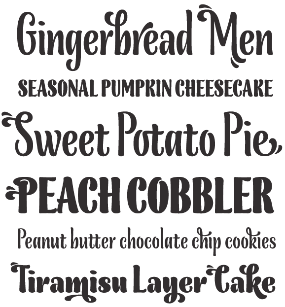
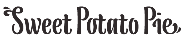
Pardon my disappearance. I've been in ligature-land, building the rest of this thing out. I'll still take a look at those serif issues but in the meantime have a look through the rest of these glyphs. I'm pretty excited about the stylistic sets. Here's some over-the-top, swashy examples:

Piquant/Blancmange 32

(thx Minerva)

Love the droplets!

hhp

Agreed. This is looking great. These recent embellishments are miles ahead of your first attempts.

I just noticed something: the numerals are too light.

BTW, forget "droplets" - let's call these "squirts". :-)

hhp

Hmm. Agreed.

Will you make accented swashes or ligatures or just basic latin?

I can do that. Wasn't sure how much demand there would be for that. Some glyphs probably won't allow for certain accents etc.

Stunning!! Will you create a bold as well or just leave it at this?

Trying to get the color right on these numerals:

That /8/ still bothers me.

In my perfect world, there would be a light and bold face (maybe even an accompanying text face) but am not sure how long that would all take. I can try out some bold glyphs and see if it's worth pursuing.

Keep going with this?

Certainly!

Yes! Have you tried extrapolating to a light?

I'm doing all this by hand, so...not yet. If I had known I would have made light/bold masters and let software do the in-between. I'll play with it. See how it looks.

Nice to see this evolving. What a step from your initial characters!

A peek at the bold under construction:

Looking good. I'd say the same thing I said long ago about the regular: mind balancing the counter sizes, which are again getting too narrow in some cases.

There may be a better solution for the top terminal of /C/G/, which here even more than the regular looks too turned in on itself to my eyes. An additional issue with this shape in the bold is that the /c/ may look too much like an /e/.

Love that /X/x/!

That's no Bold, that's a Demi!
With the Bold, go hog-wild.

hhp

Nice! Hrant, this looks like an extrabold to me.

Middle part of /e/ is too thick.
tittles look odd. I think you could extend them more vertically as well.
I don't see any counter-size problems. Perhaps the counters of /uvwxy/ are a bit too large...
Diagonal in /k/ is too light.
bottom of /j/ looks weak.
/EFL/ are too wide.
Bowls of /P/ and /R/ are too small.
Bottom of /U/ needs more weight on the left.
part where the thins of /x/ meet the thick diagonal should have about the same thickness as the part where the middle part of /e/ enters the bowl, which should be thinner in both cases.
/r/ might turn out too wide when set in a word.

Cheers!
jasper

OK, OK, it's a Bold (but not more).
But with the Black do go feral porcine.

hhp

Ok that's the kick in the ass I need. I don't want to be wishy-washy with the bold. Or black. Or fat, husky, whatever.

Blancmange Obese. That's it.

So there's essentially two types of terminals I'm trying to reconcile here. A "thin" one, like at the top of the /a/ and a bulbous one, like on the top of the /c/. What to do when blowing it up real fat? Any thoughts on some of these options:

I think there's three things you can try: increase
contrast, increase contrast, and increase contrast.

hhp

For /a/ go with nr 2.
For /c/ go somewhere between 1 and 2.
Why did you make the joint at the bottom of /a/ thicker? I prefered the previous one.

Hrant. Explain.

I'm just saying the way to make a Bold
alive is just as much through contrast
as it is through weight.

Or were you talking about "feral porcine"?
That was just a joke: hog-wild. Geddit? :-)

hhp

That's the Typophile humor we should all by paying money for.

If you extrapolate out the curves from the original weight, you get this:

Looks unorthodox but it seems true to the design. Thoughts?

Put that in a juicer! Yum.

hhp

Cool! In all styles you made so far, the bottom right of /c/ needs to be moved to the left a bit. It's falling backwards...

YES!

The main UC and LC. No ligatures or numerals just yet.

Blancmange Bold 04

[bringing those tittles down a bit to fit under the /T/]

/t/ looks short compared to the ascenders.
/T/ looks light.
Some of the tall vertical strokes might be a little stiff looking. Is there a way to soften up those straight (or nearly straight) contours?
/s/ looks a little out of character - maybe too wide, too symmetrical, too smooth?

I think the main problem here is the difference in thickness of the horizontal parts when letters like /c/ and /a/ or /e/ and /s/ are placed next to each other.

In trying to keep a high contrast, some horizontals might look, say, forced. Given the two versions below, do you think the second line is an improvement?

No way.

hhp

If you've got that thin hairline in /a/, your thinnest parts of other letters have to at least come close to its thickness.

Eh?

/s/ has an asymmetrical approach to terminals and is slightly more narrow
/t/ bottom terminal falls in line with /c/e/s/ and is taller

Hmm. Did you try going the other direction: making bottom of /c/e/s/ conform to what you had for /t/ before? Now they seem neither here nor there.
Judging the /t/ height will require setting it next to full ascenders.

I'm thinking something like this is the solution here. Leaving the thin strokes mostly untouched while the big "flare" terminals are blown up. i.e. Bodoni Poster

In context:

IMO those terminals need to re-thicken at the ends.

Seconded.

hhp

Top: terminals keep the same thickness throughout (roughly)
Bottom: terminals flare a little at the ends

Better.

hhp

Terminals working together:

Yes, that's the right approach.

I still think /t/ could be a lot taller, given the full ascenders.

Update: Softening up the sides on the verticals. I'm pretty sure there's no straight lines left now.

Ex:

Looks good!

Very nice.

The /c/ looks a bit too /e/-like for my taste, though.

I'm about to wrap this sucker up, so I wanted to post my original type "specimen" in it's almost final form. Just for comparison.

You've come a long way, baby.
Nice job.

In the bold weight /S/ is definitely too dark.
/s/ may also be a bit too thick.
/P/'s bowl could end further down. Right now it's conflicting with your lowercase, leaving a white gap (particularly noticeable if you look at /Pi/, which is relevant, if you're going to name your typeface Piquant), but I understand it's also a matter of style. Consider the option of making an alternate for the most problematic pairs.

I like how your bold /T/ compensates the shortness of the right end of the horizontal with a weight increase. Overall, congratulations! I really like the feel of it :-)

Yeah, a few of the uppercase letters in the ultrabold could do with having their counters opened somewhat, but overall, this has come on in leaps and bounds since the first post (when I already thought is was pretty good!). Nice work.

Thanks. I appreciate all the help. Your checks will be arriving in the mail soon. ;)

(I agree w/the /P/. The style does run into an issue there. I'll look into an alternate pair.)

Congratulations on the release! The posters look great. One small thing - I don't think the flag shows it off to its full potential. Maybe a closer up example of some of the sexy curves in action would be better.

I love how this looks like.. and I loved to know the path you walking to reach this result.. very clever and intricated design.. deserve a very good place between on the best.

BTW I just curious what Lex talk about /Pi/ so I tried a possibility to compensate the white space between them

so, if you like it.. could try yours :-)

Captured from web.archive.org on 16 Apr 2015. view this capture