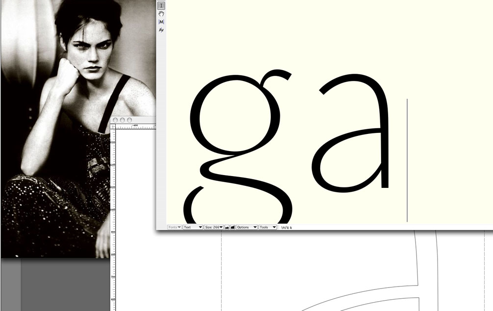
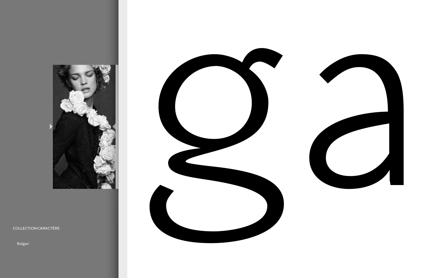
Monitor pictures during my work on a „Advanced“-version for my new webpage thought for tiny letter sizes.
Image_ga_small
Monitor pictures of while I am working on my new typeface Minors advanced. This sans serif character is indeed a very old one (of mines) on which I did modifications that changed its look. I wanted to add to it more fashionable elegance, more in the direction of Franklin gothic feeling, clear and charming forms.
On my table I kept an old ad campaign of Giorgio Armani of 2003 photographed by Paolo Roversi and an open Dior book which contains a beautiful Didot character. I search for inspiration in them to turn the character of the face into something more stylish even keeping it a sans serif face. […]
Another picture while working on the ‘s’. I find it personally hard to do the downwards swelling. It tends to go up on the right side. Yet, I tried to keep it symmetrical. This keeps it somewhat warmer in feeling. The hidden photograph also is by Paolo Roversi.
| Attachment | Size |
|---|---|
| Image_ga.jpg | 97.24 KB |
| y_ysRA.png | 110.74 KB |
| Image_Zs_weiter.gif | 62.07 KB |
| Image_27g.gif | 61.48 KB |
| 8421.png | 80.45 KB |
| 8_Zurichtung.png | 49.83 KB |
| Image_ga!.png | 194.1 KB |