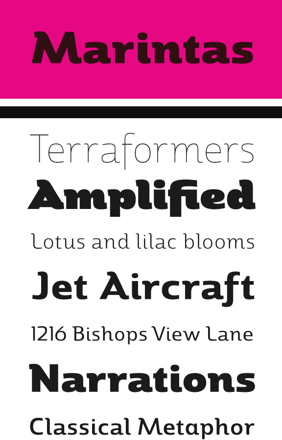
“HFS” (working name) is a friendly sans serif with plenty of character. I am planning seven weights.
I've been working off and on this font for a while. It has begun to take on some similarity to antique olive in the heavier weights, but that does not carry through to the family.
The extreme mass of the black has created a problem creating the intermediate instances of the multiple master. I am planning to to split the current multiple master somewhere around the medium range. One for light through medium and then another for bold to black to make two masters for this font to correct some of the weight issues in the medium-regular- light range. At least, that is the conclusion I've come to you so far. If somebody knows a better way has to deal with these intermediate weight issues, please let me know. I'd be very grateful. It would be nice if fontlab would allow for an intermediate master character to correct these issues. I suppose there are some options in the robofab world, but I cant make that jump.
In addition I have the question of whether or not I should make this a rounded family or keep it as is. I think rounded might work better with the concept of “friendliness”, but that might be something that I need to add later in an extension to the family.
The font does not yet have kerning and spacing issues have not been completely resolved yet either. I have only got the forms down to close to what I want them.
Please let me know your thoughts on the design thus far. I welcome all comments.
I guess the image upload is broken, so here is a link to a .pdf.