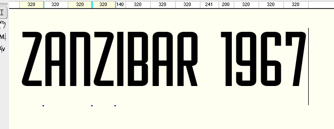
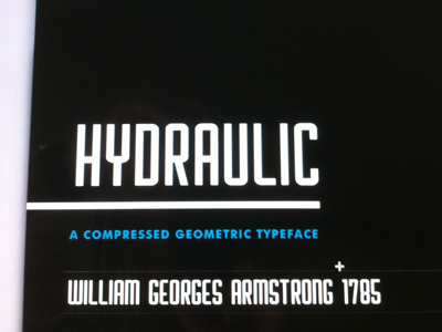
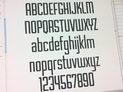
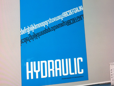
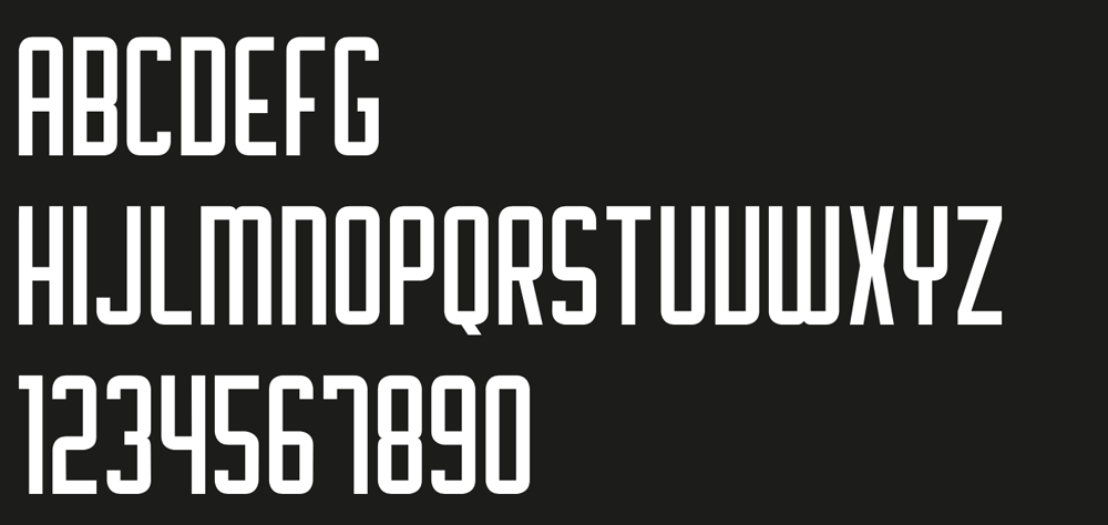
After developing an interest in typography over the last few years (I'm a web designer by trade), and plenty of sketching and practice with software, I've actually pulled together an almost complete set of alpha numeric glyphs.
It really is a simple beginning. A geometric condensed uppercase sans-serif, with no changes in stroke width, except perhaps for the 'X'. If anything it's been a great introduction to using typetool.
I struggled somewhat with the 'M' and 'N', however feel that these ended up on the right track. The 'V' is a bit of a concern, possibly too close to the 'U'. Also I find the 'B' lacking.
I'd love to get some expert criticism. Your thoughts, comments and brutal honesty are welcome, and most appreciated. Is there anything I'm really missing the mark on?
Thanks!
| Attachment | Size |
|---|---|
| tphile.png | 16.12 KB |