Hi Everyone,
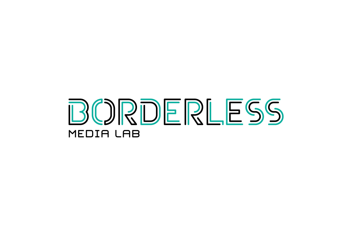
We've been working on a logo for a new type and media foundry. We chose to go with a simple shape and line based approach to keep the mark true to what the foundry did.
We've been staring at this for ages nw and wanted a slightly outside perspective. Please be ruthless! Any critique or feedback would be most appreciated.
| Attachment | Size |
|---|---|
| borderless_logo | 25.06 KB |