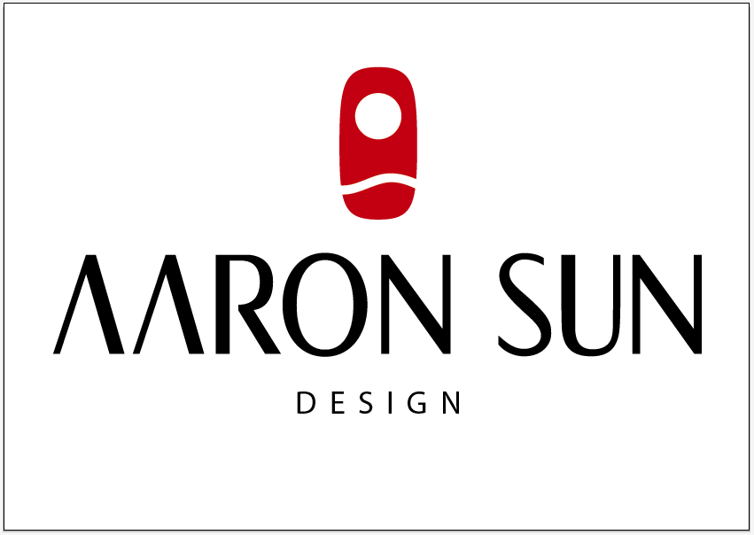
Hey Guys, It's my first post here and one of my first logos. I've played around with typography for a while so hopefully this logo isn't too bad.
The logo is basically for personal branding. I do design, software development, and various forms of entrepreneurship, but I'm primarily trying to create consistant personal branding. It's not primarily for consulting or jobs, but more for networking, etc. I usually end up chasing my own project anyways and I want to put my best foot forward when trying to get other people to participate and help out.
The Background:
I played around with many different types of fonts to try to get something that conveyed professionally and competence. In that regard, I really like very corporate serif fonts. But a part of me also needed to depart from that, saying that we're not corporate (and all the things that go along with corporate). I ended up wanting to make a weighted (is that the right term for where one leg is heavier than the other) sans-serif font that was very clean.
The Current Logo:
I started sketching out different variations and looked around for other similar fonts. The only font that I could find that had the basic same idea was the Nordstrom logo, which is very well done. I like the barless 'A's but it seems to make the beginning a little heavy on the white space. I don't know if this is too big of an issue though. Also I spent a good amount of time on the 'S' but it's hard to get it to look right.
Any and all critiques and comments are welcome. Thanks!
| Attachment | Size |
|---|---|
| aaronsun.pdf | 54.1 KB |