
I know this is very handrawn but I feel like this is a customized version of a font I've seen many times before. Anybody have any suggestions? It looks oh so familiar...
Best,
Danny

I know this is very handrawn but I feel like this is a customized version of a font I've seen many times before. Anybody have any suggestions? It looks oh so familiar...
Best,
Danny
Here is another example where it's used:


That's just Dana Tanamachi being amazing. I'm sure her scripts are based on existing formal scripts, you could find the influence anywhere.
Right. I'm just looking for a particular typeface that I know exists that it is based on. It's even currently used on myfonts.com in the main banner image spelling 'The' but I can't locate the font on their site either:

That’s because, in this case, it’s not a font per se, but just a catchword:
http://myfonts.us/td-J3QIab
Thanks for the feedback riccardo, much appreciated.
I think this is the font I was thinking about, it's got some similarities, but obviously different: http://marketplace.veer.com/font/Oberon-LFT2342700

Maybe something like Samantha Script could work for you with all of its swashes:
http://new.myfonts.com/fonts/laura-worthington/samantha-upright-script/
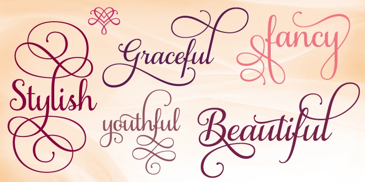
oooh yes very nice. Thanks!
Being a competitor of Dana's I've researched this font as it's one of her most used. I actually make an effort not to use so I don't get my work confused with hers. You can almost pull the entire alphabet of it from all of her different sample images. Most notable are the S and the Q and the lower case x, they are dead on ENGRAVER'S SCRIPT. The rest of this main script font she uses so often is her take on engraver's script as well. While I don't think there is an exact font called that, I find it often in my old typography and lettering books, it's plate 25 of 60 Alphabets by the Hunt Brothers, 4th printing.
You can find several similar fonts by looking up copperplate script fonts:
http://www.fontshop.com/fontlist/genres/copperplate_scripts/
She draws it single line and then comes back and thickens up all of the downward strokes. Then she drops in a shadow line, normally to the bottom right. If you want a quick trick for getting the shadow line right draw your letters out first. Then tape two pieces of chalk together, hold them in your hand at a 45* angle facing down and to the right, then trace over the right side portions of the letters lightly. Then go back and darken your new line, skipping parts that overlap. You will also find that to make the letters pop she ads a shadow when a line in a letter overlaps. She's just erasing right beneath the overlapping line.
Sorry I found this so late. In the future I may put up a free font on my website based on this style, as it's so popular.
Captured from web.archive.org on 10 Oct 2014. view this capture
