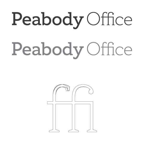
I've made a custom logotype based off of H&FJ's Archer. I tore off the ball serif, and made them all slab-ish, and brought down the cap-height. The result was a significant change to Archer's standard ffi ligature on the word "Office."
Aside from critiques on the ligature, I'm happy to hear any other points of concern. Especially, I'm not in love with the "c."
Thanks in advance!