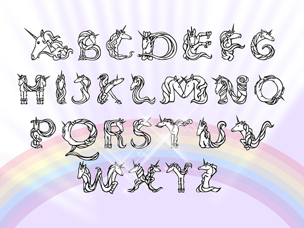
Greetings all,
After quite a bit of work, I can finally do a release of my new display typeface. Since it's meant for display the level of detail is quite high, making it not really usable for body type. However, this is also an experiment in legibility, to see if some letterforms can be read or not, or if it's all contextual. I didn't design some characters since I didn't see a use for them in a header-only typeface.
The type family consists of a ornamented version, and a more subtle sans. Both use the same main shapes though, and are not completely redrawn. Since I wanted to make this typeface a capitals only , the lower case is used as a series of alternate capitals. I manly chose to do this since I wanted people to be able to type with it in less advanced text programs, which do not have full opentype support or glyph panels.
Well, without further ado, here is a small specimen, showcasing usage in text, the complete alphabet and numerals.