Anybody have any famous examples of bad typesetting? Possibly by a large company or something that we see everyday...
Anybody have any famous examples of bad typesetting? Possibly by a large company or something that we see everyday...

See my posting of 3 Oct. 2010 here…

Beat this:
http://www.themicrofoundry.com/other/typorgy.jpg
hhp

Generally speaking, although I know there are some real doozers out there and plenty of them to be sure, a lot of crappy work is the result of companies with lots of doe and little taste hiring some one on the cheap to shill their crap. Generally, cheap means little talent, and the results are predictable... They are crap. No argument there, but the fact that the person who does the work has no talent isn't their fault. We all do what we can and there is no shortage of "AAA Towing" companies and "Crazy Joe's Discount Carpets" joints they can work for, but if a bigger company that should know better comes calling, they'd be stupid not to take the job. Their work naturally becomes a laughing stock, but really, who's to blame? I don't like to see the poor benighted schlubs who accept the job take the heat for the stingy corporation that hired them.
And then, there is the London 2012 Olympics.
The 2012 Olympics *font* though I personally admire.
hhp

Beat this:
http://www.themicrofoundry.com/other/typorgy.jpg
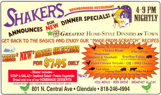
How is this example bad? I would say the advertisement as a whole is successful in fulfilling its purpose.
No, because Shakers doesn't feature children of a dozen different ethnic backgrounds jumping on the tables and flinging gravy at crazed senior citizens swinging their canes at each other all to the beat of a combination of rap, flamenco and Russian folk music. It's mostly quiet white people around 50.
hhp

Ick. That sample looks like somebody threw a copy of inDesign and some text at me and told me to go hog wild with it but it has to be at the printer's in an hour.
Actually, the more I look at the Shakers ad, the more I think that it does send particular messages to the target demographic--white people over 50. First, the typography is downright archaic, so you don't expect young people to be there. The seeming incompetence of the design is a signal that the place is unpretentious. People who dine here don't know the names of typefaces, and if they could name one, it would probably be whatever the default is on their 10 year old PC. Its a place where 'regular people' can go and get a meal. Its not going to be too expensive. They'll have lots of choices. You don't have to worry about someone putting arugula on your salad or trying to convince to try vegan tapas or some other nonsense. If that is what they're trying to communicate, they did so very effectively. Its like Texas governors saying "nucular"--it means something to people who are looking for it.
In all the print-related jobs I've had, I can only recall typesetting a menu on one occasion. It was for a Chinese restaurant that wanted to cram 200 menu options onto a single take out flier. I tried to explain to them that if they are catering to non-Chinese diners, a more streamlined approach could allow them to potentially charge more. To a point, as restaurants move upscale they often have fewer items on the menu. They would have none of that, and I ended up committing some kind of atrocity with the leading. Who's to say though, maybe they knew their business better than I did.

Hrant: Wow, thanks for posting that Shakers ad. What a dreadful dissonance!

@hrant: Beat this:

Captured from web.archive.org on 7 Nov 2014. view this capture