
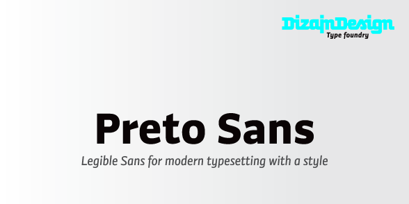
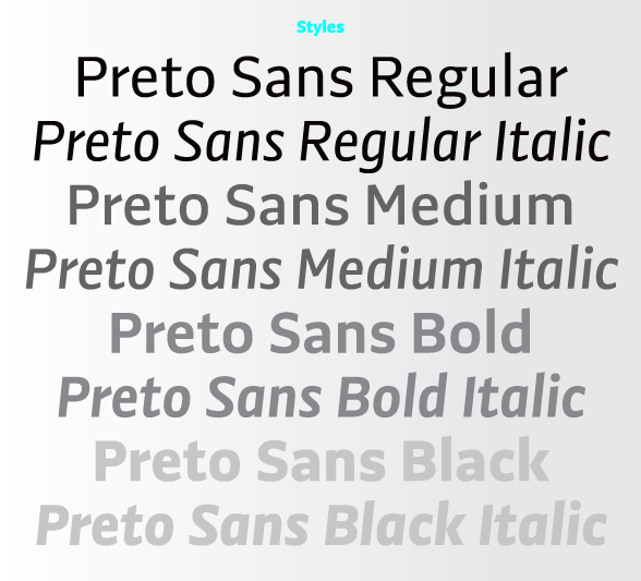
DizajnDesign is happy to announce Preto Sans, first released member
of Preto typeface family:
Development of Preto Sans
DizajnDesign is happy to announce Preto Sans, first released member
of Preto typeface family:

Nice, but maybe the name is a little too close to Prelo?
Hm. I didn't know Prelo before... A nice one.
"preto" is actually a slovak word ;)

I think the f ligatures are admirable here. 1. I like the tasteful restraint. 2. I like the two different styles of ligatures. Very nice.

Congratulations Ján, there are a lot of faces in this contemporary genre (whatever it is), but you've managed to create a face that's even in colour and understated (and hence very useful, I would expect) en masse, and yet has some very confident and distinctive letter forms—a typeface with real personality.
I am very happy about your reaction on the typeface, because my aim actually was to create an universal typeface, but still somehow interesting.
But this family is 1/3 of the project only. I will still need to finish two other type families to complete Preto family.
Thank you!

I like this but, unfortunately, I cannot open any of the links. Also, you may want to reconsider that blue on the samples you posted here – it's quite jarring.
Hm. I dont know why they dont work.
You can try copy-paste these links:
Development of Preto Sans
http://blog.dizajndesign.sk/2011/preto-sans-development/
Pdf specimen
http://dizajndesign.sk/subory/fonts/preto_sans/Preto_Sans_Specimen.pdf
More info
http://dizajndesign.sk/index.php?category=&page=fonts_preto_sans
Buy on Myfonts
http://new.myfonts.com/foundry/DizajnDesign/
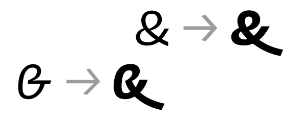
Very nice! I really enjoyed reading the development. That italic ampersand is really good looking
Thank you.

Congratulations Ján!
Very nice
And I love the name of the font also - meaning "because" in Slovak, it is somewhat "mean" but very self confident.
But it surely works worldwide too:-)
Andrej
Well. Thank you!
The name just somehow "pop up", when I was unable to find out a good name. The time was pressure and I was asking myself, why this name, why that name...
And I didn't have a good reason, why it should be named after the names I invented.
"Because" ("preto" in slovak language) was the only reasonable answer I could get. :)
So the typeface name came from the answer.
Captured from web.archive.org on 17 Aug 2013. view this capture