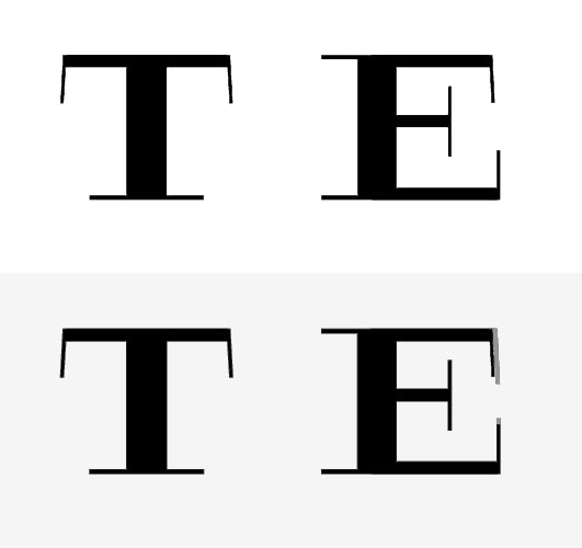
I am currently trying to draw an E to match this T (for a top-secret logotype). The bodies of the letter forms are based on Engravers Boldface but I have been changing the serifs and adding a thick crossbar at the top. The thick crossbar is part of the design concept. So, what I can't figure out is how that thickness should be interpreted in the middle and lower arms of the E.
I would love some advice.
Sorry for being a novice.
 I thought adding this reference might help illustrate how I've been fooling with the thickness of the horizontal strokes.
 The serifs are inspired by what's going on here in Commercial Type's Giorgio.