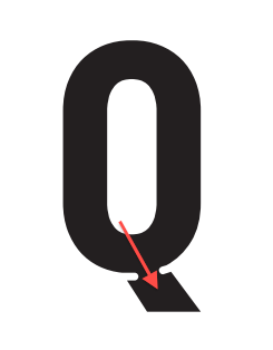
My last post on "Antechamber" was a bit premature; I knew I wanted to create a somewhat neutral, condensed display face, but the first attempt was way too generic.
This new take on the face is much heavier and stronger, with tiny crossbars on the /I/ (a la Bell Gothic) and stylized ink traps. As I said last time, this is a display face for use in the titles of an animation project that will deal with architecture, so I want to create a face that looks somewhat industrial, somewhat "machined", and very sturdy.
The heavily filled alternates from the last post are being left out for now. I want to get the basic alphabet as balanced as possible first.
Any feedback on the quality of the curves, stroke thickness and character widths would be really appreciated. In particular, I stared at the /B/ way too much this morning and am suddenly a little uncomfortable with it. If anything jumps out about the /S/, /M/ or /W/ that'd be useful as well.
Thanks so much!
| Attachment | Size |
|---|---|
| amv-antechamber_r4_glyphs.pdf | 83.76 KB |
| amv-antechamber_r4_pangram.pdf | 81.88 KB |